Product Roundup June 2019
Huddle up your different teams, because the updates of June cover something for everyone – from the Brand Guidelines to the backend of Creative Collaboration, and even DAM.
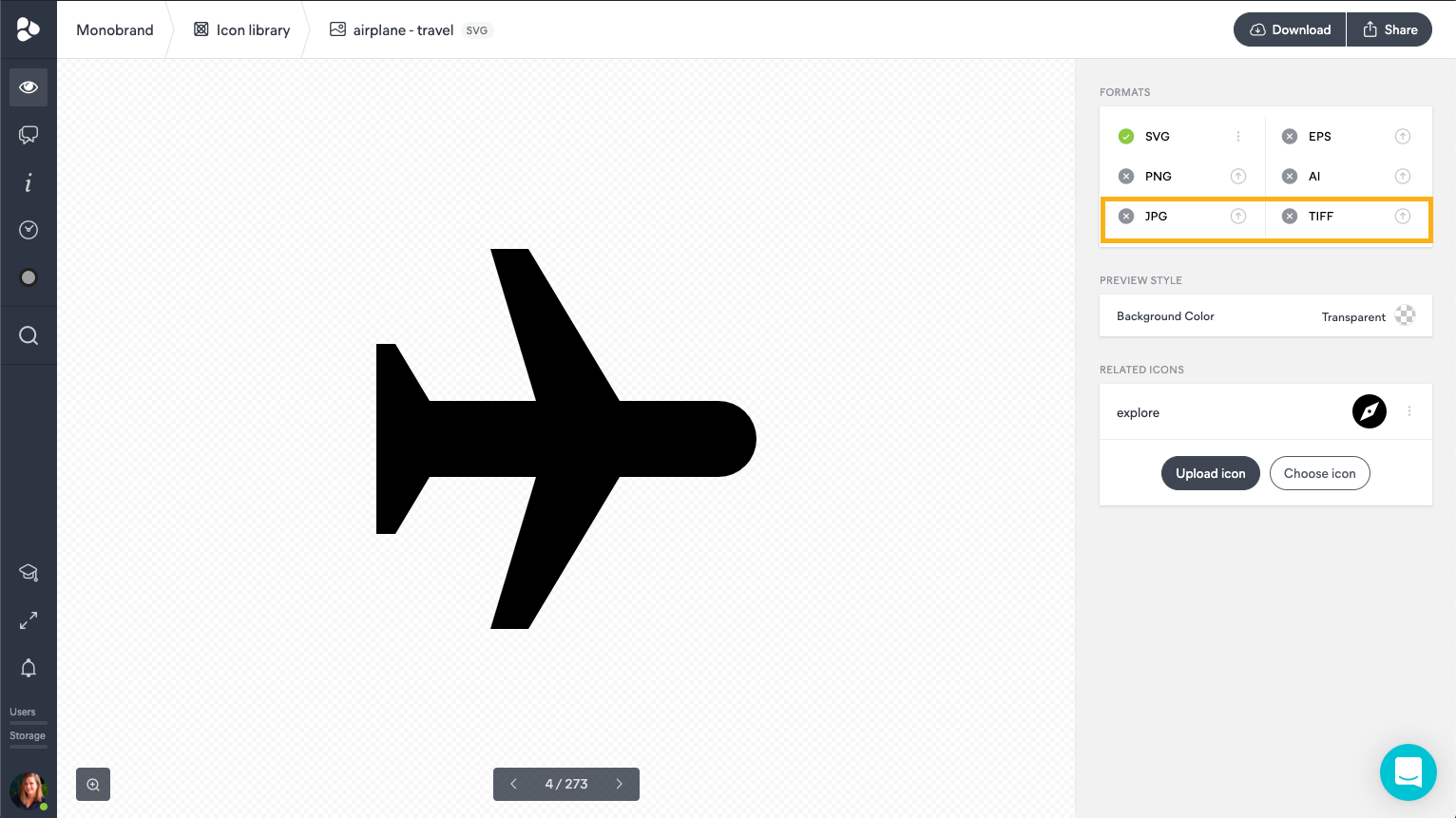
Icon Library: JPG & TIFF – Now Supported
Your Icon Library now has a new update, allowing you to improve your file assortment. Apart from supporting SVG, EPS, PNG, and AI upload formats, users are now able to upload icons in JPG and TIFF file formats. This is of particular importance for users who utilize icons for several different purposes. Read more about this, and other interesting icon library setups.
Custom Height of UI Patterns
This next new update will revolutionize the way you organize your UI Pattern Library. We’ve created a way to set custom heights for your component space. OK, but what does this mean? In the Brand Guidelines, whenever you type the code in the UI Pattern box, and the element in the viewport seems to exceed the size of the space – the system will automatically resize and establish itself in a way that the element can be viewed in its entirety. The update doesn’t stop there, this space can also be modified manually by moving the resize handlebar, conveniently placed just beneath the element.
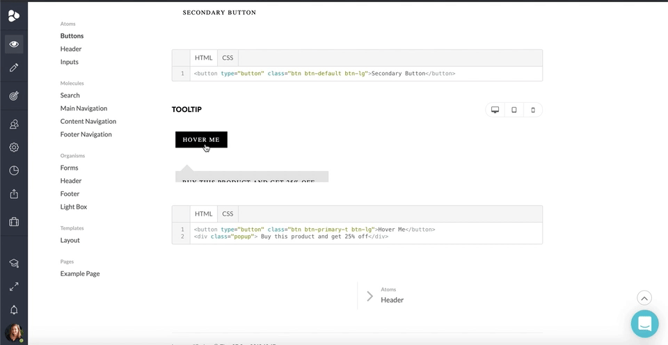
It doesn’t end there either; we can go on all day. If you’re into precise measurements – edit the height of the viewport space by directly typing in the pixels you wish to have, using the cogwheel settings icon on the right side of the element, in edit mode.
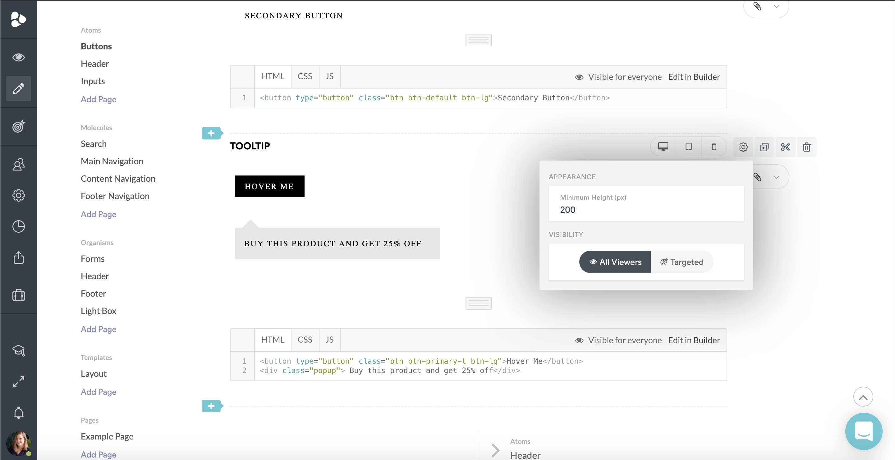
The flexibility of the Custom Height in UI Patterns allows you to present your elements in full perspective, without having to limit yourself to specific spaces. It’ll also save you time by having it done automatically for all the elements you might already have.
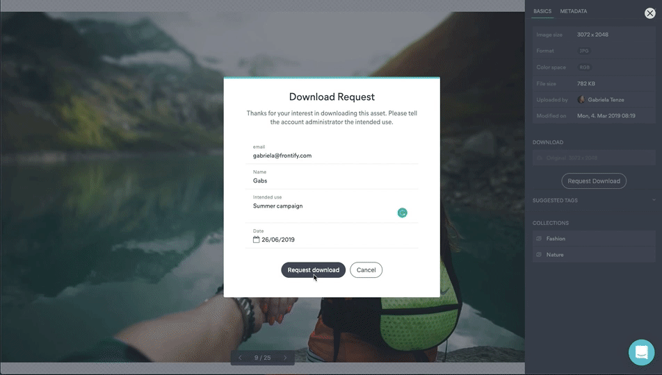
Auto Approval of Assets
In the last product update, we introduced the Custom Download Form. We have now complemented this update with the Auto Approval of Assets. The idea behind this new update is that you can create a custom download form, but if you don't necessarily have the time to approve all the requests to download an asset, you can activate the Auto Approval. This feature will automatically allow users requesting an asset to download the asset right after filling in the form. This is a particularly useful way to grant direct access to specific teams within your company – saving you the time it takes for someone to answer to each and every request.
Custom Crop & Focal Point
You can now custom crop your assets before you download them. The cropping feature is accompanied by the ability to set focal points – this will allow you to define the center of where your cropping will be.
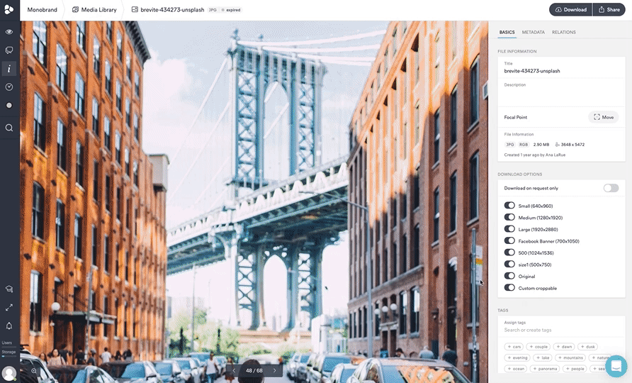
You now have the option to set custom crop dimensions, or use the predefined. This is of great importance for specific marketing campaigns, or when you want to post assets in social media – with specific measurements.
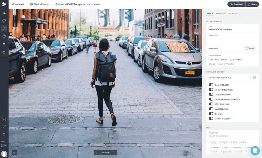
The custom crop and focal point update can be found when downloading images in the DAM and Creative Collaboration, where a viewer is available in the backend.
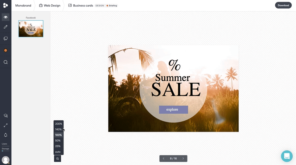
Zoom Past 100% with Creative Collaboration
For those of you with an eye for detail, we’ve incorporated the Zoom Past 100% feature in the Creative Collaboration templates and designs. Every asset in the viewer mode now has a zoom that reaches up to 100%. But in the case of templates and designs that are used in, for example, the Digital & Print Templates, the zoom has been increased to up to 200% – with a 140% interval. These templates are, in some cases, used for printing – where 140% shows the actual size, giving you an almost exact view of how the final product will look like. The actual maximum of 200%, however, would give you a more detailed view that works perfectly in case you have smaller templates, such as business cards.
In case the images surpass the view area, the image can be moved from left to right.
Custom Login Page
You now have the option to change the layout of the login page to a two-sided page with the login details on the left side of the screen, and a brand image on the right. The update comes with engaging welcome lines every time you open the page, made to lighten up your day. Have a look at how you can start customizing your login page.
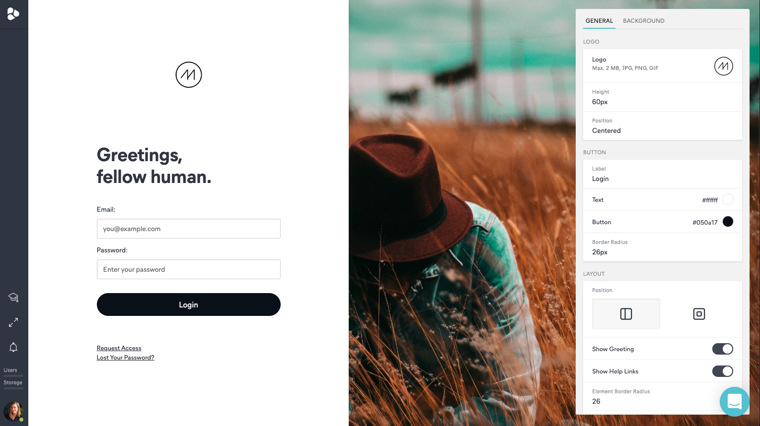
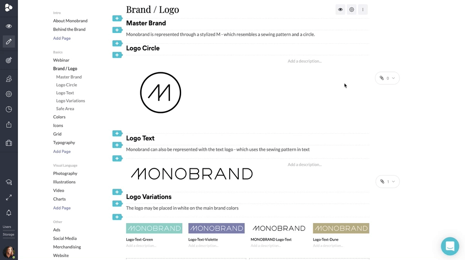
Image Alignment Block
Your Brand Guidelines images can now be aligned left, centered, or right – in case they don’t fit the page completely. This flexible way of organizing images will allow you to make proper use of the space you have. The image can be set to the left or right to enable you to include text at either side, minimizing the waste of space in-between. This versatility allows you to present organized and aesthetically pleasing guidelines. As if this is not enough, there are even more new options to edit your images in the Brand Guidelines.