

If a hungry time traveller from the 1980s spotted those familiar golden arches, they’d do a double take when they walked through the doors. And not just because of the touchscreens everywhere. While the McDonald’s logo has remained familiar, the rest of the brand has been transformed, from a family-friendly place to eat and play to a sleek, minimalist spot to grab your food and go.
How did they get from one to the other, and adapt to changing consumer habits and market needs? It was all thanks to a rebrand (well, several.)
You’re probably not rolling out a McDonald’s-scale rebrand, but it’s still a major undertaking. This playbook is designed to help companies kick-start their rebrand process and navigate the common challenges that come with it. Read on for your rebranding guide.
What is rebranding?
Rebranding is the act of updating, refreshing, or overhauling a company’s existing image, identity and positioning in the market. The process can include changing the brand’s name, logo, tagline, packaging, marketing materials, and messaging to better align with its goals and target audience.
There are two different levels of rebranding:
- A full rebrand involves a comprehensive overhaul of the company's brand identity, encompassing a new name, logo, mission statement, and overall brand strategy
- A partial rebrand is more of a refresh or light update, aimed at modernizing and polishing the existing brand identity without altering its core essence.
A full rebrand is often done to refresh a stale image, appeal to new customer segments, or move away from negative connotations. While a partial rebrand is more often done to reflect changes in the business and ensure the brand continues to reflect the company’s evolving brand identity.
A successful rebranding project aims to create a positive impact on customers and stakeholders, to increase brand awareness and loyalty, and, ultimately, to drive business growth.
7 reasons why companies rebrand
There are several triggers that can prompt organizations to consider rebranding:
- Changing customer demographics: When a company’s primary customer base changes, a rebrand ensures the brand message continues to resonate with its target audience
- Outdated brand image: Companies may be seen as old-fashioned or undesirable. A rebrand can help them shed that outdated image and reinvigorate their brand, helping to attract new customers and rekindle their relationship with their old ones
- Strengthening business identity: As companies grow the market perception of their brand may not match the reality of the business — for example established businesses may still present themselves like a scrappy startup. That’s what prompted Templafy to embark on its recent rebrand
- Entering new markets: If a company is expanding globally, entering new markets, or expanding into new categories, it may need to rebrand to meet the tastes or demands of a new audience. That’s why PORTO ROCHA helped Olympikus with its recent rebrand. Some companies do a total rebrand while others do a smaller refresh to create a regional sub-brand for different regions
- Mergers or acquisitions: When two companies merge, they need to carry out a rebrand to harmonise their shared values, goals, and aesthetics. Alternatively, if a large company acquires a smaller one, the small company may have to rebrand to adopt the identity of the larger brand
- Market shifts: Emerging market trends may mean companies need to rebrand to stay relevant. Alternatively, if new competitors are disrupting the market, a rebrand can help businesses stand out amongst the noise
- Reputational recovery: If a business has a poor reputation, a rebrand can sometimes give it a fresh start by redefining its message and values, and rethinking its core identity. However, this can backfire if consumers feel it’s a blatant attempt to deflect or dodge valid criticism.
The impact of a (good) rebrand
A good rebrand can breathe new life into a business, delivering both short- and long-term benefits.
Increased brand awareness
A rebrand typically brings a short-term spike in brand awareness, that you might see as an increase in branded search or direct visits to your company website. This is because a rebrand often comes with a lot of external communication about the new brand, putting it front of mind for your customers and others in your network.
This is just as true for large global brands as it is for smaller ones. Luxury car manufacturer Jaguar was a “brand that was largely becoming less and less relevant in today’s society,” according to managing director Rawdon Glover. When it rolled out a full rebrand in November 2024, brand awareness and attention spiked: it became “the most talked about thing on the planet for three days, in terms of what’s trending on social media.”
But if a rebrand is managed poorly — for example if it’s rolled out haphazardly or it no longer reflects the brand’s core identity — this increased awareness can feel like hostile scrutiny. Jaguar’s rebrand got everyone talking, and for them the controversy and strong reactions to its rebrand were worth it to make an impact, but other companies may not welcome such a divided reaction to a rebrand.
Enhanced competitive positioning
A modernized, cohesive, and updated brand identity can help companies stand out in a crowded market and strengthen their positioning against competitors. It also helps strengthen brands’ market position and build resilience in tough economic times: 88% of CMOs say “investing in brand-building is key to building a resilient brand during economic uncertainty.”
But if a rebrand isn’t well-received, it can actually damage your competitive position, driving customers to research alternatives to your business. You might see a spike in searches for “[brand name] alternatives” or a drop in social media followers.
Strengthened customer loyalty and trust
A successful rebrand can strengthen (or in some cases, reignite) companies’ relationships with their customers. A refreshed or completely new brand can make the company seem more relatable, authentic, or simply better-aligned with consumers’ values.
But a poorly executed rebrand can damage those customer relationships. Some may feel the brand no longer reflects their values, resulting in lost customers and lower brand engagement.
Luxury fashion retailer Burberry has ridden the downs and ups of the rebranding rollercoaster. Following a roll-out of a modern brand in 2018, Burberry rebranded again in 2023 to return to its creative roots. CEO Jonathan Akeroyd said they have “seen a higher performance in terms of brand clarity [and] an improvement in engagement with the brand” as consumers felt this repositioning was a more authentic expression of the brand’s identity.
Drive growth and innovation
A well-timed rebrand can position a company as innovative and forward-thinking. This can help future-proof the business, paving the way for expanding into new markets, launching new products and ultimately driving revenue growth.
When Wise rebranded (which included a name change from TransferWise to just Wise), it recognised that “people needed more than just money transfers”, so its old brand and name were limiting its long-term growth. Since the rebrand, it has diversified its product offering, adding multi-currency accounts and cards, and business accounts to its range.
But a poorly-executed rebrand can take peoples’ focus and attention away from business growth and innovation. If a rebrand is done for the wrong reasons (like on a whim or to deflect negative attention), it creates a lot of work internally that takes team members away from their core work.
What to consider before rebranding
A rebrand is a significant investment, both in terms of employee resource and budget. So companies should carefully consider whether a rebrand is worth the investment before they begin.
Understand the risks involved
Rebranding can be a risk for businesses for several reasons:
- Loss of brand recognition. If your rebranded design is too different from your old one, your audience might simply not recognize it and switch to competitors' products and services. This can lead to a loss of brand equity and market share.
- Alienating loyal customers. A drastic rebranding can often feel like a betrayal of the relationship that customers have with a brand – especially if the rebranding is accompanied by a shift in the market positioning.
- Website traffic setbacks. Changes to company names, product names, or domain names can significantly impact website traffic. Years of SEO work can be undone if not managed carefully during a rebrand. This can result in reduced online visibility and a drop in web traffic and leads.
- Inconsistent implementation. A rebrand is only as strong as its implementation. Inconsistencies across different touchpoints can confuse customers and dilute the new brand's impact. This often happens when the scope of the rebrand is underestimated or when there's a lack of clear guidelines and oversight.
Understand your audience
To make sure your rebrand gets a positive reception, you need to understand your audience. What do your customers love about your brand, and what do they expect from you?
Use surveys and focus groups to collect feedback about how your customers perceive the current brand. Find out what customers like and dislike, and why they choose your product over competitors. This will help you understand what’s missing from your current brand, and what needs to change, to shape and guide your rebranding efforts.
Assess employee alignment
Internal buy-in is essential to make your rebrand a success. Employees are the frontline representatives of a company, and play a crucial role in embodying and communicating the brand to customers.
Start by assessing their understanding and alignment on your current brand. Examine how employees in different departments describe your brand, values, and mission. Look for commonalities and differences between teams
If they feel disconnected from the new identity, or struggle to understand and internalize the new brand values and messaging, it can undermine the entire rebranding effort, potentially resulting in confusion for customers and a weakened market position.
Review resource allocation
A rebrand requires significant time and budget commitments. There’s a lot of work involved to develop your new brand identity, and then to update all internal and external materials to reflect that new brand.
If you handle your rebrand in-house, that’s all work for your marketing or brand team, and will limit their capacity to support on other key projects. If you outsource to an agency or other partner, that’s a significant cost and will require a lot of support and oversight from your internal team.
Calculate the expected costs of a rebrand against its anticipated ROI. You should also consider how it will affect the company’s larger strategic objectives, both positive (like a smoother launch into a new market) and negative (reduced internal capacity to work on key marketing projects).
Finding the right agency partner
Selecting the best possible partner agency is a critical step in any rebranding process. The strategists and creatives at a design agency serve as strategic allies, bringing expertise, fresh perspectives, and specialized skills that can significantly impact the success of the rebranding effort.
They can enhance and elevate a brand’s rebranding vision, providing insights and a fresh perspective that isn’t immediately apparent. Their experience can be invaluable in avoiding common pitfalls and capitalizing on opportunities that might otherwise be overlooked. And their expertise can hugely streamline the rebranding process, giving the new brand identity a home and a seamless rollout experience for stakeholders and external partners
Equip teams with the right tools
Maintaining consistency is one of the biggest challenges companies experience when they rebrand. Once you roll out the new brand you need to be confident you’re not going to find any documents still using your old logo, tagline, or messaging.
Outdated systems and asset management solutions make it hard to achieve consistency across the business. Some team members may have old logo files or collateral with your old brand saved on their local machines, and accidentally keep using them after the launch.
Investing in the right tools can streamline the rebranding process and support your teams in using the new brand. For example, a modern digital asset management system (DAM) provides a centralized repository for all brand files. And a brand management platform like Frontify provides a home for everything brand related, from online brand guidelines to collaborative templates.
Develop your rebranding strategy
Understand the strategy driving your rebrand instead of jumping straight into the creative work. Starting the rebranding process with research, analysis, and goal-setting will hugely help a brand further down the line, as it seeks to maximize the chances of a successful, smooth roll-out. Your rebranding strategy should include:
- Understanding business needs. What are the business needs driving this rebrand? Make sure you understand the expected benefits and ROI, as well as considering the potential risks involved in your rebrand.
- Setting clear and actionable goals. Having clear objectives and actionable goals can help a brand to ensure that the rebrand presents tangible business opportunities and isn’t just a vanity project.
- Conducting a brand audit. A brand audit takes a strategic look at the existing brand and its performance to identify opportunities for improvement. A comprehensive audit focuses on the three core areas of consistency, visibility, and reputation.
- Identifying the target audience. A brand’s target market will influence not only the strategy behind the new identity but also the creative direction it will take.
- Analyzing competitor positioning. Conducting in-depth competitor analysis is a great way to gain insights into the strengths and weaknesses of a brand pre- and post-rebranding. It can allow a brand to aim for distinctiveness, or market trends, depending on what the goal of the rebranding is.
The rebranding process: How to do a rebrand from start to finish
Once you’ve done some initial research and have internal alignment on your rebranding strategy, it’s time to start the rebranding process. Here’s a step-by-step guide to carrying out a company rebrand.
Conduct research and audits
Start by gathering insights about your current brand. Gather customer feedback and conduct market research to understand your positioning and competitor landscape.
Then, conduct a brand audit. Look at your current brand positioning, strengths and weaknesses. This provides crucial insights that inform the rebrand, helping you identify areas for improvement and also components to retain with significant brand equity that particularly resonate with customers.
Analyze the market to understand what trends are emerging in your industry and how customer expectations are changing. As part of this you should conduct a competitor analysis to map the competitive landscape and understand your brand position relative to your closest competition.
Develop the brand identity
The next step is high-level creative thinking where you redefine your brand identity. What are the company’s new or revised mission, vision, and values? These are the core parts of your brand identity, so once you have these worked out it will help guide and shape the rest of your rebrand.
Develop core brand elements
Develop or redesign the core elements that represent your brand. These include:
- Logos
- Color palettes
- Fonts and typography
- Taglines
- Brand voice
- Visual motifs
- Icons.
These elements should feel like they authentically connect with your new brand values and visual identity, to help create a consistent brand. Creating these assets gives you the framework for rolling out your new brand across the business.
Implement an initial review
Once you’ve got these core elements together, gather some key stakeholders to review the revised branding. A cross-functional team will bring diverse insights and perspectives on your new brand, and may spot potential issues you might not notice otherwise.
Aim to include internal stakeholders and cultural consultants in this review. This will ensure the rebrand aligns with the company’s vision, and that it’s inclusive, legally compliant, and free from unintended negative connotations.
You could conduct this review as a series of meetings, workshops, or emails. Alternatively, tools like Frontify’s brand management platform provide a central place to share feedback asynchronously. This helps to streamline approvals, and maintain consistency before launching the new brand.
Create your new brand guidelines
Your brand guidelines document the rules for how your brand should look and sound across all media and touchpoints, from social media posts to sales presentations. Make sure to update your brand guidelines to align with your new brand and send them to the key stakeholders across the business.
Use cloud-based brand guidelines in a brand management platform like Frontify to create online, centralized guidelines. These make your brand guidelines easily accessible and they update automatically, so no-one will be able to access your old brand guidelines once you update them.
Create new brand assets
Update all your core brand materials so they’re using your new brand elements. This should include:
- Website
- Apps
- Social media profiles
- Marketing materials
- Product packaging
- Sales collateral
- Email signatures
- Newsletter templates
- Listings on business directories
You may want to update everything before you roll out the rebrand, or you may prefer to make a priority list and have just the top priority items updated in advance, then work through the rest of the list in the days that follow.
Creative tools like Frontify templates help to scale-up asset creation as team members can use the same template to create multiple versions of similar assets. They also help ensure creative alignment as you can limit the areas that can be changed, to make sure team members keep using the correct logos, colors, and fonts.
Develop your brand communication plan
Create a detailed plan for rolling out your rebrand internally and externally. This is important for maintaining brand recognition and making sure employees, stakeholders, and customers are all on the same page.
Some core elements of your communication plan should include:
- Internal brand announcement
- External brand announcement, such as a news article or blog post for your website
- Press releases to announce the rebrand
- Social media posts about the rebrand
- Email newsletter to customers
- Separate email to send to your mailing list.
Share the brand internally
Share updates about the rebrand with employees and brand representatives to get them excited about the rebranding. Involving them before you announce your new brand helps them know what to expect and how to communicate with customers about the new branding.
Once your brand is ready to launch, make an internal announcement about the rebrand. Share your updated brand guidelines and make sure everyone knows not to use your old brand materials. Give employees a few small tasks to help them engage with the rebrand, like updating email signatures and sharing some social media posts.
3 successful rebranding examples
Jaguar
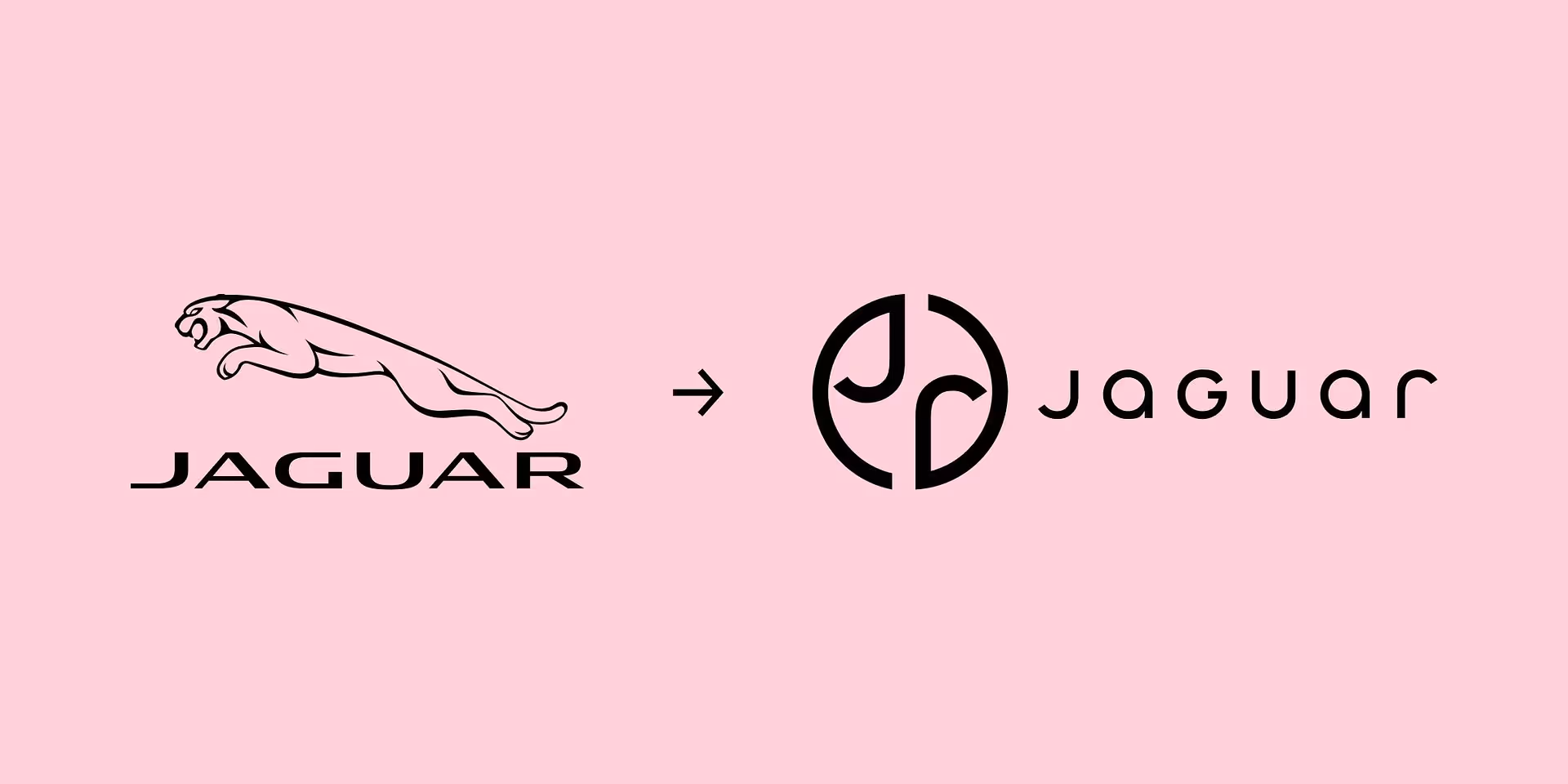
Jaguar traded its famous leaping jaguar logo for a sleek, minimalistic logo. A complete rebrand has helped the company shed its stuffy, outdated image and reposition itself as forward-thinking, modern, and desirable.
The rebrand brought a lot of discussion and controversy online as some people felt the brand was shedding its core identity. But the company needed a new look and feel to kick-start its next chapter.
Tupperware

Tupperware has rebranded to appeal to a new, younger audience. The brand had a reputation for being old-fashioned (think Tupperware parties of the ‘70s and ‘80s), and was struggling to connect with the next generations of consumers.
The new branding is bright, dynamic, and vibrant — more likely to stand out and catch the eye of consumers in-store or scrolling social media feeds.
Lloyds Banking Group

Lloyds Banking Group rebranded, keeping much-loved elements of its old brand but giving it a sleek, modern look.
The brand refresh kept some familiar branding elements like the black horse that has been a staple in its adverts and other marketing for many years. But it has been refreshed with a new logo, color palette, and visual style to modernize the brand.
Is it time for a company rebrand?
Rebranding is a serious investment, but it can make a huge impact on your business. If you’re weighing up whether a rebrand is the right move for your business, consider the following:
- Missed connections: Does your current brand struggle to appeal to your target audience?
- Mixed messages: Does your current brand no longer reflect your company’s core values, mission, or purpose?
- Market missteps: Is your brand falling behind in marketing relevance or losing market share to emerging competitors?
- Competitor confusion: Is it difficult to differentiate your brand from other players in your market?
- Operational overwhelm: Do teams struggle to achieve brand consistency across teams and departments, leading to poor brand recognition and recall?
If these pain points sound familiar, it might be worth considering if it’s time for a rebrand. Whether you handle your rebrand internally or work with an agency partner, the right tools can help the rebranding process run smoothly.
A brand management platform like Frontify has helped global companies like Kia and Brenntag roll out major rebrands, giving them a central space to organize, collaborate, and communicate their brand. See how Frontify could help you: request a demo today.