
Building a Typeform Content Block
With Frontify's new Brand SDK for Content Blocks, you can create your own blocks for our Brand Guidelines.
In this quick guide, you'll learn how to create a Typeform block that uses most of our Content Block features.
Prerequisites
Before starting, you should get access to the general Content Block documentation to get a rough overview of how Content Blocks work. If you're at it, check out the Typeform React Embed Library as well 🙂
You need to have Node >=14 installed, and a basic understanding of TypeScript would be good, too.
Frontify-CLI
One of the main features of Content Blocks is our frontify-cli tool. You can install it globally if you want:
$ npm install -g @frontify/frontify-cli
# Or
$ yarn global add @frontify/frontify-cli
Another way to use the tool would be to use npx @frontify/frontify-cli instead. Just replace the frontify-cli calls with npx @frontify/frontify-cli.
Scaffold a new Content Block
Once the frontify-cli tool is installed, we can use it to scaffold our Typeform block:
$ frontify-cli block create typeform_block
If everything worked out, you should have a new folder looking something like this:
.
├── README.md
├── cssModule.d.ts
├── manifest.json
├── package-lock.json
├── package.json
├── postcss.config.js
├── renovate.json
├── src
│   ├── index.tsx
│   ├── settings.ts
│   └── style.module.css
└── tsconfig.json
To finish the installation, we need to install all the npm packages:
$ cd typeform_block
$ npm ci
Test our new block
Let's test-run our new Content Block to see if everything is working as expected.
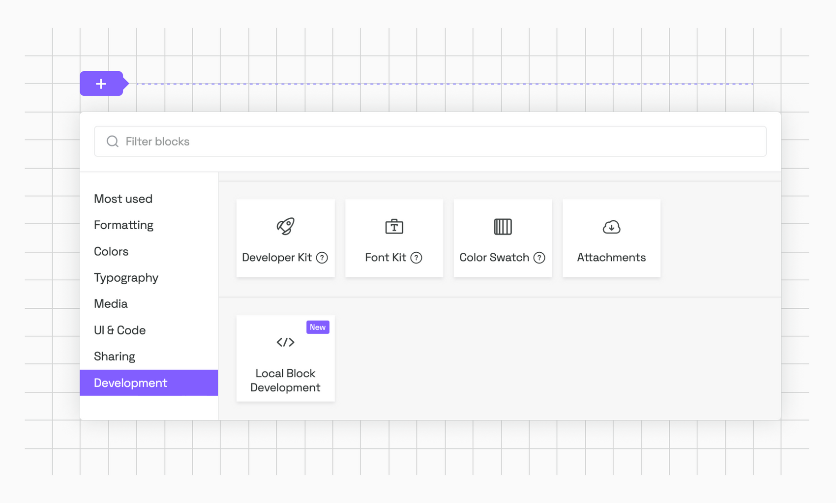
Local Block Development block
For our block to be displayed in our Guidelines, we need to add a "Local Block Development" block:

You should now see something like this:

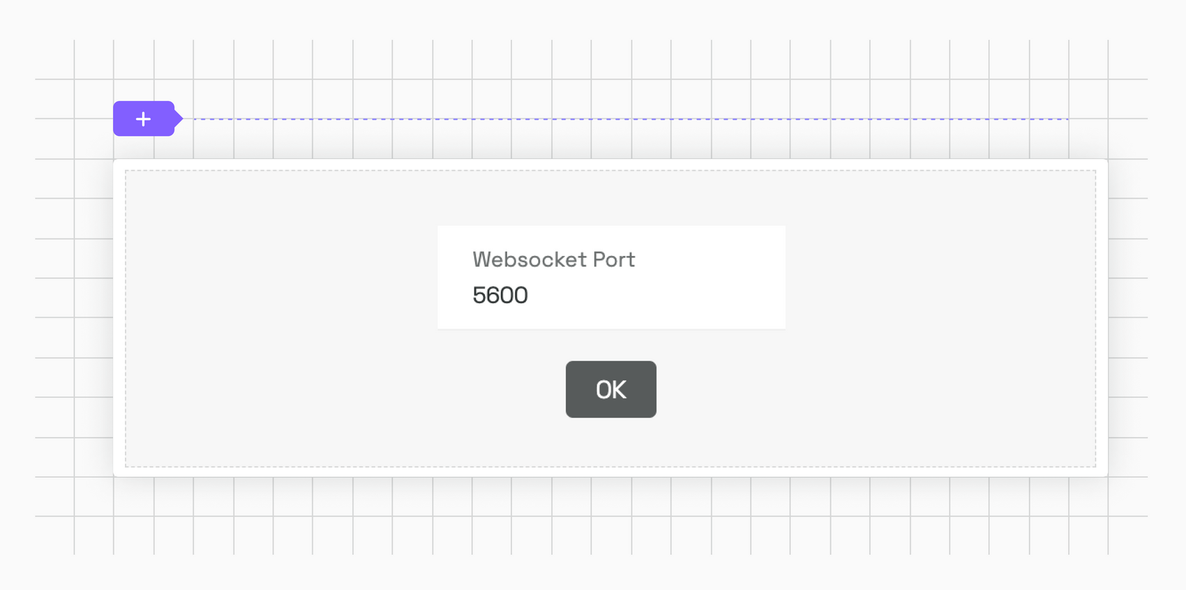
The block itself doesn't need much configuration besides the WebSocket port, which you can leave at 5600.
Running the watch task
In our project, we can now run the serve task to connect the development environment with our Guidelines:
$ npm run serve
Assuming that this worked, you’ll get a notification that the task is listening on port 5600:
     ______               _   _  __
    |  ____|             | | (_)/ _|
    | |__ _ __ ___  _ __ | |_ _| |_ _   _
    |  __| '__/ _ | '_ | __| |  _| | | |
    | |  | | | (_) | | | | |_| | | | |_| |
    |_|  |_|  ___/|_| |_|__|_|_|  __, |
                                     __/ |
                                    |___/

[14:53:58] Starting the development server...
[14:53:58] Development server is listening on port 5600!
. . .
And the Guidelines should now show the contents of our block:

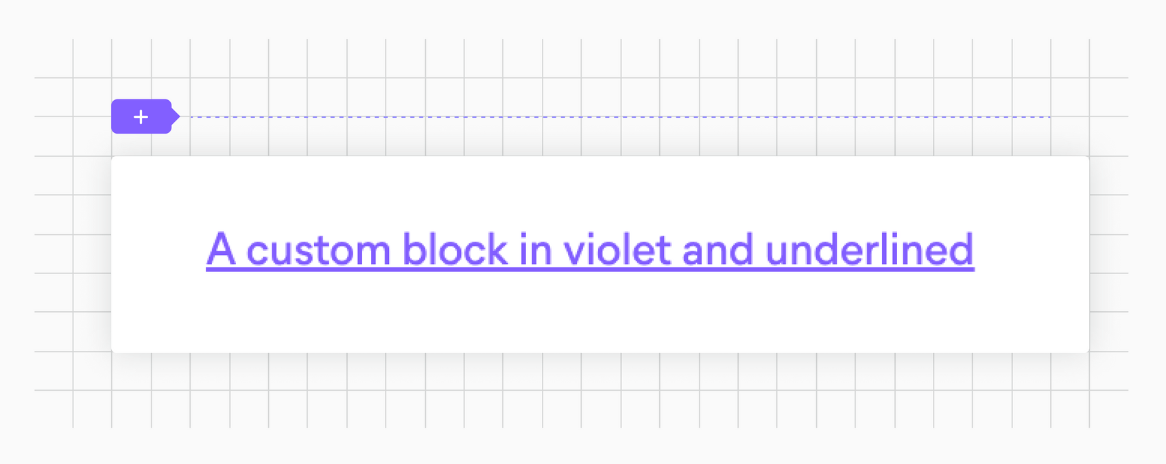
If you don't see the violet message, try refreshing the page.
Adding the Typeform Library
Typeform offers multiple ways to embed their forms in our projects. But since the Content Blocks use React, we're going to use the Typeform React Embed Library:
$ npm install @typeform/embed-react --save
Preparing the index.tsx file
Now that we have everything ready for our Typeform block, we need to set up the part of our block that gets rendered in the Guidelines. For this, we modify the index.ts file in the src/ directory:
import { ReactElement } from 'react';
import { Widget, PopupButton, SliderButton } from '@typeform/embed-react';
import { AppBridgeNative, useBlockSettings, useEditorState } from '@frontify/app-bridge';
import styles from './style.module.css';

type Props = {
    appBridge: AppBridgeNative;
};

type Settings = {
    'embed-style': string;
    'form-id': string;
    isHeightCustom: boolean;
    heightCustom: string;
    heightSimple: string;
    buttonText: string;
};

const Placeholder = (): ReactElement => (
    <div>
        <p className={styles.placeholder}>Please enter a Typeform form id in the block settings.</p>
    </div>
);

export default function TypeformBlock({ appBridge }: Props): ReactElement {
    const isEditing = useEditorState();
    const [blockSettings] = useBlockSettings<Settings>(appBridge);

    if (!blockSettings['form-id']) {
        return <Placeholder />;
    }

    const renderEmbed = () => {
        switch (blockSettings['embed-style']) {
            case 'standard':
                return (
                    <Widget
                        style={{
                            height: blockSettings.isHeightCustom
                                ? blockSettings.heightCustom
                                : blockSettings.heightSimple,
                        }}
                        id={blockSettings['form-id']}
                        enableSandbox={!isEditing}
                    />
                );

            case 'popupButton':
                return (
                    <PopupButton
                        size={100}
                        opacity={100}
                        className="tw-outline-none tw-relative tw-flex tw-items-center tw-justify-center tw-border-0 tw-rounded tw-cursor-pointer tw-font-sans tw-transition-colors tw-px-4 tw-h-9 tw-text-s tw-text-white tw-bg-black-90 hover:tw-bg-black-100 active:tw-bg-black-superdark dark:tw-text-black dark:tw-bg-white dark:hover:tw-bg-black-10 dark:active:tw-bg-black-20"
                        id={blockSettings['form-id']}
                        enableSandbox={!isEditing}
                    >
                        {blockSettings.buttonText}
                    </PopupButton>
                );

            case 'sliderButton':
                return (
                    <SliderButton
                        className="tw-outline-none tw-relative tw-flex tw-items-center tw-justify-center tw-border-0 tw-rounded tw-cursor-pointer tw-font-sans tw-transition-colors tw-px-4 tw-h-9 tw-text-s tw-text-white tw-bg-black-90 hover:tw-bg-black-100 active:tw-bg-black-superdark dark:tw-text-black dark:tw-bg-white dark:hover:tw-bg-black-10 dark:active:tw-bg-black-20"
                        id={blockSettings['form-id']}
                        enableSandbox={!isEditing}
                    >
                        {blockSettings.buttonText}
                    </SliderButton>
                );

            default:
                return <Placeholder />;
        }
    };

    return <div className={styles.container}>{renderEmbed()}</div>;
}
Let’s talk about the contents of this file. First, we import all the necessary bindings we need for the presentational part of the block:
import { ReactElement } from 'react';
import { Widget, PopupButton, SliderButton } from '@typeform/embed-react';
import { AppBridgeNative, useBlockSettings, useEditorState } from '@frontify/app-bridge';
import styles from './style.module.css';
We'll be using the Widget, PopupButton, SliderButton, and Sidetab components from the Typekit library. Besides that, we need to include the Frontify App Bridge to enable communication between the presentational part of the block and its settings. And lastly, we import some CSS, let's create that file right now, in the src/ directory:
.placeholder {
    color: #ddd;
}

.container {
    overflow: hidden;
}
Next, we define some types we’re going to need for the block:
type Props = {
    appBridge: AppBridgeNative;
};

type Settings = {
    'embed-style': string;
    'form-id': string;
    isHeightCustom: boolean;
    heightCustom: string;
    heightSimple: string;
    buttonText: string;
};
This is not strictly necessary, but since we're using TypeScript, it makes sense to have everything properly typed.
Because we have an initial state, we need to prepare a React element to render in those cases:
const Placeholder = (): ReactElement => (
    <div>
        <p className={styles.placeholder}>Please enter a Typeform form id in the block settings.</p>
    </div>
);
Now we’re getting to the exciting part, the main component:
export default function TypeformBlock({ appBridge }: Props): ReactElement {
    const isEditing = useEditorState();
    const [blockSettings] = useBlockSettings<Settings>(appBridge);
Here, we're defining the block itself that we're going to export. We're using the useEditorState() hook and as well the blockSettings, which we'll be using to handle the edit-state of the block and to pull in the settings for the block itself.
if (!blockSettings['form-id']) {
    return <Placeholder />;
}
In case we haven't set a form-id in the settings, we want to render the <Placeholder /> component defined before in the file. Keep in mind that we haven't set up any settings yet. So the form-id will always be undefined.
Finally, we render the actual Typeform components, depending on what has been set up through the settings:
const renderEmbed = () => {
        switch (blockSettings['embed-style']) {
            case 'standard':
                return (
                    <Widget
                        style={{
                            height: blockSettings.isHeightCustom
                                ? blockSettings.heightCustom
                                : blockSettings.heightSimple,
                        }}
                        id={blockSettings['form-id']}
                        enableSandbox={!isEditing}
                    />
                );

            case 'popupButton':
                return (
                    <PopupButton
                        size={100}
                        opacity={100}
                        className="tw-outline-none tw-relative tw-flex tw-items-center tw-justify-center tw-border-0 tw-rounded tw-cursor-pointer tw-font-sans tw-transition-colors tw-px-4 tw-h-9 tw-text-s tw-text-white tw-bg-black-90 hover:tw-bg-black-100 active:tw-bg-black-superdark dark:tw-text-black dark:tw-bg-white dark:hover:tw-bg-black-10 dark:active:tw-bg-black-20"
                        id={blockSettings['form-id']}
                        enableSandbox={!isEditing}
                    >
                        {blockSettings.buttonText}
                    </PopupButton>
                );

            case 'sliderButton':
                return (
                    <SliderButton
                        className="tw-outline-none tw-relative tw-flex tw-items-center tw-justify-center tw-border-0 tw-rounded tw-cursor-pointer tw-font-sans tw-transition-colors tw-px-4 tw-h-9 tw-text-s tw-text-white tw-bg-black-90 hover:tw-bg-black-100 active:tw-bg-black-superdark dark:tw-text-black dark:tw-bg-white dark:hover:tw-bg-black-10 dark:active:tw-bg-black-20"
                        id={blockSettings['form-id']}
                        enableSandbox={!isEditing}
                    >
                        {blockSettings.buttonText}
                    </SliderButton>
                );

            default:
                return <Placeholder />;
        }
    };

    return <div className={styles.container}>{renderEmbed()}</div>;
The different components are pretty self-explanatory. We populate the different properties through the blockSettings object that we instantiated at the beginning of our component. Here's where we use the isEditing variable again to set the enableSandbox property on the Typeform components (to disable tracking while we're editing the block).
If the user has not set up the block yet, we default to the <Placeholder /> element.
Now that we set up the presentational part of the block we can run the npm run serve command again and should see the before mentioned placeholder.
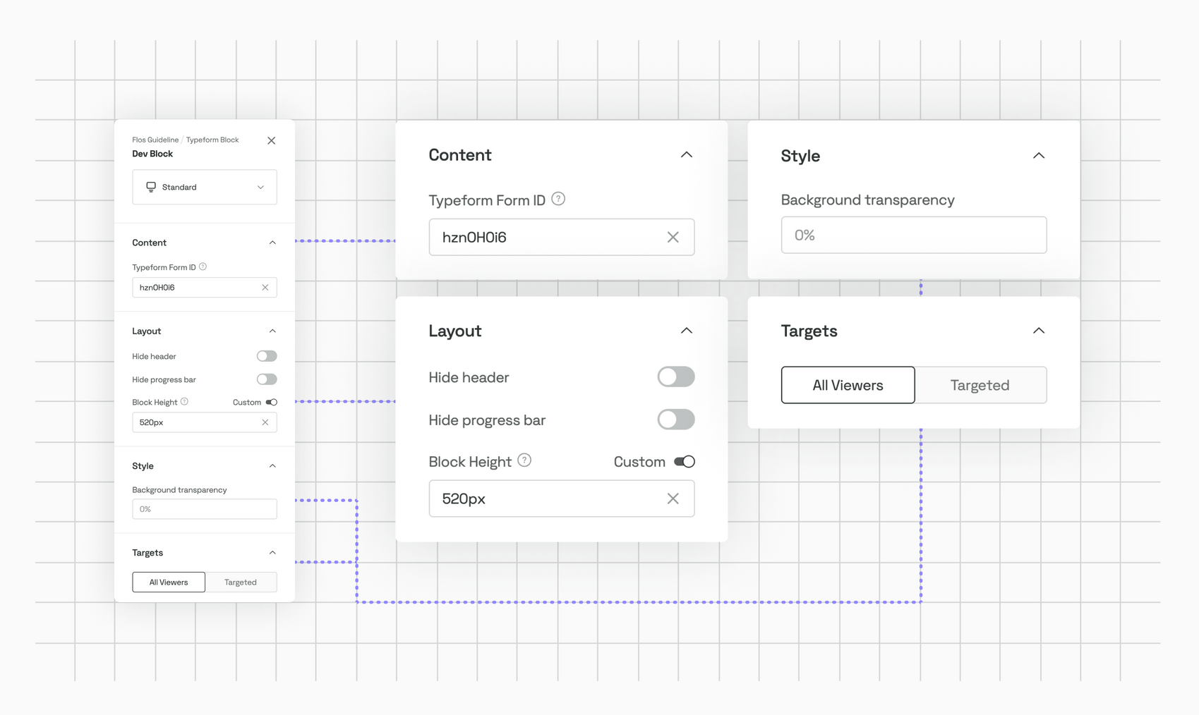
The settings.ts file
Let's do the same thing we did with the index.ts file for the settings.ts file:
import { IconEnum, DropdownSize } from '@frontify/arcade';
import { BlockHeight } from './types';
import { BlockSettings } from '@frontify/guideline-blocks-settings';

const HEIGHT_DEFAULT_VALUE = BlockHeight.Small;

const settings: BlockSettings = {
    main: [
        {
            id: 'embed-style',
            type: 'dropdown',
            defaultValue: 'standard',
            size: DropdownSize.Large,
            choices: [
                {
                    value: 'standard',
                    icon: IconEnum.FigureTextBottom,
                    label: 'Standard',
                },
                {
                    value: 'popupButton',
                    icon: IconEnum.Button,
                    label: 'Popup Button',
                },
                {
                    value: 'sliderButton',
                    icon: IconEnum.Button,
                    label: 'Slider Button',
                },
            ]
        }
    ],
    content: [
        {
            id: 'form-id',
            type: 'input',
            label: 'Typeform Form ID',
            info: 'You can find <form-id> from the public URL of your form: https://form.typeform.com/to/<form-id>',
        },
        {
            id: 'buttonText',
            label: 'Button Label',
            type: 'input',
            placeholder: 'Open',
            defaultValue: 'Open',
            show: (bundle: any): boolean => ['popupButton', 'sliderButton'].includes(bundle.getBlock('embed-style')?.value)
        }
    ],
    layout: [
        {
            id: 'hideHeader',
            type: 'switch',
            label: 'Hide header',
            defaultValue: false,
        },
        {
            id: 'hideProgressBar',
            type: 'switch',
            label: 'Hide progress bar',
            defaultValue: false,
        },
        {
            id: 'isHeightCustom',
            type: 'switch',
            label: 'Block Height',
            switchLabel: 'Custom',
            defaultValue: false,
            show: (bundle: any): boolean => bundle.getBlock('embed-style')?.value === 'standard',
            info: 'Determines the block height.',
            on: [
                {
                    id: 'heightCustom',
                    type: 'input',
                    placeholder: '100px',
                    rules: [
                        {
                            errorMessage: "Please use a numerical value with or without 'px'",
                            validate: (value: string) => value.match(/^(?:-?\d+)(?:px)?$/g) !== null,
                        }
                    ],
                    onChange: (bundle: any): void => {
                        const blockHeight = Number(bundle.getBlock('heightCustom')?.value);

                        if (!Number.isNaN(blockHeight)) {
                            bundle.setBlockValue('heightCustom', `${blockHeight}px`);
                        }
                    },
                },
            ],
            off: [
                {
                    id: 'heightSimple',
                    type: 'slider',
                    defaultValue: HEIGHT_DEFAULT_VALUE,
                    choices: [
                        {
                            value: BlockHeight.Small,
                            label: 'S',
                        },
                        {
                            value: BlockHeight.Medium,
                            label: 'M',
                        },
                        {
                            value: BlockHeight.Large,
                            label: 'L',
                        },
                    ],
                },
            ],
        },
    ],
    style: [
        {
            id: 'opacity',
            label: 'Background transparency',
            type: 'input',
            placeholder: '0%',
            show: (bundle: any): boolean => bundle.getBlock('embed-style')?.value === 'standard',
            rules: [
                {
                    errorMessage: "Please use a numerical value with or without '%'",
                    validate: (value: string) => value.match(/^(?:-?\d+)(?:%)?$/g) !== null,
                }
            ],
            onChange: (bundle: any): void => {
                const blockOpacity = Number(bundle.getBlock('opacity')?.value);

                if (!Number.isNaN(blockOpacity)) {
                    bundle.setBlockValue('heightCustom', `${blockOpacity}%`);
                }
            },
        }
    ]
};

export default settings;
Like with the index.ts file, we’re importing all the necessary bindings:
import { IconEnum, DropdownSize } from '@frontify/arcade';
import { BlockHeight } from './types';
import { BlockSettings } from '@frontify/guideline-blocks-settings';
Let’s create the needed types.ts file:
export enum BlockHeight {
    Small = '360px',
    Medium = '600px',
    Large = '960px',
}
In this file, we're exporting the block-heights we'll need for the settings.
The settings are split up in several different sections, which mirror the sections we have available in the Guidelines:
const settings: BlockSettings = {
    main: [. . .],
    content: [. . .],
    layout: [. . .],
    style: [. . .]
};
For more instructions on how to use the different sections and for what use-cases they might fit, check out the in-depth documentation.
In our case, we use the main section for the way we’re going to display the Typeform component:
main: [
    {
        id: 'embed-style',
        type: 'dropdown',
        defaultValue: 'standard',
        size: DropdownSize.Large,
        choices: [
            {
                value: 'standard',
                icon: IconEnum.FigureTextBottom,
                label: 'Standard',
            },
            {
                value: 'popupButton',
                icon: IconEnum.Button,
                label: 'Popup Button',
            },
            {
                value: 'sliderButton',
                icon: IconEnum.Button,
                label: 'Slider Button',
            },
        ]
    }
],
For size and icon, we're using the imported enums, so we don't have to worry if they change in the future.
The content section is pretty basic, except for the show property on the second item:
content: [
        {
            id: 'form-id',
            type: 'input',
            label: 'Typeform Form ID',
            info: 'You can find <form-id> from the public URL of your form: https://form.typeform.com/to/<form-id>',
        },
        {
            id: 'buttonText',
            label: 'Button Label',
            type: 'input',
            placeholder: 'Open',
            defaultValue: 'Open',
            show: (bundle: any): boolean => ['popupButton', 'sliderButton'].includes(bundle.getBlock('embed-style')?.value)
        }
    ],
The show property determines if a setting item will be displayed. In this case, we'll only display the Button Label setting if the user chose the popupButton or the sliderButton version of the Typeform integration in the main section.
The layout section is a little bit more complex because it contains a switch setting:
layout: [
    {
        id: 'hideHeader',
        type: 'switch',
        label: 'Hide header',
        defaultValue: false,
    },
    {
        id: 'hideProgressBar',
        type: 'switch',
        label: 'Hide progress bar',
        defaultValue: false,
    },
    {
        id: 'isHeightCustom',
        type: 'switch',
        label: 'Block Height',
        switchLabel: 'Custom',
        defaultValue: false,
        show: (bundle: any): boolean => bundle.getBlock('embed-style')?.value === 'standard',
        info: 'Determines the block height.',
        on: [
            {
                id: 'heightCustom',
                type: 'input',
                placeholder: '100px',
                rules: [
                    {
                        errorMessage: "Please use a numerical value with or without 'px'",
                        validate: (value: string) => value.match(/^(?:-?\d+)(?:px)?$/g) !== null,
                    }
                ],
                onChange: (bundle: any): void => {
                    const blockHeight = Number(bundle.getBlock('heightCustom')?.value);

                    if (!Number.isNaN(blockHeight)) {
                        bundle.setBlockValue('heightCustom', `${blockHeight}px`);
                    }
                },
            },
        ],
        off: [
            {
                id: 'heightSimple',
                type: 'slider',
                defaultValue: HEIGHT_DEFAULT_VALUE,
                choices: [
                    {
                        value: BlockHeight.Small,
                        label: 'S',
                    },
                    {
                        value: BlockHeight.Medium,
                        label: 'M',
                    },
                    {
                        value: BlockHeight.Large,
                        label: 'L',
                    },
                ],
            },
        ],
    },
],
If you have a look at isHeightCustom, you'll see that we use the on and off properties. You can think of them as nested settings that will be displayed depending on the state of the switch setting. The documentation explains that behavior pretty well.
The last setting is the style part:
style: [
    {
        id: 'opacity',
        label: 'Background transparency',
        type: 'input',
        placeholder: '0%',
        show: (bundle: any): boolean => bundle.getBlock('embed-style')?.value === 'standard',
        rules: [
            {
                errorMessage: "Please use a numerical value with or without '%'",
                validate: (value: string) => value.match(/^(?:-?\d+)(?:%)?$/g) !== null,
            }
        ],
        onChange: (bundle: any): void => {
            const blockOpacity = Number(bundle.getBlock('opacity')?.value);

            if (!Number.isNaN(blockOpacity)) {
                bundle.setBlockValue('heightCustom', `${blockOpacity}%`);
            }
        },
    }
]
Here we use a custom rule to make sure the entered value is a numerical one (since we'll use that value for transparency).
And that's basically it. Let's run npm run serve again and open the settings for our block:

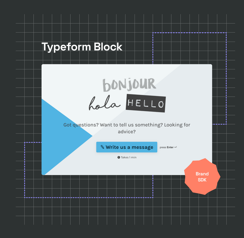
If you use GKcYunMz as the Form ID, you should see the Typeform form getting loaded in the Guide Lines:

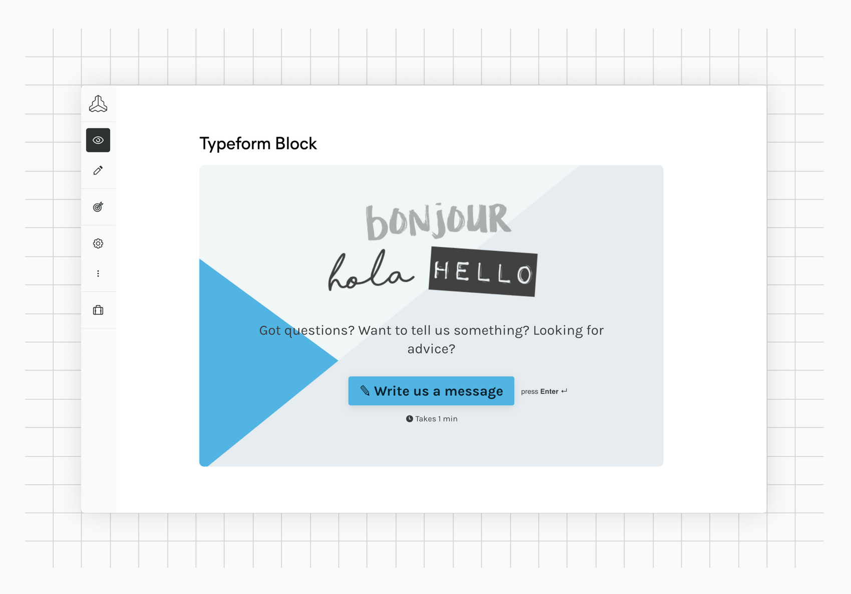
And that's it. Congrats for making it this far 🙂
While we know that this tutorial is not very in-depth, it should give you an idea of how a basic block is built. We're constantly working on extending and improving our documentation. So if you have feedback, please get back to us!

