

Taming the Newsroom With Style Guides
From the days of Julius Caesar to today, media outlets have been taming the newsroom with style guides. Consistency is of vital importance for all creative work, not just in newsrooms. The way your design looks when it is applied to the real world has a direct bearing on the perception of your brand's quality.
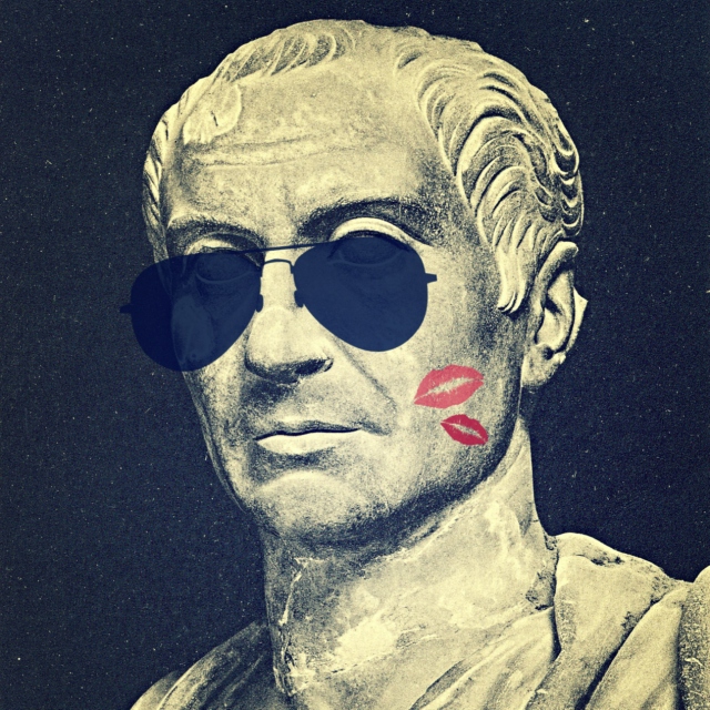
The first newspaper hit the streets with the bang of a hammer in 59 BC.
Invented by the Roman Emperor, Julius Caesar, the role of his daily journal was to rally the empire with news of Rome. He published under the banner, Acta Diurna (‘Publicize and Propagate”) with news, local gossip and events, and even gladiatorial sports reports. On papyrus and hand written by numerous scribes, Caesar’s journal was hammered onto posts in public places everywhere.
Caesar was the first dictatorial editor, and his newspaper’s style guide was formed by his personal use of the language and his beliefs. Just like every style guide ever written, it was the editor’s call. What was said, how it was said, the tone of voice, the social purpose of the publication - everything was under his control.
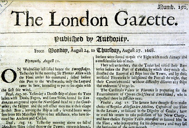
Let’s skip down the timeline of newspaper history to the 1650s when the English press started publishing newspapers and periodicals in earnest. The first US newspaper was published a little later, on September 25th,1690 in Boston, Massachusetts. Edited by an enterprising fellow, Benjamin Harris, the first edition contained three printed pages and one blank one.
As yet, there were still no formal style guides.
Ink In Your Veins
The story of the modern newsroom style guide starts in the crusty, formative newspaper editorial departments of the 20th century.
In the early days, up until offset printing in the mid-1980s, massive presses rumbled beneath the editorial floor with the steady beat of the afternoon edition, giving a sense of subtle doom to the fast approaching late-night deadline for the morning paper. Today, the deadline is 24/7. ‘What is a deadline, you may ask?’ Unless you still work in a daily newspaper you probably don't have one.
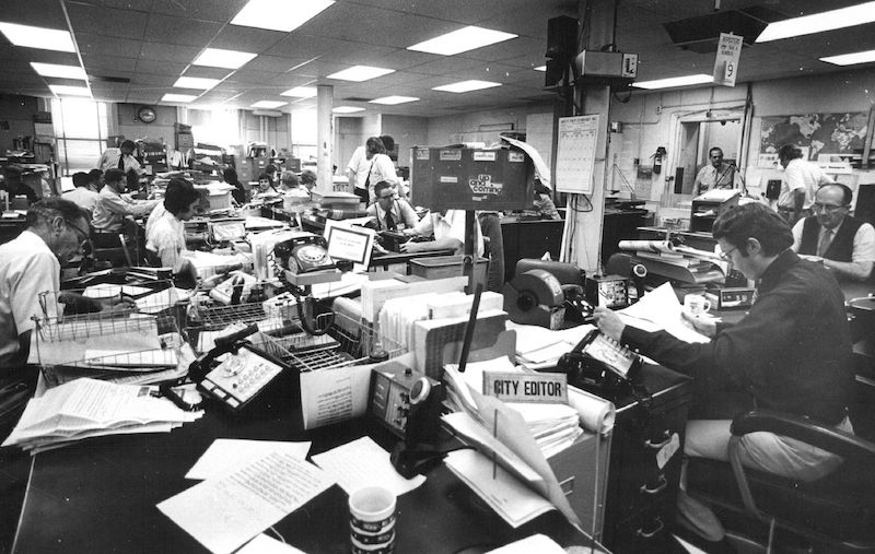
In those bygone days of news reporting -- we’re talking up until to the very late 1990s -- the chairs were not ergonomic, and the entire place seemed a little cluttered. Desks were piled high with old newspapers. Noisy mechanical typewriters created a racket, while staffers bellowed into bulky black Bakelite telephones with short cords anchoring them to their metal desks, and cigarette smoke filled every corner of the room.
These newsrooms of old were crowded with journos beavering away at stories, frantic sub-editors writing snappy headlines, teletype machines clacking away, copyboys running here, there and everywhere to post stories and do odd jobs.
At the center of all this organized chaos was the chief himself, the editor -- the most senior person on the floor, who spoke like an oracle on editorial policy down to the use of a capital letter. His dictates were followed and closely guarded by the militia of proof-readers who poured over long galley proofs in their tiny cubicles in another part of the building.
These days we can wander around on our mobile phones, write our copy in the park with two thumbs if we want and post it in an instant. The phone’s writing software even has spelling and grammar checking on the go.
Rules Were Not Meant to be Broken
There have been rudimentary style guides since the early days, but by the mid- 20th century, the style guide had matured.
It now came in a printed book with all manner of quirky language rules. Each one of these style guides was a standalone piece, and there were many discrepancies in the use of language to be found from one newsroom to another. Take the word ‘percent' as an example, it can be written as ‘percent,' ‘per cent’ or ‘%.', whatever the fancy of the editor. No matter which usage, format or social slant the editor chose, every journalist and sub-editor had to conform.
Compiling these style guides was a laborious task, but critical to a publication’s credibility. Poor, incorrect English would be frowned upon, and some stories were far too lewd to publish.
Standards needed to be set, and they were.
Standby – You’re On the Air
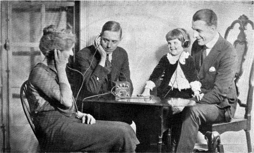
On August 21, 1920, at a small radio station in Detroit an announcer said something like; ‘… and now for the news.’
That station, now on call sign ‘WJJ’ was the initiative of a visionary newspaperman, and had the first dedicated radio newsroom staff, and a new set of rules was suddenly necessary because the newspaper’s style guide did not apply. Instead of long articles with all the relevant details, news clips had to be written in short, sharp bursts of information.
Nothing could be recorded, and the whole exercise was live to air. Radio communication required audio cues instead of layout. Spelling no longer mattered, and punctuation became the most important element of the style so that the news reader could make sense of the copy, reading it on the run.
In the mid-1940’s the advent of TV newsrooms presented yet another challenge for those broadcasting the news – this time in moving pictures and audio so every station or network of stations gave birth to a new on-air style guide with specifications for graphics and clear principles for the tone of voice.

Massaging the Medium
Each type of media had its own requirements. The language and the visual aspects of newspapers demanded a defined set of rules and an ordered way of making sure that every aspect of the journalism and print layout conformed to rigid standards. For radio, another set of criteria was needed for the spoken word, and for TV a whole range of newly developing rules for on-air graphics and style of writing were devised.
Reports in all media were written in active voice so as to be punchy and sharp. The use of language, typography and images along with the social standpoint of the owner and editor were defined in the printed style guide so consistency was maintained and the news was written and presented in the same style every day.
The Wall Street Journal, for instance, only started using photographs regularly less than a decade ago; before that, they published with pointillist style portraits that printed clearly and were easy to manufacture as striking single-tone images. It was the WSJ style.
The Guardian newspaper now lets through four letters words. Just because it is more liberal in its views, it is not lax in sticking rigidly to its own comprehensive style guide.
Perhaps the most valued and widely used newsroom style guide comes from Associated Press (AP). Although the company was already breaking news in 1846, it issued its first style guide in 1953. The AP style guide now runs to over 600 pages and grows with new words and rules for language usage every year, e.g. Google is now a verb but should be written with a capital letter, as in ‘Just Google it.’
Other gems include:
The abbreviations for all US states, like ‘Wyo.’, ‘Colo.’, and particular favorite, ‘lll’ for Illinois. Use noon or midnight, never 12 a.m. Write out the numbers one through nine and use numerals for numbers 10 and higher. Percent for AP, % for the WSJ. (Just to clear that up.) Double quotation marks around any titles from movies, books, TV shows and works of art, like the “Mona Lisa” or “The Simpsons.”
If you want to have the AP style guide by your side or embedded into your writing software, you will have to pay for it, and handsomely, because it is a treasured resource.
In the UK there are 5 media outlets with their own style guides, the BBC News, The Economist magazine, The Guardian, The Telegraph, and of course, The Times. Take the time to look at a few of these, they are fascinating.
In the USA there are now only 3 or 4 in regular use for a shrinking number of printed publications – AP and The New York Times are for sale, but the WSJ is online.
Change is rampant, the AP Stylebook is revised annually. Others are up to their 16th edition and still changing by the day and month.
The Style War On the Web
The broad church of style guides remains alive in today’s Internet world where online news channels all have nuances in tone, attitude and grammatical usage. Some are formal, down to a ‘dot and tittle’ following the AP guide, others use a much more informal style and writing in the vernacular, the way people speak today.
With mobile messaging shorthand, acronyms like ROTFLOL entering the written language, and words that used to mean one thing now mean something entirely different, like ‘sick,' which no longer just means ‘unwell,’ but refers to something being great.
The Chicago Manual of Style and the Yahoo Style Guide are new additions and are aimed at writers working in the digital age; the Chicago manual even has a searchable Q&A service, so a writer is never stuck.
DIY Style Guide
Consistency is of vital importance for all creative work, not just in newsrooms. After all, the way your design looks when it is applied to the real world has a direct bearing on the perception of your client’s brand quality.
Your style guide doesn't have to be 600 pages, but a clear guide can now easily be accessible to everyone involved, Do it online with Frontify. There is no need for printing or PDFs anymore, and being online, access to any updates are available instantly. An online guide also makes creating a style guide more efficient, because stakeholders like the Creative Director and the client's marketing team can give real time comments and approvals as the process unfolds.
Nowadays, you can create your own Style Guide online and easily control your own written content and design work using specific language usage, fonts, layout specs, the tone of voice and value and quality standards and change them as you and the world move forward.

