
7 Designers Share Their Favorite Fonts
Modernism changed the way we use typefaces today. Posters of the 19th century once used every square inch of whitespace; a rather elaborate approach to design. It often cluttered the page making them almost illegible. Today, however, the focus has drastically changed. “Less is more”, and designers favour clean, simple designs which includes a ton of whitespace with focus on simple fonts.
There’s nothing more exciting than choosing a font for a new website, mobile app or other digital product. And so, we have listed the go-to fonts of some of the top-rated and award-winning designers (some of whom use Frontify for their work). Check them out below to see how you can use them for you next project.
1. Articulat CF
Designer: Tyler Finck
I’m proud to say that I’ve been strictly freelance for over a year now. Half of my business is creating typefaces that I want to make, and selling them on my website – which is a mix of working for myself and other designers or font buyers. The other half is a diverse mix of clients. Over the past year, I’ve completed work for BBMG, ImageThink, Chronicle Books, The Planetary Society, a local running company, and a makerspace.
My work has been featured on many websites’ “top free fonts” lists, and my spoof Kanye West typeface received quite a bit of press. But President Obama’s use of Ostrich Sans in two tweets is better than any award.
I’ve been loving (and using) Articulat CF by Connary Fagen. I implemented it on my site as the body copy workhorse, which has been working incredibly well. It’s a great alternative to overused Swiss-style sans-serif typefaces, and I love supporting a fellow independent type creator.
2. Brandon Grotesque
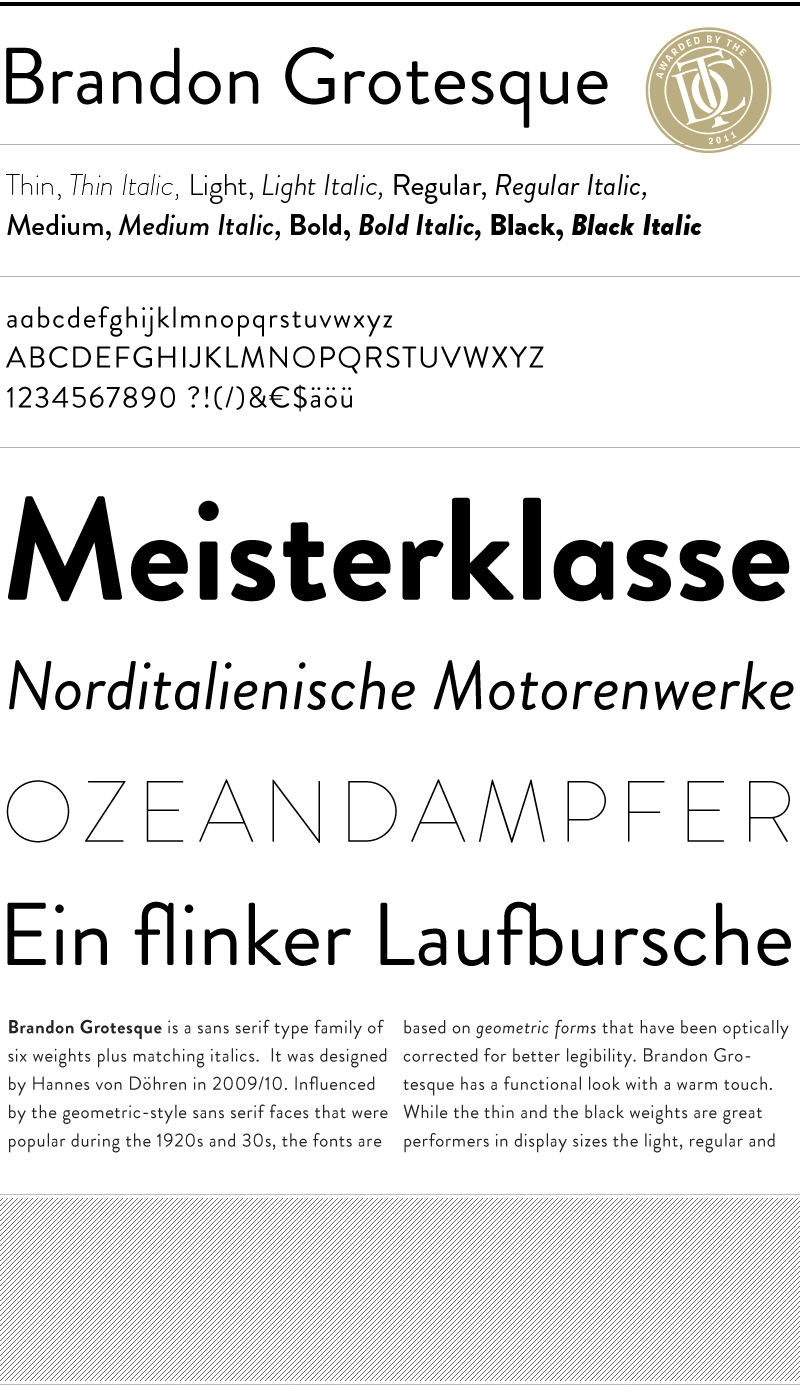
Designer: Ashley Farrand
I freelance, but I do work for a few firms and marketing agencies. Recently I've been working with government organizations like Choose Folsom and Visit Folsom, but I've worked with travel and well-being bloggers, authors and bodybuilders.
My Visit Folsom logo will eventually be on guitar picks and t-shirts in a Johnny Cash tribute park when it's finished!
My favorite font is probably Brandon Grotesque by HVD Fonts. I love it because it's very functional like Helvetica, you can use it almost anywhere--especially in combination with something more frilly like I might do--or even by itself if you want a more modern and elegant look. I'm using the lightweight of it in my Brian Newman logo.
3. Ink Bandits
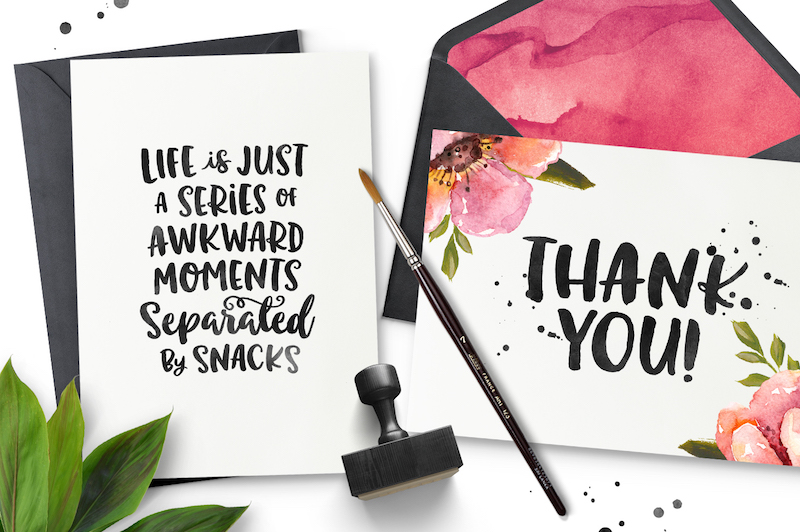
Designer: Denise Chandler
I work strictly freelance. I like to work with small businesses of all types. Those who can appreciate a custom design over plugging their info. into a template.
My sites have been featured on several design galleries such as The Best Designs and Unmatched Style.
My favorite font is changing constantly. I'm not one of those designers that are obsessed with Helvetica or some other standard font. I love the ones that aren't fit for everything, but can really elevate a particular design. My current favorite is Ink Bandits by Callie Hegstrom. The fonts pair so well together, and provide many fun options to work with.
4. Lora
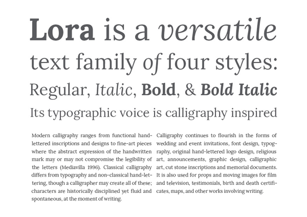
Designer: Adham Dannaway
I'm currently contracting client side at Qantas, where I'm working on a range of website features and products. I work on the user experience as well as the UI and visual design. I've previously worked client side at two of Australia's most successful tech startups: Campaign Monitor and Freelancer.com. I like working client side, as it allows me to really get to know a product and its users, and to continue to build and improve the product over time.
My work has been featured on quite a few websites and magazines such as Six Revisions, Awwwards and Web Design Ledger, to name a few.
A font that I like at the moment is a Serif Google font called Lora created by Cyreal. I'm currently working on a minimalist website with a strong focus on typography, and Lora works well at a relatively large size in headings as well as for body text, where ease of readability is important. Since it's a Google font it's free to use, and easy to integrate it into any website.
5. Proxima Nova
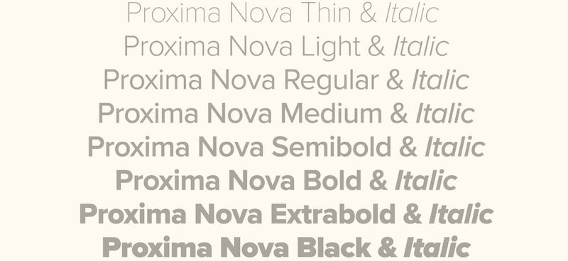
Designer: Melanie Daveid
In the past, I ran a small studio together with a friend, founded a startup, did some freelance projects, and worked for a digital advertising agency with clients like Red Bull, Puma, Expedia and many more. I basically went through a lot of various design fields and processes before I initially decided to join Onefootball.
Onefootball is a product company that offers the most comprehensive experience for football fans on various platforms (iOS, Android, Windows and the web). This means that I am not working directly for clients anymore, but we are collaborating with several big brands on features and sales topics.
I won several “Site of the Day awards” by Awwwards, and my personal website was featured on almost every platform you can imagine which makes me still incredibly proud.
My all time favorite font is Proxima Nova, designed by Mark Simonsson Studio. It offers various font weights, and it can be easily combined with illustrative or artsy elements. Whenever it fits the occasion, I am a huge fan of self-made, handwritten fonts. They add personality to digital products that seem to become more and more unified these days.
6. Sentinel
Designer: Beta Takaki
I work as UX/UI designer for a FinTech company called Mogo Portal, based in Vancouver, BC. Mogo is a really fast-growing company that provides financial services in a fun and responsible way. Right now, my main clients are young people (millennials) that need financial support. I also have been working on several service design projects for big investors from Vancouver.
My previous portfolio was featured on several famous awards websites including Awwwards, the FWA and CSS Awards. It was seen in lots of articles about inspirational design portfolios, and reached 1000+ views per day when it was launched.
I love working In contrast between typographies and Sentinel, designed by Jonathan Hoefler and Tobias Frere-Jones. It is a famous timeless slab serif font that does this job very well when paired with heavier and modern non-serif fonts. Although Sentinel is a serif font, it is legible for paragraphs, and gives a quite elegant charming look to it.
Sentinel was seen in President Obama's 2012 campaign, the St. Louis Browns Historical Society, Wildfire Studios, and Stumptown Coffee.
7. Whitney
Designer: Ryan Scherf
I work strictly freelance. I try to stick to SaaS companies that are looking for both app and marketing page designs. I’ve done a lot of them in the past, and feel like I can both burn through them quickly and add a lot of value for the client.
Some of my work has been featured in print publications like Net Magazine, Webdesigner Magazine, Computer Arts Projects Magazine, Smashing Book and many other digital blog roundups for unique and inspiring designs.
I’ve loved Whitney by Hoefler & Co. for a few years now, ever since we started considering it for site-wide use at Groupon. I think it provides the right amount of personality, while still being a highly legible font. It’s now becoming more widely adopted. Rdio used it for some time. Stripe is probably the most well-known company using it now.
So, how can you can you elevate the aesthetic of your next project with the perfect font? Those we’ve featured here should spark some ideas of which to use, and how they may be a good fit. With so many options out there, learning some of the favorites of top designers can make your selection less daunting.
Need to get your company on-brand? Create Brand Guidelines with Frontify.

