- Color literacy now signals cultural sophistication
- Fixed brand colors risk appearing culturally out of touch
- Focus on a consistent creative approach, not rigid color use
- Create flexible frameworks that maintain identity while allowing evolution
- Use color as a platform for cultural dialogue, not just recognition
Key takeaway: Brands need color systems that can adapt to cultural moments while maintaining coherent identity.
For today's “extremely online” consumers, color literacy has become a marker of cultural sophistication. From coining new sartorial metas (how was your Tomato Girl Summer?) to sharing curated color packs for social clout , the public's appetite for #coloranalysis is soaring.
Little wonder, Pinterest's 2025 Predicts 1 report leads with “Cherry Coded” — driven by a 325% surge in searches for Cherry Vibe. This signals how color curation now extends far beyond mood boarding to become a key tool for expressing complex emotional states 2.
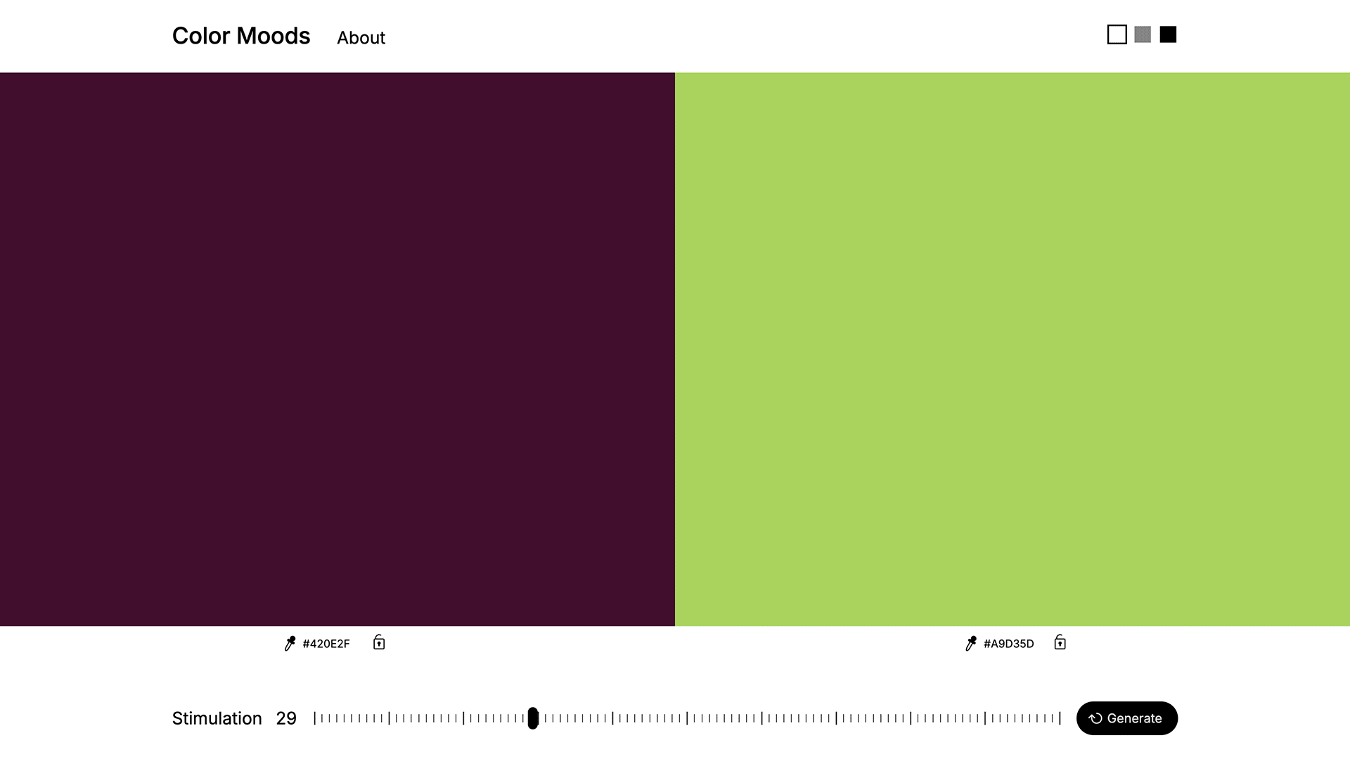
2Ruxandra Duru’s Color Moods generator translates a single hue into a full palette of emotional “vibes,” showing how flexible frameworks can keep brand colour both coherent and culturally fluent.
This rising color literacy challenges long-held brand beliefs about color as a fixed pillar for consistency. While “optimistic” yellows and “excited” reds remain branding doctrine, IPSOS research reveals a crucial insight: It's the consistent creative approach to key assets like color, rather than the assets themselves, that captures consumer attention.
This shift signals that brands now need systematic frameworks that bridge identity coherence with emotional fluidity or risk appearing culturally tone-deaf.
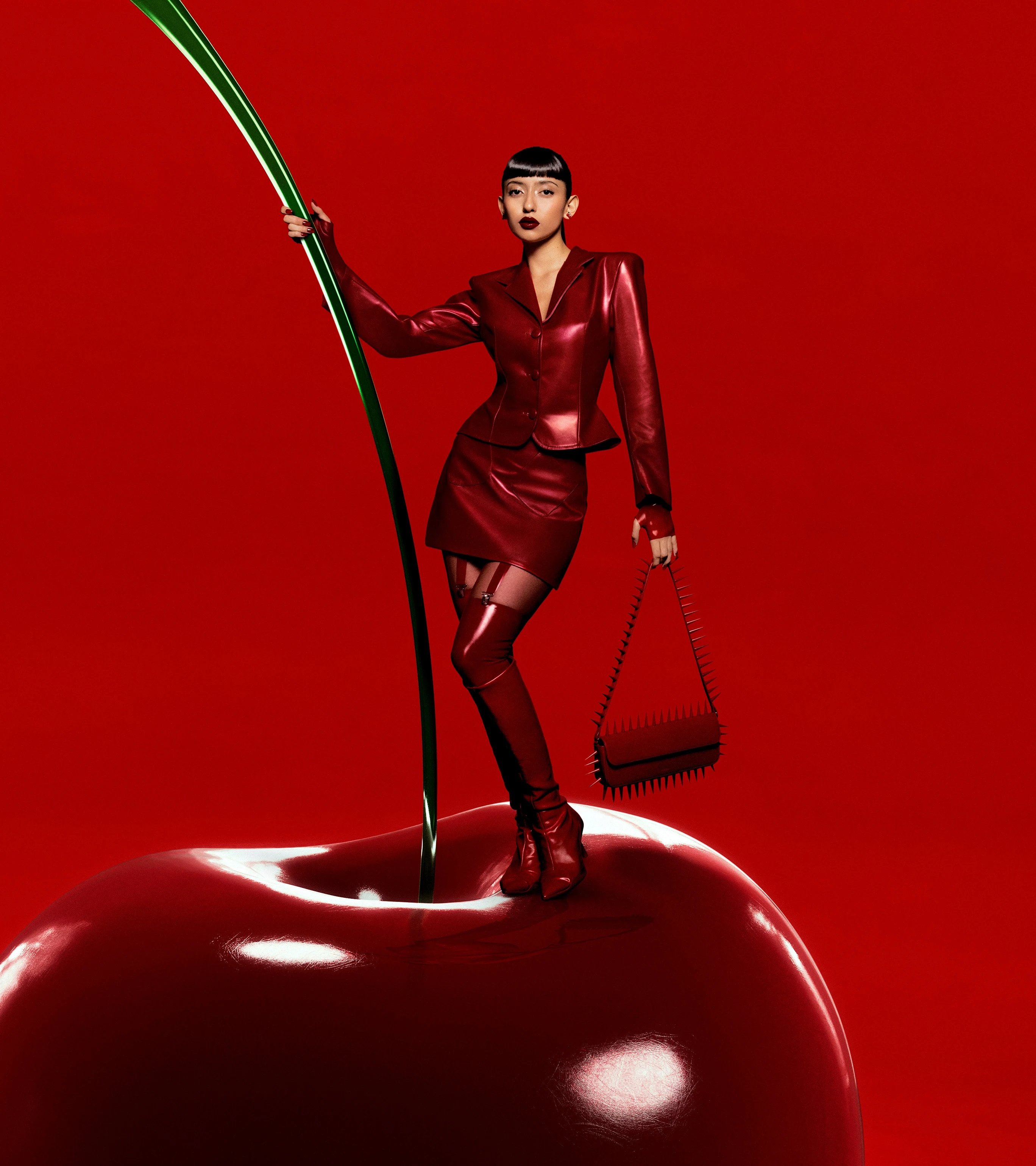
1Pinterest’s “Cherry Coded” trend forecasts a bold infusion of deep cherry red across makeup, menus, and decor in 2025, reflecting a shift towards expressive, emotionally resonant color palettes that resonate with Gen Z and Millennials.
3 Walmart’s refreshed color system balances heritage and flexibility, anchoring its identity in iconic True Blue and Spark Yellow while introducing accent blues to enhance clarity, accessibility, and emotional resonance.
Recent updates to blue-based brand books offer compelling insights into this chromatic retooling. Walmart's first aesthetic update since 2008 saw Jones Knowles Ritchie create a “richer and warmer” True Blue 3, helping the brand resonate across expanded fashion and home inventories — traditionally challenging contexts for value retailers. In digital spaces, this evolution reinforces Walmart's democratic, people-first positioning. “You may say it's subtle, but there are meaningful differences,” explains William White, Walmart's CMO.
This pursuit of “meaningful difference” extends to skincare brand E45 4, whose historical blue effectively conveyed pharmaceutical heritage but limited engagement with broader wellness-focused consumers. “Our design strategy had to strike a balance between capturing scientific expertise and everyday care,” explains Kyle Whybrow, Creative Director at Elmwood London. Their solution pairs clinical blue with a “lifestyle” coral, creating a systematic approach that credibly spans both professional and domestic care contexts.
4 Elmwood’s rebrand for E45 transforms its iconic skin cell logo into a flexible design system, pairing clinical blue with lifestyle coral to balance scientific credibility and everyday care.
5 Collins' rebrand for Bose focuses on the concept of “immersive sound” inspired by the chromatic tones found in sound waves. The visual system transforms the brand’s visual language into a fluid, emotive spectrum that amplifies its cultural resonance.
Bose offers perhaps the most ambitious evolution, transforming its engineering-focused blue into an eight-note tonal hierarchy 5. It represents “a musical scale, and expands into a matrix of options capable of serving future products, partnerships, and communications," explains Creative Director Zuzanna Rogatty. This framework maintains technical precision while enabling more organic presence in music culture — particularly relevant as competitors like Sonos and Apple establish visual footprints at concerts and festivals.
The real opportunity here isn't just in more sophisticated color systems but in recognizing color's emerging role as social currency. As consumers increasingly leverage color literacy to signal cultural sophistication, brands must pivot from using color purely for recognition to viewing it as a dynamic platform for dialogue. As design theorist Elizabeth Goodspeed notes, “color has never been more accessible — or more powerful.”
Brands who master this transition will find themselves equipped not just to reflect cultural moments, but to create them — elevating chromatic strategy from design consideration to conversation catalyst.