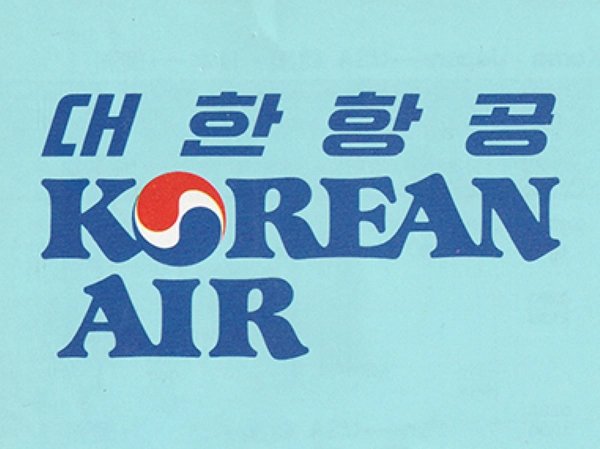
We were tasked with creating a modern, globally appealing identity that would reflect Korean Air’s renewed focus on premium travel. Our brief was to design a brand that embodied this change, effectively replacing brand assets that had been in the market for over 40 years.
Korean Air has been historically synonymous with efficiency, punctuality and safety. We knew this was not a complete reinvention but an evolution. They needed to credibly pivot toward premium travel and invite reappraisal from domestic and international audiences.

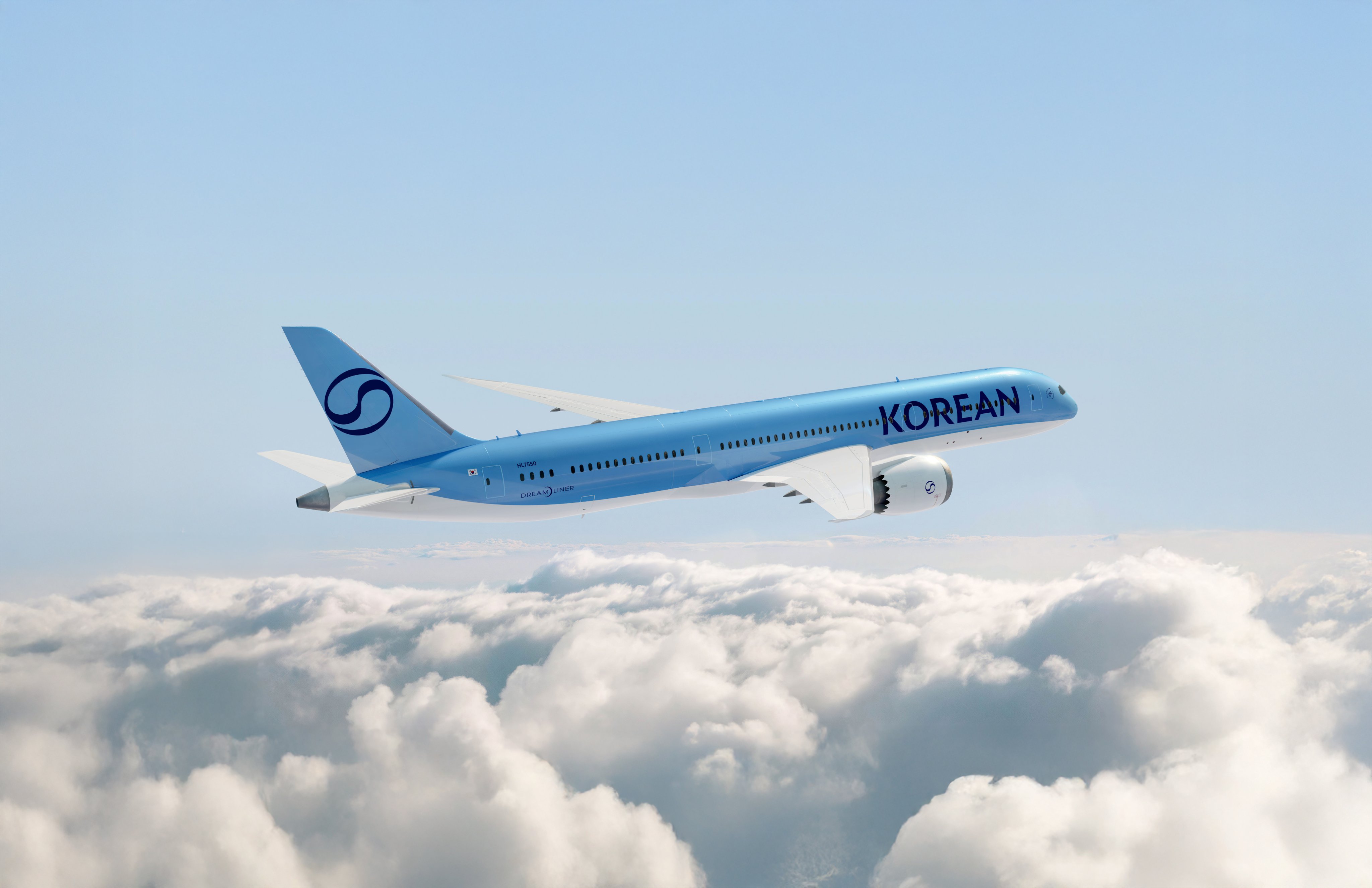
We conducted a deep dive into the symbolism of the Taegeuk, as well as the significance of other national symbols. It became evident that the Taegeuk carried considerable equity. So, our explorations turned into making the Taegeuk distinguished and ownable to Korean Air.
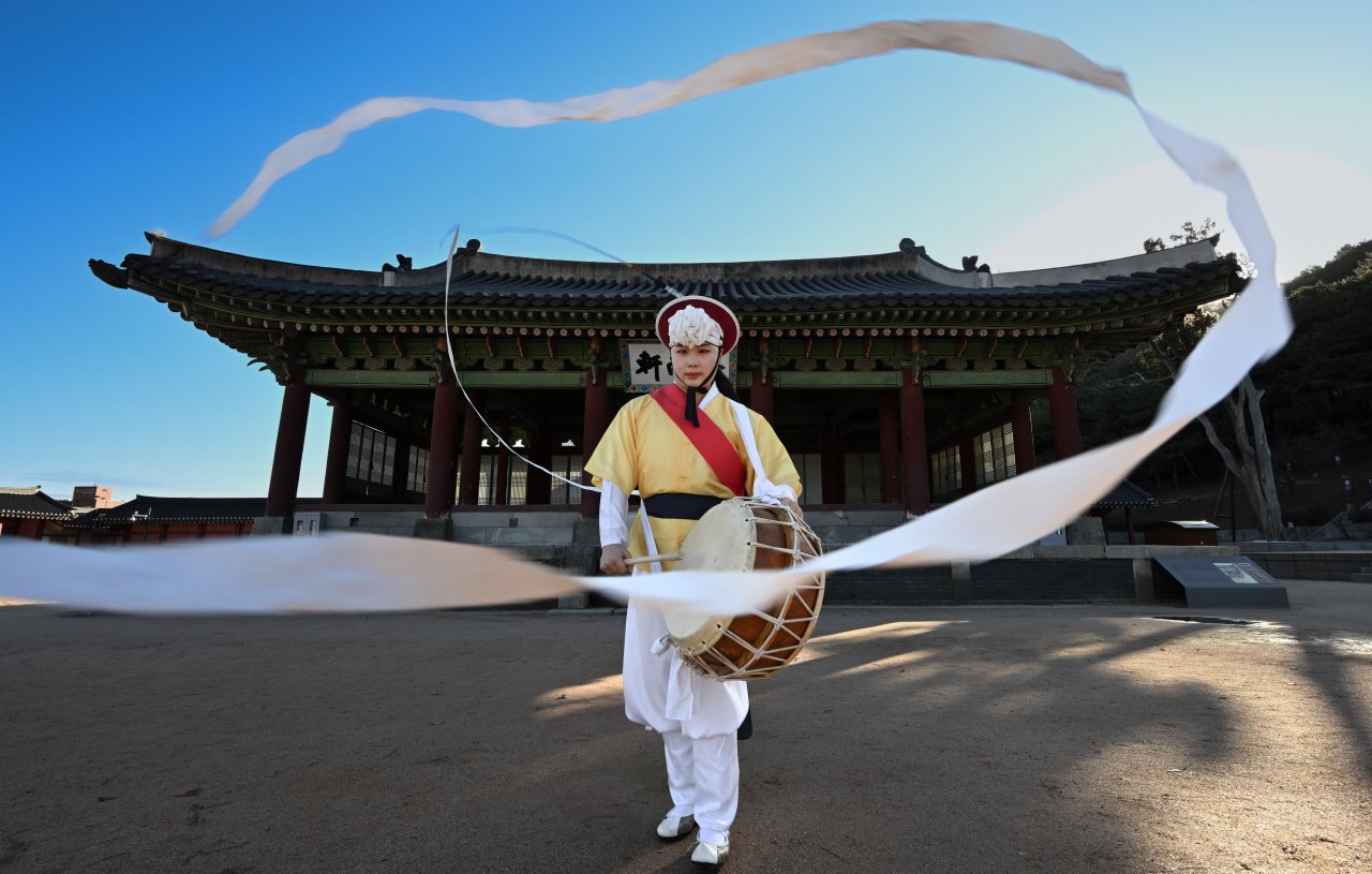
As part of our research, we found a traditional folkloric dance called Sangmo Nori. The performers wear Sangmo hats with a long ribbon. We were inspired by the symbolism of the ribbon, which evokes elegance globally while also resonating with a Korean audience.
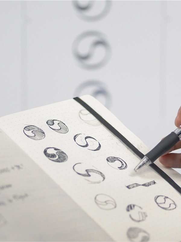
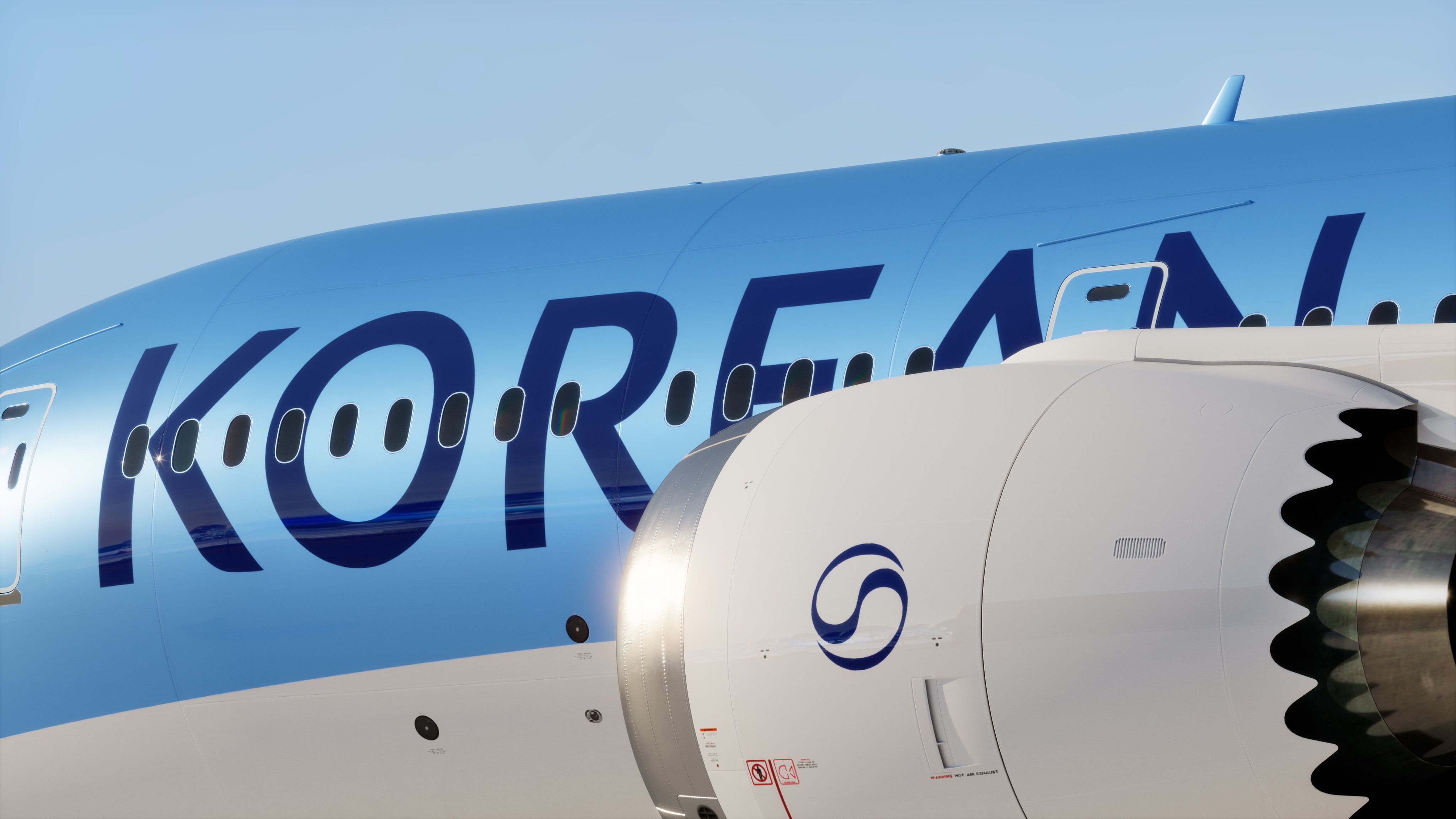
The Taegeuk is synonymous with South Korea — but it's widely used by many organizations in the country. Our challenge was to reference the icon while creating a symbol unique to Korean Air. In our reinterpretation, we decided to make it resemble a ribbon.
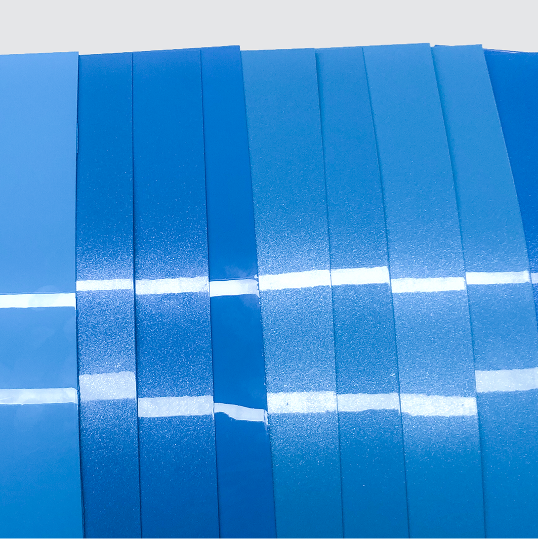
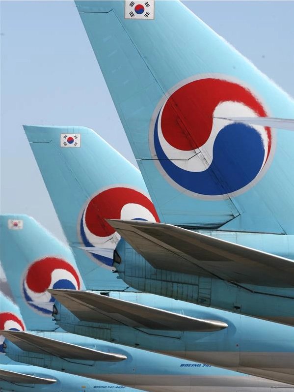
Through our research, it became clear that both domestic and international audiences associate blue with Korean Air, followed by red in a distant second place. This provided an a-ha moment: retain the blue fuselage, which had been in the market for over 40 years.
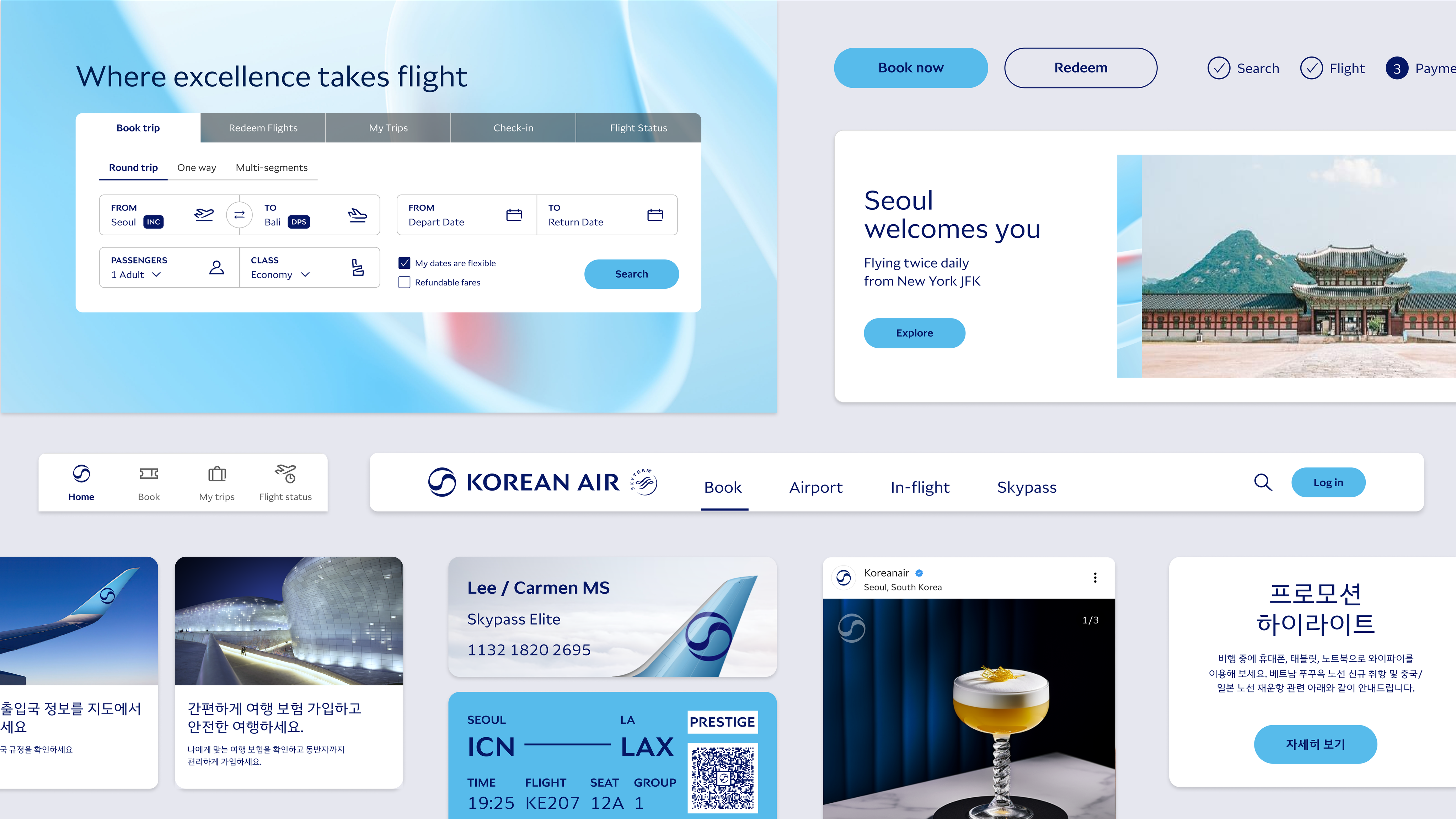
Modern airline brand identities are essentially about planes and pixels. Once we knew the evolved brand assets worked well on the livery, we switched gears to ensure they would display perfectly on screens of different sizes: from desktops to phones and smartwatches.
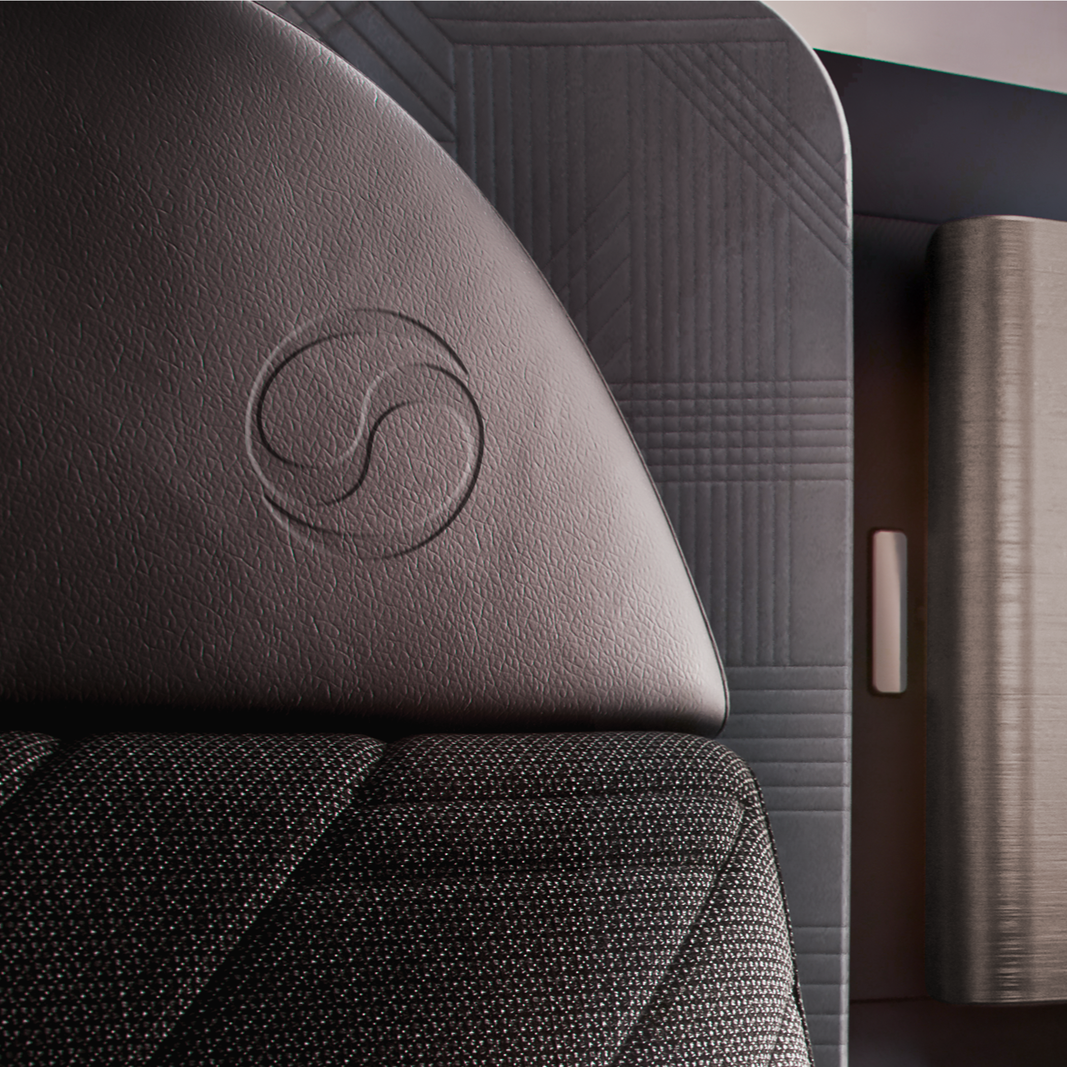
We referenced business class seat materials and colors to create the look and feel for the premium passenger experience. The design of the core brand assets was driven by simplicity, reduction and formality — hallmarks of the confidence you see in premium brands.
Having an ambitious client certainly made the work better. Their response has been excellent — perhaps the biggest indication was seeing Chairman Cho interviewed on CNN with the proud backdrop of a gleaming Boeing 787 displaying the new livery.