- Experimental, interactive web design is resurging among creative studios
- Playground-like websites reward exploration, making visits more memorable and shareable
- Communicate your brand character through unexpected, interactive features
- Foster an active dialogue rather than just a showcase of work.
- Avoid formulaic web design and over-optimised, static sites
- Offer something unique and harder for AI to simply aggregate
Key takeaway: Interactive websites help studios showcase their brand personality and attitude more clearly, strengthening emotional connections and increasing memorability in a saturated digital environment.
At the dawn of the internet, every site was a playground. While the dial-up speeds left much to be desired, creativity flourished thanks to Flash plugins and a complete lack of rules.
Front-end developers unleashed their visions on unsuspecting visitors: zany, maximalist experiences that combined animation, sound design, and gamification. There were Easter eggs, madcap 404 pages, animated GIFs and more.
Every click was an adventure.
Then, around the middle of the last decade, as internet spaces became increasingly commodified, websites grew dull — and stayed that way.
The design agency landscape, for instance, is inundated with sleek, ‘timeless’ design that sits back and lets their case studies shine.
But in recent years, some studios are abandoning the safe, minimalist, and portfolios in favour of a more interactive, playful, and nostalgic approach to web design.
These engaging spaces revive the spirit of the early web by transforming passive sites into interactive playgrounds, inviting users to explore, experiment, and discover through fun features that capture the essence of a brand’s creativity and vibe.
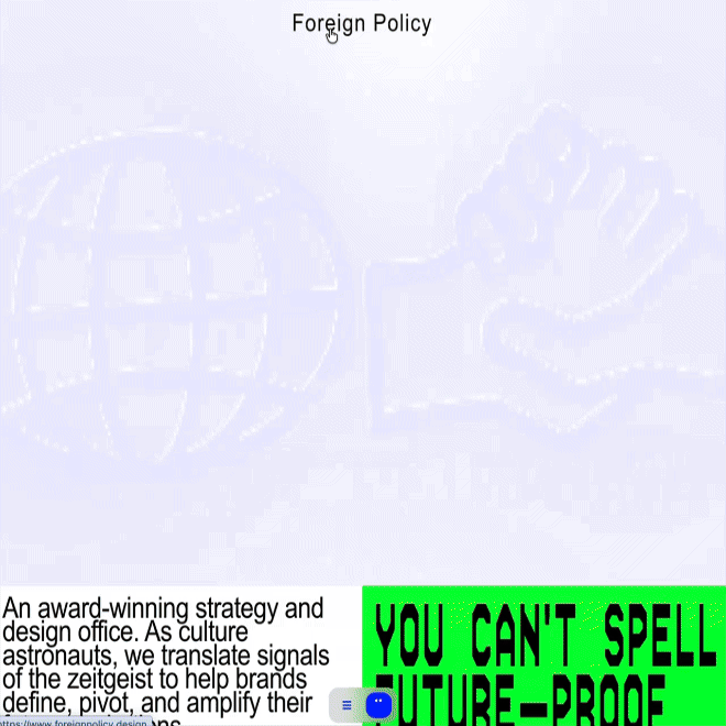
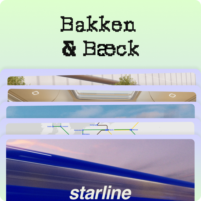
1Foreign Policy's new website "invites a conversation, not a scroll" says Co-Founder Yah-Leng Yu.
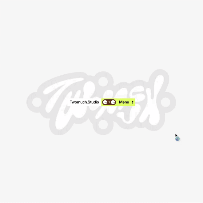
2TWOMUCH Studio's own website lets you throw, flip and fling elements around like a digital snow globe.
Spend a few moments on Foreign Policy’s 1 new website, made with TWOMUCH 2, and you’ll get drawn in, nudging every element with your mouse to see them shift, rotate, pulse, and morph.
The animations are seamless yet the look feels pulled out of an early 00’s PlayStation game, with pixelated graphics and square type.
Instead of conventional menus, an adorable “bot” named N@th@n is front and centre, ready to be poked, hovered, and clicked: “our way of turning today’s AI moment into something useful and delightful,” says Co-Founder Yah-Leng Yu.
It’s both toy and tool, she notes; a character guiding you through the site and a system that keeps navigation simple, visual, and memorable.
It’s effective because “it invites a conversation, not a scroll.” N@th@n, she explains, reacts in small, surprising ways, rewarding curiosity and increasing dwell time — “so the studio’s voice, attitude, and thinking come through instantly.”
Yu wants users to feel as if they’re walking into a studio that’s playful but a bit mischievous — yet absolutely capable and still professional.
“The connection is an exchange, the work convincing, and the impression trust.”
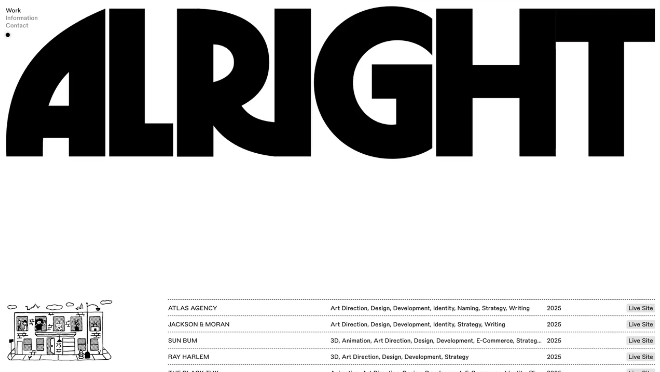
3Creative agency Alright Studio have delivered sites and identities for the likes of Sun Bum, The Black Tux, and Unicef.
In need of an entirely new website experience, Mother Design called upon US-based creative agency Alright Studio 3 to build the Mother Family 4.
Crafted to bring visitors up to speed with the essence of Mother, it reflects their unique brand of humour — “a certain wryness, intelligence, and wit mixed with a bit of slapstick, and referentiality — that is Mother,” says partner Spencer Joynt.
Avoiding the use of well-worn web templates, they instead conceptualised the site as its own operating system, with interactive widgets that, as Mother Design’s Mark Sloan recalls, took inspiration from “dating sites, online questionnaires, pyramid schemes, gambling, the occult, and of course magic.”
The site captures the energy of Mother — “a web of people who not only like each other very much, but who are willing to run through fire in order to make worthwhile things.”
“We broke the rules when it came to UI, but followed them when applied to UX,” adds Joynt. “The site is easily navigable and a bit of a workhorse, while still leading with that sense of humour that is so uniquely mother.”
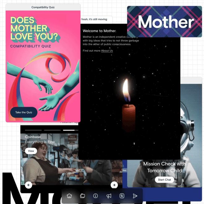
4Wanting to avoid tired templates, Mother Family's new site took inspiration from “dating sites, online questionnaires, pyramid schemes, gambling, the occult, and of course magic.
Every landing page is an opportunity to say exactly who you are — something NOT Wieden + Kennedy (sister studio to Wieden + Kennedy) embraced wholeheartedly when they gave us a Microsoft Paint-esque tool to draw custom wordmarks — ‘The Not Machine’ 5.
Every brush, animation, and feature — dialling up a doodle into a dynamic design — reveals something about who the London-based team are, while also showing us a truth about ourselves as humans — we can’t help but play.
Design Director Adam Hunt emphasises that “optimism and irreverence are core values that stem from the W+K mothership,” and the process of working with them is always fun, “whether the output is serious or not.”
The Not Machine, he explains, serves to embody this spirit, as well as the famous mantra of Dan Wieden: “Move me, dude.”
As advocates of bespoke tools, this tool — “used to create logos and an expressive design language” — was not only entertaining for the team to develop but also a fun way to democratise the design process — something everyone can use.
‘The Not Machine’ is, as they say, on the site to spread “a little stupidity across the internet.”
These novel approaches are a refreshing change of pace for users who are fatigued by a seemingly over-optimised digital experience — a never-ending feed of content, designed to keep the neurons firing on all cylinders.
They work, because, as Yu notes, it “makes the visit more memorable (and shareable), and still keeps the work the hero — not a gimmick, but a better handshake.”
“Mother's website, some days, is a gleaming beacon of hope in a sea of frightening tedium and empty posturing,” says Sloan. “It gives people a glimpse into the kind of relationship we might have once we get to know each other.”
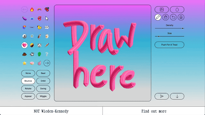
5Not Wieden + Kennedy's site aims to teach visitors something about the sensibility of the team, but also to spread “a little stupidity across the internet.”
And that’s what users are crying out for — a dialogue — where active inquiry, exploration, and engagement is rewarded.
AI search can and will aggregate every piece of information listed on your site without anyone having to click a link.
Therefore, by creating both a destination and an experience, one that represents not just what you do, but who you are – your personality, your vibes – the website becomes a new kind of digital calling card.
A statement of intent more akin to those bombastic, joyful, and revolutionary websites of yore, where a visit was rewarded with something unique. Something valuable. Something memorable.
That's an experience AI can't aggregate. And it's what smart agencies and brands are already capitalising on.