
Brand guidelines exist so a hundred different people can produce content for their brand that looks and feels consistent, without a designer checking every file. In practice, most fall short of that: PDFs go stale, and portals get built but are never used by anyone outside the marketing team.
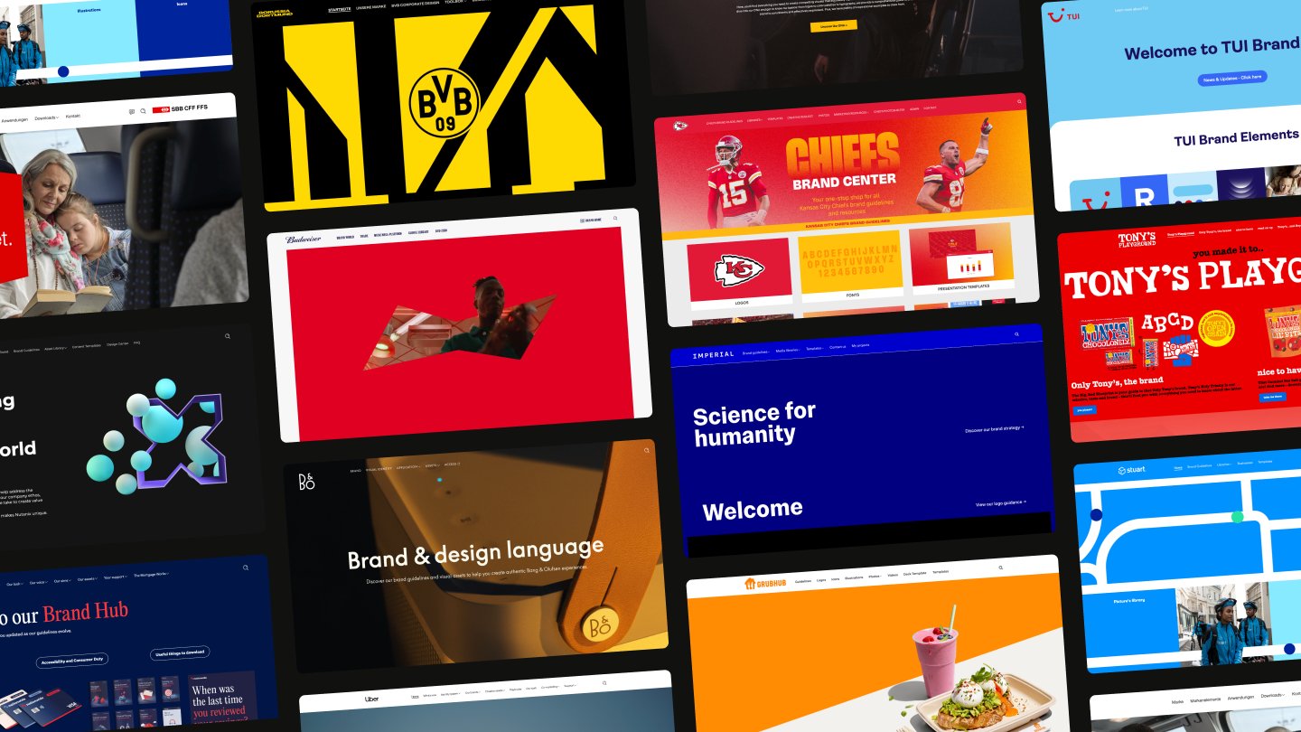
We’ve pulled together examples from 19 brands that have solved this problem and put together creative, engaging, and practical guidelines that bring their brands to life. Skim the whole list, or jump to a brand you know and love, then see which elements you can use in your own guidelines.
What makes great brand guidelines?
Most brand guidelines get judged on how they look. But a portal can be beautifully designed and still fail the people who need it, if it sits behind a login nobody remembers, or if it documents rules without letting anyone act on them. Here are four criteria that actually make brand guidelines great to use, rather than just nice to look at.
They're live where the work happens
A PDF buried in a shared drive doesn't get opened at the moment someone needs it. It gets requested, tracked down eventually, or skipped. The best brand guidelines exist at a URL: something a person can bookmark, pull up mid-task, search for an exact hex code, read on a phone in a meeting, or send to an external agency without attaching a file.
And just because they’re a live URL doesn’t mean they need to be made public or visible to anyone and everyone. The strongest portals let anyone check basic logos or colors, while gating asset libraries or unreleased campaign materials behind a login or request process. This helps companies balance governance and brand openness.
Non-designers can create from them
There's a difference between documenting a brand and letting people build with it. Guidelines that only describe the rules put every request back on the design team: a color code without a template still means someone has to build the thing from scratch, or wait for someone who can. But guidelines that link out to templates or include downloadable brand elements give non-designers the practical tools to create on-brand materials more easily.
The brand team updates them without an agency
Brand guidelines that need a developer or an agency to change falls behind the next campaign, rebrand, or product launch. Once people spot one outdated rule, they stop trusting the rest. So your brand guidelines should be easy to update and maintain without relying on outside agency support.
The easiest way to check this from the outside is to look for a "what's new" or recent-updates section. If a portal shows one, that suggests someone on the brand team is maintaining it directly.
AI tools can query them
Teams now draft copy, design layouts, and write code with AI assistants, and those tools pull in whatever brand context they can reach. Guidelines locked in a PDF or a hand-built site don't get read — the AI just guesses at your colors, your tone, your rules.
Look for guidelines held as structured, live content that AI tools can query directly, through a connection like the Model Context Protocol, so the AI assistant pulls from your actual brand rules instead of approximating them from a logo and a font name.
If your organization doesn’t have a detailed set of brand guidelines or your existing ones need an update, here are 19 examples from leading brands to inspire you.
(The guidelines are in no particular order — we don’t want to play favorites.)
1. Bang & Olufsen (Built on Frontify)
Criteria met: live access, AI-queryable, non-designer creation, in-house updates
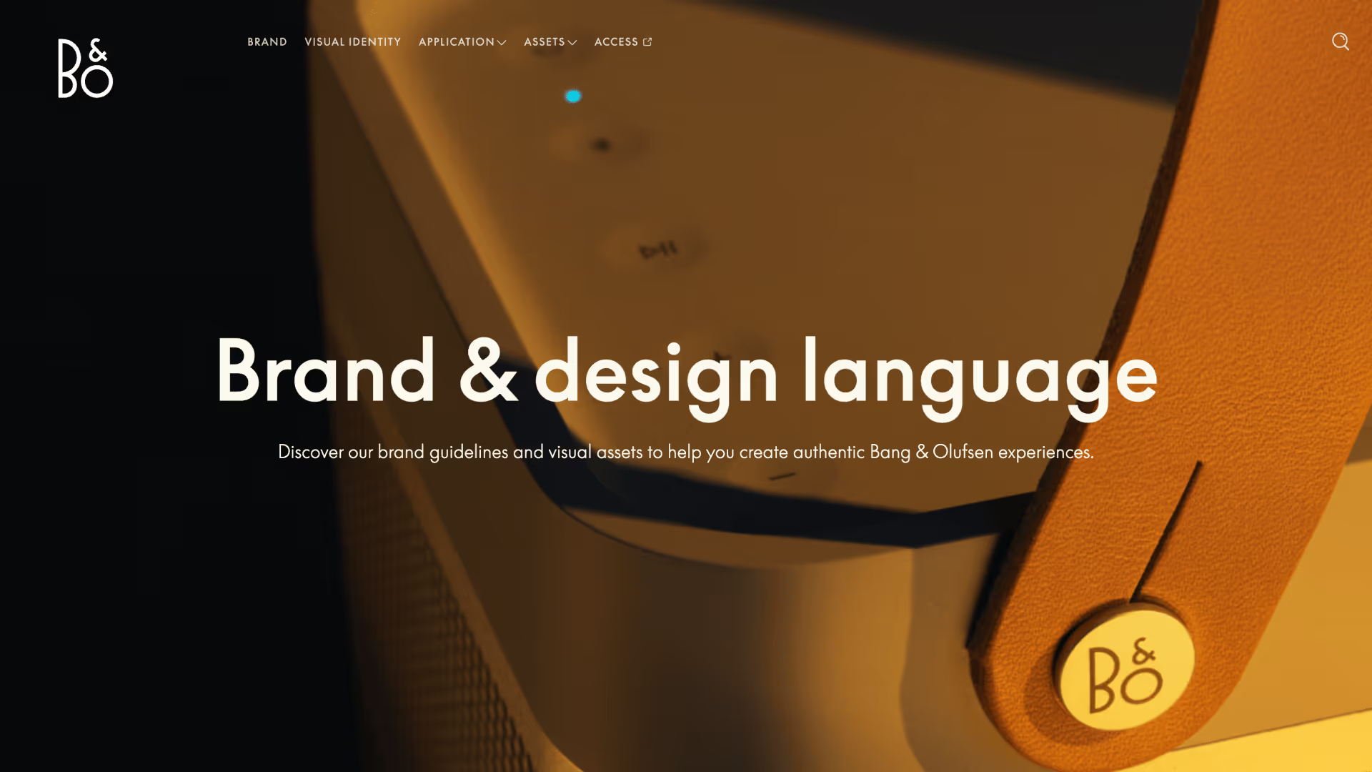
Bang & Olufsen's brand hub reflects the brand: the interface is elegant and understated in the same way the products are, so browsing it feels like an extension of what it documents rather than a bolted-on tool.
Its guidelines are easy to navigate, with many sections including brand elements users can download directly (like fonts or logos). Bang & Olufsen's brand guidelines also houses templates for common creative tasks, like Figma layouts and presentation templates, to help users create on-brand materials independently.
Why we love these guidelines:
- Design-first approach: The brand hub reflects Bang & Olufsen's design sensibility, with a visually elegant interface that mirrors the premium nature of the brand.
- Effortless navigation: Powerful search and filter options make it easy for teams to find exactly what they need in seconds, even across thousands of files.
- Comprehensive asset management: From high-resolution product imagery to finished campaign materials, every asset is categorized and instantly accessible.
2. Cashapp
Criteria met: live access
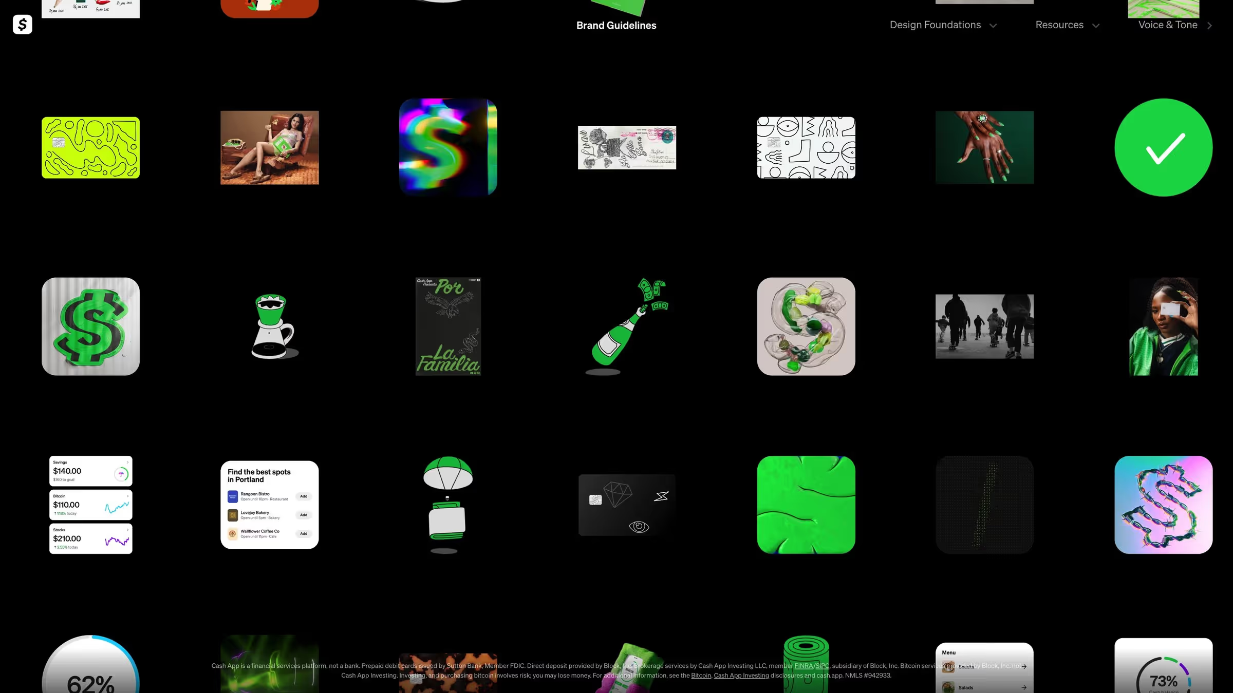
Cash App's guidelines open on an infinite, zoomable canvas instead of a homepage that lets you drift through hundreds of 3D and 2D icons the way you'd browse a game's item collection rather than scroll a style guide.
Why we love these guidelines:
- Immersive brand experience: The infinite canvas turns the guidelines into something people actually explore, not just reference.
- Named creative intent: Motion and illustration principles are spelled out clearly enough that a designer can apply them without needing a rulebook for every scenario.
- Distinct personality: Custom typography and a playful icon system make the guidelines as recognizable as the product itself.
3. IBM
Criteria met: in-house updates, live access

IBM’s brand guidelines share the company’s guiding principles, its ethos, and resources to bring the brand to life.
Why we love these guidelines:
- What’s new: The best brands continuously evolve. IBM has a dedicated “what’s new” section so users can easily see what’s been updated recently.
- Data visualization: IBM’s brand guidelines include a section on data visualization to help teams create charts that communicate messages clearly.
- Resources: IBM links to design tools and repositories for people to apply its brand elements. For example, designers can download libraries and kits for Sketch and Adobe and integrate core components into their everyday tools.
4. Herman Miller
Criteria met: non-designer creation, live access

Herman Miller has detailed brand and identity guidelines to ensure a consistent brand presentation across all touchpoints, both physical (e.g., brick-and-mortar stores) and digital (e.g., campaign ads).
Why we love these guidelines:
- Vision and mission: Herman Miller helps everyone understand the importance of its brand by sharing the company's vision, mission, and values to introduce its brand guidelines.
- Brand history: Herman Miller can look back on over 100 years of brand history, and it shares its brand evolution and development to make people feel part of this story.
- Downloadable templates: The guidelines include downloadable templates for frequently used marketing materials — such as emails, website pages, and presentations — to maintain brand consistency and improve creative efficiency.
5. Kansas City Chiefs (Built on Frontify)
Criteria met: live access, AI-queryable, non-designer creation, in-house updates

The Kansas City Chiefs' Brand Center helps the brand and creative teams deliver memorable experiences across all their touchpoints. It puts templates, creative requests, photos, and marketing resources in the top navigation, so users can easily self-serve and a request that used to land on the design team's desk now gets handled by whoever needs the asset.
Why we love these guidelines:
- Self-service by design: Templates and a Creative Request flow sit right in the main navigation, so non-designers across the organization can produce on-brand work without a design ticket.
- Real time savings: Consolidating brand guidelines, assets, and templates into one portal has saved the brand team up to 10 hours a week.
- Partner-ready: External partners get access to approved assets directly, cutting out the back-and-forth of emailing files.
6. Nestlé (Built on Frontify)
Criteria met: live access, AI-queryable, non-designer creation, in-house updates
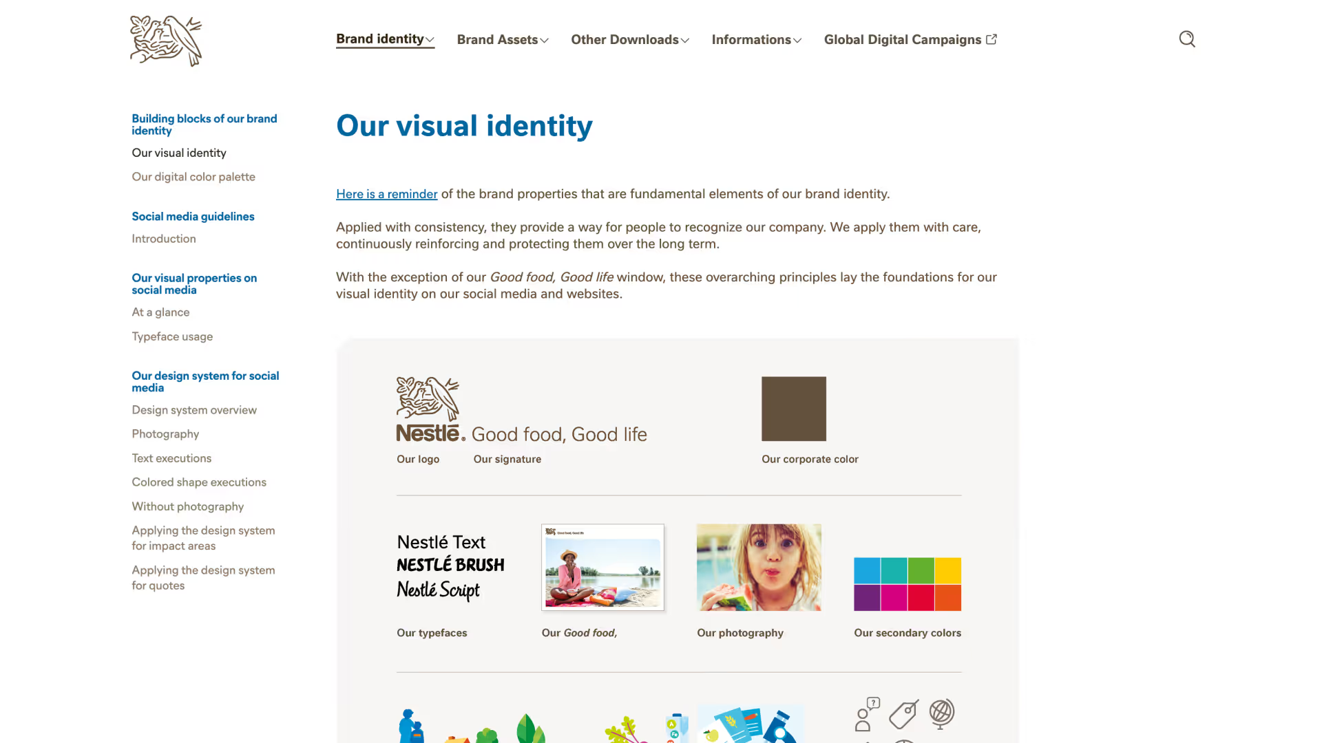
Nestlé, the world's largest food and beverage company, manages more than 2,000 brands in its brand portal. As a truly global brand, its guidelines are designed for international audiences — it has typography guidelines for different languages, for example. Nestlé has a public version of its brand guidelines that anyone can open, alongside gated areas for registered internal teams, local markets, and strategic agencies to reach the assets and guidelines specific to their brand.
Why we love these guidelines:
- Built for enormous scale: One portal structure holds guidelines for 2,000+ brands across 186 countries, instead of splintering into local one-offs.
- Layered access that still stays open: A public tier and a registered tier work together, so the portal serves outside audiences and internal teams from the same source.
- Agencies included, not routed around: Access extends to the local and strategic agencies actually producing the work, not just Nestlé's own teams.
7. Netflix
Criteria met: live access

The Netflix brand site lets anyone access its guidelines for logo usage, but you need to request access to other brand materials — a great example of effective brand governance.
Why we love these brand guidelines:
- Co-branding guidelines: Netflix provides clear guidance on how partners should use its logo for co-branded marketing materials.
- In-use examples: The brand guidelines share several use cases of its branding in different digital and offline applications.
- Things to avoid: Netflix shows how not to apply its logo and brand assets, ensuring people place its core elements consistently.
8. Vodafone (Built on Frontify)
Criteria met: live access, AI-queryable, non-designer creation, in-house updates

Vodafone's brand portal centralizes all their brand assets into one central location. It treats the portal as a living community, with a monthly brand newsletter and a recurring jour fixe keep its employees updated on the latest brand changes. The portal also includes a fully integrated layout calculator custom block helps users find out the right typography sizings for different file formats.
Why we love these guidelines:
- Built-in technical guardrails: The Layout Calculator catches sizing errors before publication, instead of relying on a designer to catch them after.
- Campaign tracking: A documentation tool follows each campaign through the portal, keeping the brand team's record centralized.
- Active brand community: A monthly newsletter keeps the organization actively engaged and aligned, rather than leaving updates to be discovered by chance.
9. Trustpilot (Built on Frontify)
Criteria met: live access, AI-queryable, non-designer creation, in-house updates

Trustpilot's brand hub is built for people to publish from, not just read. Anyone can download core assets — sub-brand logos, icons, video clips — directly from the guidelines and put them to use without waiting on Trustpilot's brand team. Localization guidance in the tone-of-voice section means teams adapting copy for a new market aren't drifting off-brand while they do it. Trustpilot's brand team maintains all of it directly inside the platform, so a new localization rule or co-branding example goes live without a request to an agency.
Why we love these guidelines:
- Localization: Trustpilot's tone-of-voice guidelines include localization style guidelines to adapt brand materials to different languages and local markets.
- Downloadable assets: The guidelines include an extensive library of files — users can download everything from sub-brand logos to icons and video clips.
- Co-branding guidelines: Many companies are proud of their Trustpilot reviews and want to show off their ratings. To facilitate this, Trustpilot provides detailed guidelines for co-branded marketing materials.
10. Mastercard
Criteria met: in-house updates

The Mastercard brand center offers guidelines, downloadable assets, and other relevant information to ensure a consistent brand identity.
Why we love these guidelines:
- Latest updates: Mastercard puts a brief summary of recent updates at the top of its brand guidelines so everyone immediately sees what’s changed and when.
- Downloadable assets: Users can download brand artwork in different formats and for various use cases directly from the brand guidelines.
- FAQs: Mastercard dedicates a page to frequently asked questions to help users navigate the guidelines and find the relevant files — without additional support from their brand team.
11. Tonies (Built on Frontify)
Criteria met: live access, AI-queryable, non-designer creation, in-house updates

Tonies has built Tonie-World, a central online hub for its brand. Its brand style guide opens with an accessibility section addressing WCAG standards, ahead of its vision, mission, UI elements, or the media library — a rare example of a brand focusing on the experience it provides for all users. The rest of the hub follows through on that: a UI kit for building consistent interface components, plus practical dos-and-don'ts showing correct and incorrect use of brand elements.
Because the hub runs on structured content rather than a static site, Tonies' brand team updates it directly — from a new accessibility note to a new UI component — without routing changes through a developer.
Why we love these guidelines:
- Accessibility: Tonies wants all users to be able to interact with its products, including those with different access needs. The very first section of its style guide is focused on creating accessible brand content that meets WCAG (Web Content Accessibility Guidelines) standards.
- UI kit: Tonies' UI kit provides guidelines on creating elements and components for its interface to ensure a consistent experience when interacting with web pages and applications.
- Dos and don'ts: The guidelines contain many practical examples showing how (not) to use the brand elements.
12. Sinch (Built on Frontify)
Criteria met: live access, AI-queryable, non-designer creation, in-house updates
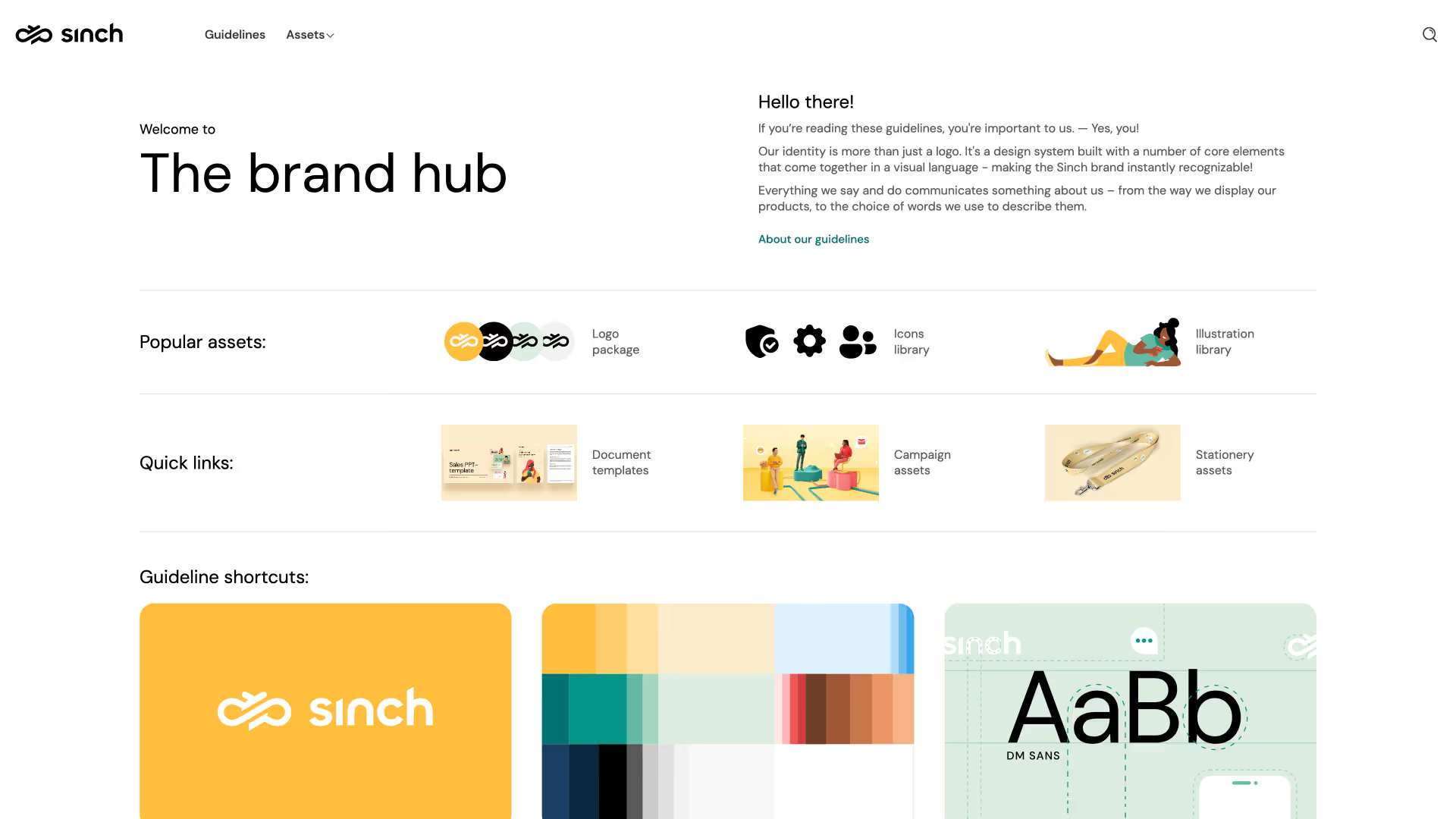
Sinch’s brand guidelines contain detailed guidance on how to present the brand consistently. Besides sections on the brand’s visual assets, it has an in-depth tone-of-voice section to help people understand how the brand should sound.
Why we love these brand guidelines:
- Collaborative guidelines: Sinch gives users a specific point of contact to go to with questions about its brand identity and allows them to request a specific brand asset for their work.
- Brand architecture: Sinch’s product offering comprises multiple sub-brands that sit under its brand “umbrella.” Users can access files for each sub-brand, in line with the global brand strategy.
- Tone of voice: Sinch provides detailed tone-of-voice guidelines. For example, it offers variations of the same technical error message. Each one contains explanatory notes about which parts of the message are good or why the copy doesn’t quite align with the brand’s voice.
13. DevRev
Criteria met: live access, non-designer creation, in-house updates

The DevRev visual identity guidelines introduce users to the core elements of its brand identity, from logos and color palettes to voice and tone.
Why we love these brand guidelines:
- Quick download option: Users can click a single button to download all of DevRev’s brand assets in one go. Perfect for busy creatives.
- In-use examples: The guidelines contain a gallery of brand materials to see how the elements work together to create a cohesive visual identity.
- Simple navigation: The collapsible navigation lets you jump between the sections of the guidelines quickly so you can easily find the elements and resources you need.
14. Dropbox
Criteria met: live access,

Dropbox’s brand guidelines break down its brand into four core areas: strategy, foundational elements, design system, and writing.
Why we love these brand guidelines:
- Customer focus: The guidelines explain how to subtly adapt brand visuals depending on where customers are in their journey with Dropbox. This puts customer needs front and center for the Dropbox creative team.
- Design system: Dropbox links to design system guidelines to help UI/UX teams deliver cohesive, high-quality experiences across the product suite.
- Writing guidelines: Dropbox knows that a recognizable brand voice is just as critical as a brand’s visual identity. It links to voice-and-tone guidelines as part of its brand guidelines.
15. Instacart

Instacart’s online brand guidelines share the information and brand files its creative teams and partners use most often.
Why we love these brand guidelines:
- Visual navigation: From the home page, users can jump to different sections of the guidelines, such as illustrations, icons, or colors. You navigate via a visual menu of cards that look like the relevant section.
- Downloadable elements: Users can download Instacart’s main brand elements — such as logos or icons — directly from the brand guidelines.
- Guidelines for sub-brands: Instacart has several additional brands that extend its main brand but have their own distinct identity. These sub-brands have their own section within the guidelines.
16. Airbus

The Airbus Brand Center provides comprehensive tools, guidelines, and best practice examples to help its teams present a unified brand identity. It includes written guidelines, editable templates, and a library of approved assets that are ready to use.
Why we love these brand guidelines:
- Use case guidelines: Airbus provides custom guidelines with visual examples for some of its most common use cases — from aircraft liveries to poster design.
- Downloadable templates: Users can download editable templates of frequently used brand assets, including slide decks and email templates.
- UI/UX guidelines: The digital experience is a crucial part of your brand, so Airbus provides detailed UI and UX guidelines for its designers and developers.
17. Firefox
Criteria met: live access, non-designer creation

The Firefox brand guidelines provide an introduction to the brand’s purpose and personality but also include details, such as specific guidelines for logos, colors, and other core brand elements.
Why we love these brand guidelines:
- Assets live alongside guidelines: Users can download brand elements, icons, logos, and images from dedicated libraries within the guidelines.
- Practical color guidelines: Firefox’s color palettes list color codes for all its primary and accent colors, as well as the exact specification for its brand gradients.
- Dos and don’ts: The brand guidelines illustrate how the brand should look, alongside examples of off-brand usage of its main elements.
18. Klarna
Criteria met: live access

Klarna’s brand guidelines give an engaging introduction to the brand and its elements. Concise written instructions and downloadable assets and resources help teams present a consistent identity for the brand.
Why we love these brand guidelines:
- Highly visual cover page: A scrollable cover page displays the brand mission and examples of past campaigns as your first interaction with these guidelines.
- Tone-of-voice guidelines: Concise voice-and-tone guidelines share examples of rewritten content and specific brand language preferences.
- Audio version: Users can listen to an audio introduction to the Klarna brand guidelines to get a feel for how the brand sounds as well as how it looks.
-
19. TUI (Built on Frontify)
Criteria met: live access, AI-queryable, non-designer creation, in-house updates
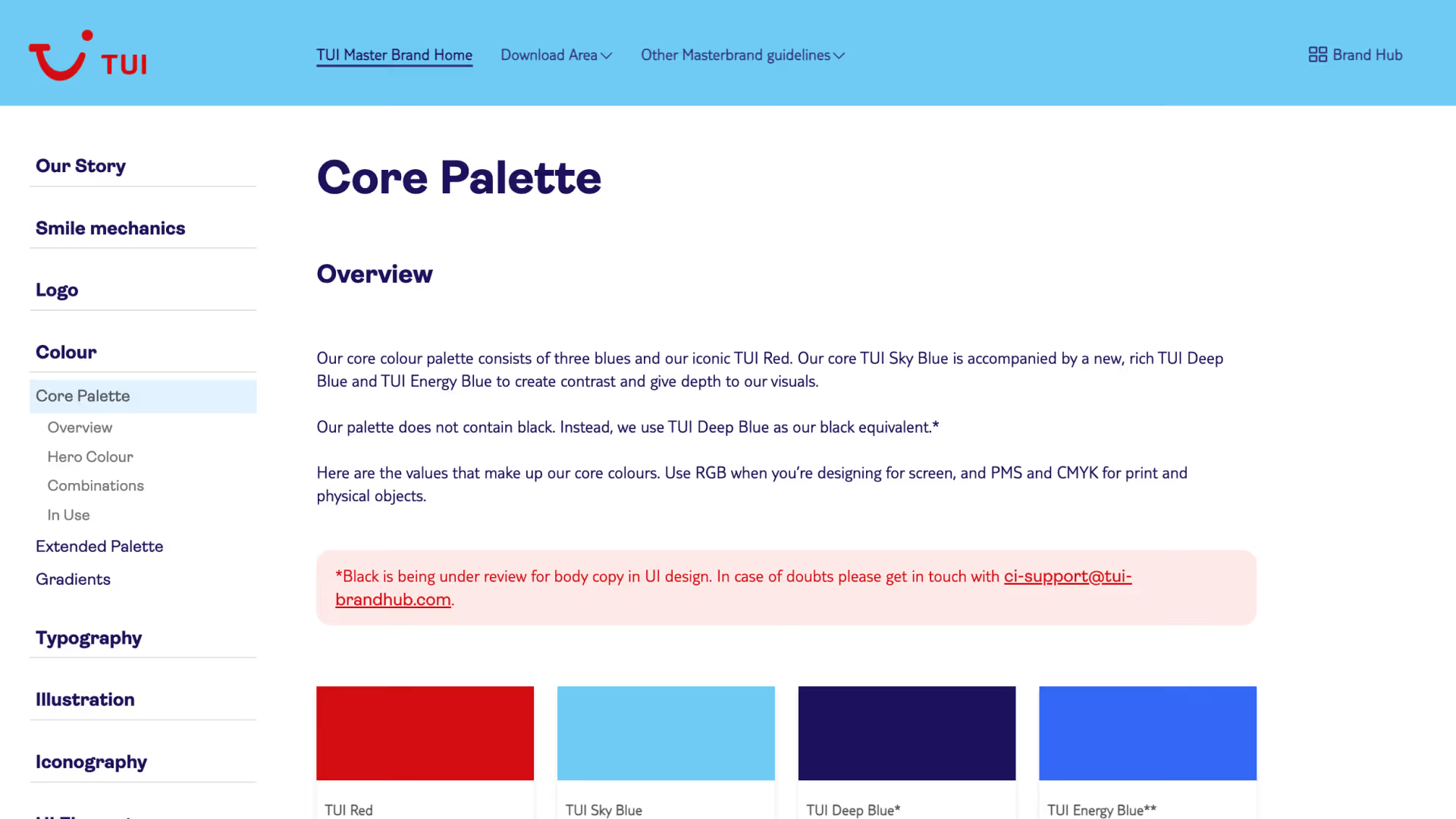
TUI manages dozens of brands from one central portal. Each brand has a dedicated space for guidelines, assets, and creative templates. Some TUI sub-brands use pre-built templates to help team members create on-brand marketing collateral without design support, and manage the full feedback and approvals process within their portal.
Why we love these guidelines:
- Templates beyond marketing: From campaign assets to HR job postings, the template library supports non-creative team members in creating on-brand assets.
- Multi-brand governance: Their brand portal manages all their different brands, without requiring different logins or tools for each one.
- Frictionless access: A desktop app puts brand guidelines and templates directly in the team's everyday workflow, so accessing them doesn't require a separate step.
Machine-readable brand guidelines examples
All the examples above are brand guidelines built for people to read. Machine-readable guidelines take the same brand rules and rewrites them so an AI tool can execute them directly. They’re becoming an essential part of companies’ brand toolkits, as 75% of marketing organizations now use AI in at least one workflow. They aren’t competing or replacing traditional brand guidelines, they’re a different type of documentation for a different kind of reader.
brand.md
brand.md is an emerging, MIT-licensed specification created by Caio Pizzol for writing your brand down in a structured format AI tools can understand. It's a single Markdown file that lives in your AI project's "root directory," alongside similar files like README.md.
The file is organized into three core sections:
- Strategy: Your brand positioning, audience, personality, and brand promise.
- Voice: Your tagline, key messages, and rules for how your brand sounds in writing.
- Visual: Your brand colors, fonts, and photography style, described in words rather than shown in images.
There’s also a fourth, optional layer: Governance. This section provides rules for maintenance, where sub-brands follow and depart from the global brand, and permissions.
For enterprise companies managing more than one brand, one real benefit is that brand.md offers hierarchy support: a master brand.md file can have product-level brand.md files that inherit its rules and selectively override them, across branded-house, endorsed, sub-brand, and independent brand architectures.
Brand skills (SKILL.md)
A "skill" is a package of instructions built around a SKILL.md file that compatible AI agents can discover and load when it's relevant to their task. The format was originally developed by Anthropic and is now an open standard adopted by tools beyond Claude, including GitHub Copilot, Cursor, and OpenAI Codex.
A skill is different to a static brand.md file because it doesn't load all at once. It uses progressive disclosure, where the agent first sees a short description — enough to know the skill exists and what it's for. Then when it’s working on a relevant task, it can pull in more instructions and any reference files it needs.
As an example, you'd document your typography, color palette, brand voice, and instructions for how and when to apply each element into a skill called brand-guidelines. When you ask an agent to build a presentation or format a document according to your brand guidelines, it checks whether a relevant skill exists, loads it, and applies your brand without having to re-explain your guidelines in the prompt.
DESIGN.md
brand.md and skill.md are built for content — copy, decks, documents. But design.md (sometimes called design-md) is built for tools that generate interfaces and code. Design-and-code tools can use a design.md file to build interfaces and components that match your brand.
It's an open-source draft specification that Google Labs released through Stitch, its AI design tool. It’s a text file that pairs “design tokens” — exact, reusable values like a specific color code or font size — with short, plain-text notes explaining each value. So a tool reading the design file gets the number and an explanation behind it.
Design.md is still an emerging convention in active development, so it’s useful to understand and monitor its ongoing development, rather than build your entire process around it.
Inspired to build your own brand guidelines?
Across all these examples, the guidelines doing the most work share one trait: they're built as structured, live content an AI tool can actually use, as well as the people on your team. Frontify's AI Brand Assistant answers brand questions straight from your guidelines, with links back to the exact source section, and the Frontify MCP server connects tools like Claude, ChatGPT, and Cursor directly to your brand's assets, guidelines, and templates — so AI tools produce on-brand work instead of guessing at it.
Frontify is an enterprise DAM at its core, wrapped in brand guidelines, templates, governance, and AI-powered brand intelligence. That foundation supports everything else a brand team needs from a guidelines platform:
- Live wherever work happens: Share guidelines with any internal or external team, complete with access restrictions where you need them.
- Built for designers and non-designers: Equip every team with templates and approved assets they can use directly, without opening a design request.
- Updated in-house: Change your guidelines yourselves, without waiting on a design agency for every edit.
As we’ve seen in the examples above, some of the world’s leading companies use Frontify to house everything related to their brand. Frontify is an enterprise DAM at its core, wrapped in brand guidelines, templates, governance, and AI-powered brand intelligence.
Want to see more of this in practice? Browse Built with Frontify for further examples of how leading brands use the platform. Ready to ditch the PDF and bring your brand guidelines online? See how teams are making the switch to Frontify, or book a demo.