

What’s Driving the Future of Brand Color?
After exploring typography in the first episode of our Rebranding Redefined series, we focused on another fundamental brand building block: colour. Joined by Carola Seybold, Head of Global Key Accounts at Pantone, and Benjamin Watkinson, Global Brand Director at G.F. Smith, we explored how brands can harness colour as a strategic tool to express identity, create emotional connections, and stand out in a crowded landscape.
How colour shapes emotion and identity
Colour is no longer an afterthought. It's a brand asset that drives connection and creates instant recognition. Carola Seybold explained that Pantone built its authority by developing a universal colour language across industries and cultures: "We tick all the boxes you need to do with colour. From trend forecasting to colour psychology to licensing."
Colour aligns emotional cues with company values. Think trust (blue) or bold optimism (yellow). As Benjamin Watkinson said, "The one defining thing in the world is colour. Yet too many brands merge into a sea of sameness."
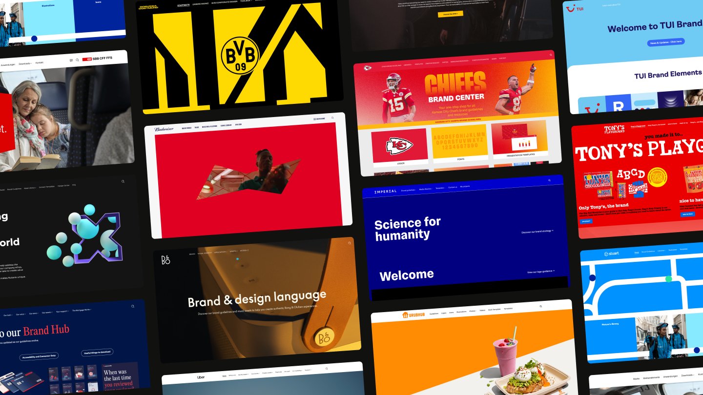
Balancing expression and function
While color evokes feelings, it must also function. Designers must create systems that work across signage, UI, and packaging without sacrificing identity.
G.F. Smith faced that head-on. Their bold rebrand brought playfulness and vibrancy back after years of monochrome. "We didn't rebrand to fit in," said Watkinson. "We rebranded to change the conversation."
From building exteriors to delivery vans, the new palette makes the brand hard to miss – online and offline.
A global language with local impact
Trends alone aren't enough. Brands must understand how colour resonates in different cultural contexts. Seybold emphasised Pantone's shift to regional forecasting: "Sometimes you need palettes that are very specific to a region or audience."
Clarity and intent are key in adapting a shade or subtly evolving a palette. The example of Porsche's recent crest rebrand shows how brands can take bold risks when storytelling and relevance align.
Why colour deserves a lead role
Colours aren't just decoration. They're strategic tools that trigger emotion, tell stories, and shape connections. As Pantone and G.F. Smith revealed, color choices reflect cultural shifts, market needs, and tech evolution. Done right, a palette becomes part of your brand's voice.
"Color is the only international language we all understand," said Seybold. That's why creative teams should wield it with care and confidence.
Watch the “The future palette” webinar to learn how brands use bold color choices to stand out and spark emotion.
- Colour is your silent brand ambassador. Colour sets the tone before a single word is read and communicates your brand's intent.
- Trends are signals, not rules. Brands that understand cultural context can use colour to stay relevant without falling into sameness.
- Rebrands need courage. A bold shift in colour can refresh perception – if it's grounded in meaning and communicated clearly.
- Digital-first isn't enough. Consistency is key when colours must work across screens, print, packaging, and physical spaces.
- Play with purpose. A vibrant palette can be expressive and ownable when tied to your brand values.
Accordion header
Digge Zetterberg

Carola Seybold
Carola Seybold

Benjamin Watkinson
Benjamin Watkinson