Key takeaways
- Consistency builds recognition and trust across every channel, team, and market.
- Brand guidelines are not the same as a style guide, a brand manual, or a design system. Understanding the differences saves time.
- What you include matters as much as how you present it. Most guidelines fail because they omit governance, social media standards, and agency-facing rules.
- Digital platforms outperform static PDFs for keeping guidelines current, accessible, and actually used.
- A third generation is emerging: AI-queryable guidelines that answer questions, generate on-brand content, and check compliance automatically. No one has to open a document.
- Guidelines that get ignored are usually too rigid, too inaccessible, or never explained to the people expected to follow them.
What are brand guidelines?
Brand guidelines are a documented set of rules that define how your brand looks, sounds, and behaves across every touchpoint, team, and market. They turn your brand identity into something clear, consistent, and usable for everyone who creates content in your name.
At their core, brand guidelines answer three questions:
- What do we look like?
- How do we speak?
- And what do we stand for?
Without clear answers to those questions, written down and accessible, different teams, agencies, and regions will answer them differently. That inconsistency erodes brand equity over time.
When brand guidelines are done well, they give every person in your organization the confidence to create. They reduce briefing time. They cut feedback loops. And they make your brand recognizable in a way that builds real commercial value.
"67% of respondents use creative guidelines that aren't part of their official brand guidelines." — State of Brand Ownership Report
That statistic matters. It means most teams are working around your guidelines, not with them. The fix is rarely more rules. It's better structure, better access, and clearer explanation of the why behind each standard.
Brand guidelines vs. Style guide vs. Brand manual vs. design System
These four terms get used interchangeably. They shouldn't be. Each describes a different scope and purpose. Knowing which one you actually need saves significant time.
- Brand guidelines cover your complete brand identity: visual standards, verbal standards, values, positioning, and often usage rules for specific contexts (social media, advertising, packaging, events). This is what you send to a new agency. This is what onboards a new employee.
- Style guide is typically narrower, focused on written language. It governs grammar conventions, punctuation preferences, terminology choices, and editorial formatting. Some organizations treat their style guide as a chapter within their brand guidelines. Others maintain it separately, particularly when different teams (editorial, product, legal) have their own writing requirements.
- Brand manual or brand bible is an older term for what is now usually called brand guidelines. You'll still see "brand manual" used for comprehensive printed documents, particularly in more traditional industries. The underlying content is the same. The format and name reflect when the document was written.
- Design system - goes beyond documentation. It's a living toolkit used by product and engineering teams to build digital products consistently. It includes code components, interaction patterns, accessibility standards, and design tokens: the named variables that define your colors, typography, and spacing in code (for example,
--color-brand-primary: #19335C). Brand guidelines inform a design system, but they're not the same thing. Your brand guidelines tell a designer your primary blue is#19335C. Your design system tells a developer how to implement it in a button component.
The practical question: if you're a startup, start with brand guidelines. If you're building digital products at scale, you'll eventually want a design system too, built on the foundation your guidelines establish.
Why brand guidelines matter
Brand consistency isn't just an aesthetic preference. It's a commercial one. Recognition builds familiarity. Familiarity builds trust. Trust drives purchase decisions and keeps existing customers coming back. Brand guidelines are the operational mechanism that makes consistency possible at scale.
- Recognition and trust - A consistent brand is a recognisable one. When your logo, colours, and tone of voice stay consistent across channels, people learn to identify you without being told who you are. That recognition takes years to build and is surprisingly easy to undermine with inconsistent creative output.
- Brand equity - Brand equity is the commercial value your brand carries beyond the functional value of your products. It's why people pay a premium for one option over another when specifications are similar. Consistency in brand expression — protected by strong guidelines — is a key driver of brand equity.
- Operational efficiency - When teams know exactly what to use and how to use it, they stop reinventing the wheel. Design requests drop. Amends decrease. Briefing time shrinks. This isn't a soft benefit — it's measurable in hours saved per project, per team, per quarter.
- Confidence for non-designers - Most of the content your brand produces isn't created by designers. It's written by salespeople, formatted by account managers, and presented by executives. Good guidelines give non-designers a clear enough framework to create on-brand content without needing to ask a designer every time.
- Protection during growth - Brands that scale without guidelines fragment. New markets, new hires, new agencies — each one introduces variation. Guidelines give you a consistent starting point that grows with you, rather than a brand identity that drifts with every hire.
What brand guidelines should include
Most brand guidelines cover the basics: logo, colors, fonts. The ones that actually get used go further. Here's a full picture of what comprehensive guidelines include, and why each element earns its place.
1. Brand Core
Before any visual standard, your guidelines need to establish why your brand exists and what it stands for. This isn't philosophical window-dressing — it's the foundation that explains every design and communication decision that follows.
- Brand values are the principles your brand operates by, ethically and practically. They should be specific enough to be useful. "We're honest" is less useful than "We say what's true even when it's uncomfortable."
- Mission statement is your present-tense purpose: what you do, for whom, and to what end. It grounds every piece of communication in something real.
- Vision statement describes where you're headed: the future state your brand is working toward. It gives teams a direction, not just a rulebook.
- Brand positioning defines where you sit in the market relative to competitors: who your audience is, what you offer them, and why that matters more than the alternatives. Brand positioning shapes every tone-of-voice decision and every visual choice. If it's not in your guidelines, teams will infer it differently.
- Brand architecture matters if you operate multiple brands, sub-brands, or product lines. Your guidelines need to explain how they relate. Is your company a master brand with endorsed sub-brands? A house of brands? A monolithic brand? That architecture determines which elements are shared and which are distinct.
2. Logo Guidelines
Logo misuse is the most visible form of brand inconsistency. Clear logo guidelines prevent it before it happens, without requiring sign-off on every execution.
Your logo section should cover:
- All approved logo variations: primary, secondary, icon-only, reversed, monochrome
- Minimum size requirements — at what point the logo becomes illegible
- Clearspace rules: how much space must surround the logo (often expressed as a multiple of the logo's height or a specific clearspace unit "x")
- Approved colour versions: full colour, one-colour, black, white
- Approved file formats: SVG for digital, EPS/AI for print, PNG for general use
- Lockup rules: how the logo combines with taglines, product names, or partner logos
- What never to do: stretching, recolouring, adding effects, placing on clashing backgrounds
Use real examples for the "never do" section. Showing the wrong version next to the right one is far more effective than a list of prohibitions.

3. Color Guidelines
Color is one of the fastest ways audiences identify a brand. It's also one of the most commonly reproduced incorrectly because the same color looks different on screen, in print, on fabric, and in signage.
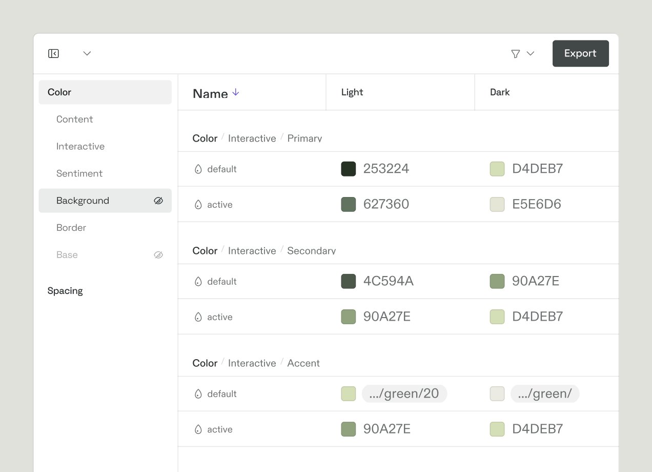
A complete colour system includes:
- Primary palette: your core brand colours with all required format codes
- Secondary palette: supporting colours for UI, data visualisation, or campaign use
- Neutral palette: backgrounds, text, dividers
- Colour values in every relevant format: HEX (digital), RGB (screen), CMYK (print), Pantone (physical reproduction)
Pantone Matching System (PMS) codes are essential if your brand appears in physical environments: packaging, merchandise, signage, print. Without a Pantone reference, the same "brand blue" will print differently across different suppliers. Include PMS codes for every color in your core palette.
Also include color usage rules: which colors are used for which purposes, which combinations are approved, and minimum contrast ratios for accessibility. The Web Content Accessibility Guidelines (WCAG) require a minimum contrast ratio of 4.5:1 for normal text. Specifying this protects your brand and your users simultaneously.
4. Typography
Typography does more for your brand's personality than most people realize. The choice between a geometric sans-serif and a humanist one, between a modern serif and a transitional one, carries connotations that shape how people perceive your communication before they read a word.
Your typography section should specify:
- Primary typeface: the font used for headings and hero text
- Secondary typeface: the font used for body copy
- Tertiary or accent typeface (if applicable): for specific use cases like pull quotes or captions
- Type scale: approved sizes for H1 through body copy and captions
- Weight usage: which weights (regular, medium, semibold, bold) are used for which contexts
- Line height and letter spacing standards for body text
- Web-safe fallback fonts: what replaces your typeface when it can't be loaded
- Licensing notes: where the font can be used and whether a separate web licence is required
If your brand uses well-known typefaces (GT Walsheim, Söhne, Graphik, Sharp Grotesk, or classic options like Helvetica Neue or Futura), name them explicitly. Teams need to know exactly what to request from IT or purchase from a type foundry.
5. Imagery and Iconography
Photography and illustration style are often where brand personality lives most visibly. They're also where the most variation creeps in because "approved" stock photography is a much harder thing to define than an approved logo file.
Include:
- Photography style: the mood, lighting, composition, and subject matter that feels on-brand
- What to avoid: overly staged or generic stock, clashing colour casts, specific off-brand scenarios
- Illustration style (if applicable): the visual language, line weight, palette, and level of detail
- Iconography: the icon set in use, sizing conventions, stroke weight, and approved usage contexts
- Image sourcing: approved stock libraries or suppliers
Showing curated examples (both approved and disapproved) is far more useful here than written description alone.
6. Design Tokens (For digital teams)
If your brand operates any digital products (apps, web platforms, SaaS), design tokens are worth including in your guidelines or referencing separately for engineering teams.
Design tokens are named variables that store your visual decisions in code. Instead of hardcoding #19335C in 200 different places, you define --color-brand-primary: #19335C once, and reference it everywhere. When your brand evolves, you update one value, not hundreds.
Tokens typically cover colors, typography scales, spacing units, border radii, shadow levels, and animation timing. They're the bridge between your brand guidelines and your design system, and they're what makes brand consistency achievable at the speed digital teams need to move.
7. Voice and Tone
Your brand voice is consistent. It's who you are. Your tone adapts to context. It's how you adjust for the situation. That distinction matters. The same brand can be warm and celebratory in a launch email and clear and calm in a support conversation. The voice is the same. The tone is different.
A useful voice and tone section includes:
- Your brand personality: 3–5 defining characteristics with brief explanations
- Voice principles: specific guidance on vocabulary, sentence structure, and what to avoid
- Tone by channel or context: how voice adapts for advertising, social media, customer support, internal comms
- Vocabulary: words and phrases you do and don't use — brand-specific terminology, competitor names policy, jargon rules
- Signed examples: real before/after copy examples that make the principles tangible
The most common failure in voice and tone guidelines is staying too abstract. "Be human" and "be direct" mean different things to different writers. Examples are the only thing that makes guidelines like these actionable.
8. Social media brand guidelines
Social media is where most of your brand's visual and verbal output actually lives, and it's often the last place guidelines get specific. That's a problem, because social moves fast and is managed by multiple people across teams.
Social media brand guidelines should cover:
- Platform-specific formatting: image dimensions, video lengths, caption style for each platform
- Profile standards: approved profile images, bio copy, link-in-bio conventions
- Visual templates: approved post formats and how to adapt brand visuals for each platform's aspect ratios
- Hashtag strategy: which branded hashtags to use and when
- Tone by platform: how voice adapts — Twitter/X tends toward brevity and wit; LinkedIn toward substance; Instagram toward aspiration
- Approval workflow: who can post without approval, who can't, what the escalation path looks like
- Community management tone: how to respond to comments, complaints, and DMs on-brand
- User-generated content rules: when and how to reshare or remix content created by others
Without this section, every social post is a judgment call. With it, the people managing your channels have a framework, and your brand stays consistent even when content is created under time pressure.
9. Templates and applications
The most useful thing brand guidelines can do is make doing the right thing easier than doing the wrong thing. Templates are how you achieve that for non-designers.
Consider including or linking to approved templates for:
- Presentation decks
- Email signatures and newsletter headers
- Letterhead and document templates
- Social media post formats
- Event signage and banner templates
- Proposal and pitch document templates
- Internal report and briefing formats
Templates don't replace guidelines. They make guidelines actionable. Someone creating a slide deck at 9pm before a morning pitch should be able to do it on-brand without calling a designer.
How to create brand guidelines: A six-step Process
Creating brand guidelines for the first time (or rebuilding them from scratch) is a significant undertaking. Breaking it into stages makes it manageable.
Step 1: Align on brand core before anything visual
The most common mistake in building guidelines is starting with the logo. Start with positioning and values instead. If the people responsible for your brand can't agree on what the brand stands for and who it's for, no visual system will hold up under scrutiny.
Run a stakeholder alignment session before you open a design file. Get sign-off on your mission, vision, positioning, and values. Then build the visual identity that expresses them.
Step 2: Audit what already exists
Before building new standards, inventory what you have. Collect every version of your logo in use. Catalogue the color values different teams are actually applying. Review a month of social posts, presentations, and sales materials. The gaps between your intended brand and your live brand are exactly where your guidelines need to be specific.
This audit usually surfaces a few uncomfortable truths: outdated logo versions still in circulation, rogue color palettes, slide decks that look like they belong to a different company. That's valuable. You can't fix inconsistency you haven't identified.
Step 3: Build the rules, then the assets
For each element (color, typography, logo, voice), document the rule before you produce the asset. This forces clarity. "Our primary blue is the brand" is not a rule. "Use our primary blue for all primary CTAs, headings, and brand lockups. Never use it as a background behind body copy" is a rule.
Then build or compile the corresponding assets: color swatches with all format codes, logo files in every approved format and variation, type specimens showing the scale in use.
Step 4: Write for your least experienced user
Your guidelines will be read by designers who know exactly what a Pantone swatch is and by marketing coordinators who have never opened a design tool. Write for the latter. Explain why a rule exists, not just what it is. Use examples generously. Define any technical terms you can't avoid.
Guidelines that require a design degree to interpret will be ignored by everyone who doesn't have one, which is most of the people who need to use them.
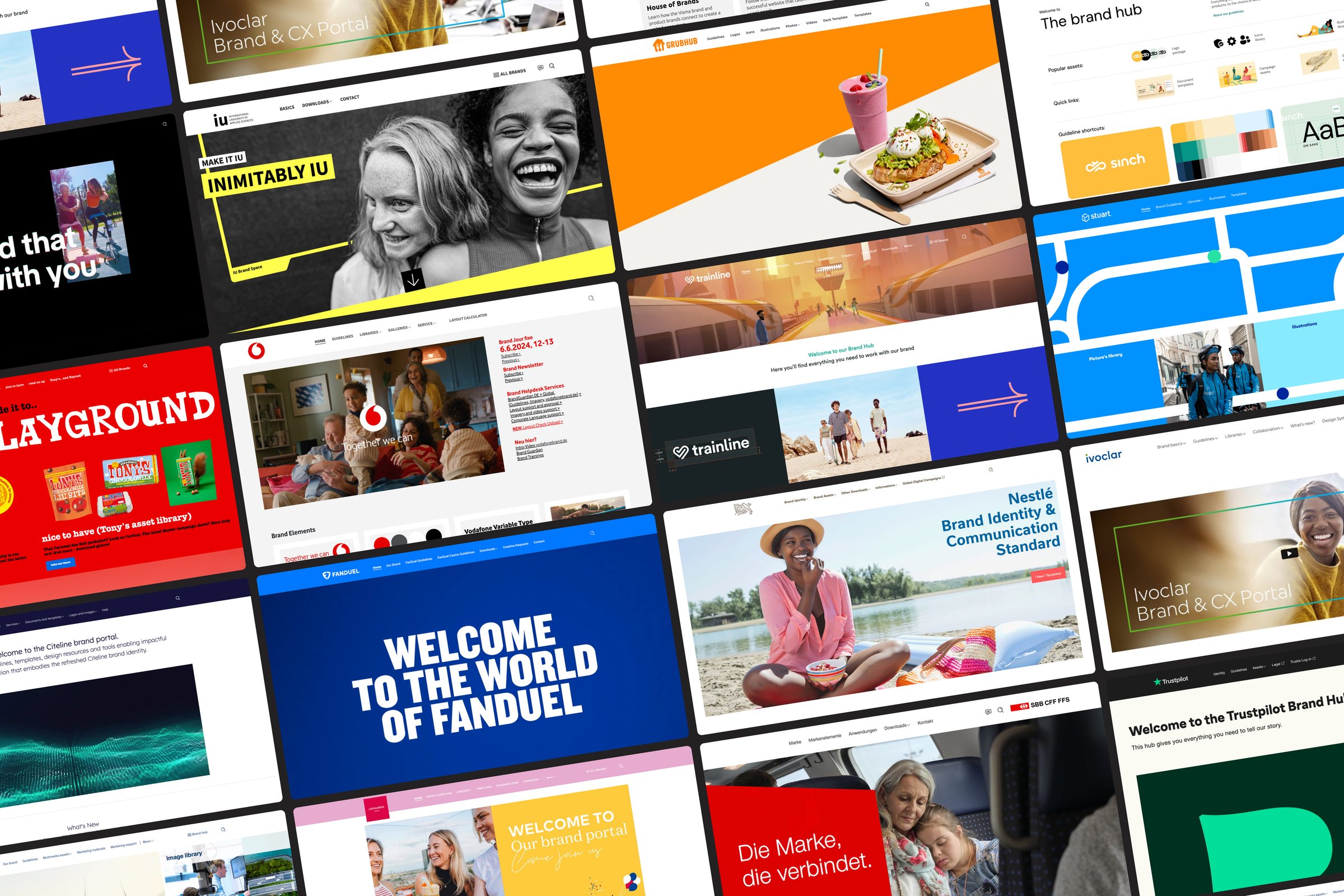
Step 5: Choose your format and platform
How you house your guidelines determines how much they're used. See the Format section below for a full comparison. In short: if your guidelines live in a PDF attached to an email from 18 months ago, they're not doing much.
Step 6: Launch, explain, and iterate
Publishing guidelines isn't the same as implementing them. Announce the launch. Run a walkthrough for key teams. Explain the most important changes or new standards. Make it clear who to contact with questions.
Then collect feedback. The first version of any guidelines will have gaps. The scenarios nobody anticipated will surface quickly once real teams start using them. Build a feedback mechanism (a form, a dedicated Slack channel, a quarterly review) and treat the guidelines as a living document, not a finished artifact.
Brand governance: Getting guidelines actually used
This is the section most brand guidelines skip entirely, and it's often why they fail. You can write the most comprehensive, beautifully designed guidelines in the industry. If there's no governance model around them, they'll drift within six months.
Who owns the brand?
Every organization needs a clear answer to this question. Typically that's a Brand Director or Head of Design, but the day-to-day guardianship of guidelines needs to be distributed. Identify brand champions within each major team (someone in marketing, someone in product, someone in sales) who can answer questions, flag violations, and escalate when needed.
How are deviations handled?
Brand guidelines will always be adapted for context. The question is whether those adaptations are sanctioned or unsanctioned. Build a clear process: who can approve a deviation from standard guidelines, under what circumstances, and how that deviation gets documented so it doesn't become the new default.
Agencies and external partners
Your agencies will do things your internal team wouldn't. Not always badly. Sometimes they'll push the brand in directions that work. But you need a clear brief and clear access to your guidelines from day one of any agency relationship. Consider a separate, agency-facing version of your guidelines that includes legal usage rules, approval workflows, and asset access instructions alongside the standard content.
Onboarding
New employees are one of the highest-risk points for brand drift, particularly in fast-growing companies where onboarding is under pressure. A 15-minute brand walkthrough in the first week, combined with clear access to guidelines and templates, goes further than any amount of post-hoc correction.
Measuring compliance
You can't manage what you can't measure. Periodically audit brand output across channels: run a social media audit, review a sample of sales materials, check what's being used in presentations. Track the ratio of on-brand to off-brand content over time. When you can show that compliance is improving (or where the gaps are), you can make the case for the resources to address them.
Three generations of brand guidelines
Brand guidelines have always been about getting the right information to the right people at the right time. What's changed is who (and what) needs to access them. There have been three distinct generations, and understanding where you sit in that evolution shapes every decision about how to build and maintain your guidelines.
Generation 1: The PDF
PDF guidelines are fast to produce and familiar to everyone. They work offline. They're easy to attach to an email.
The problems are just as immediate.
- The moment a guideline is updated, every emailed PDF becomes outdated — with no way to recall it
- There's no way to link directly to an asset (logo file, approved image) from within the document
- Version control requires manual coordination, and different teams will inevitably work from different versions
- PDFs can't accommodate feedback, comments, or collaborative updates
- There's no usage data — you have no idea whether anyone is actually reading them
Most brands start here. Most eventually wish they'd moved on sooner.
Generation 2: Digital brand guidelines
A digital brand guidelines platform solves every PDF problem. Updates are live the moment you publish them. Assets are directly linked and downloadable. Access controls let you share the right sections with the right people (internal teams, agencies, and external partners) with different levels of permission.
Digital guidelines can be interactive. Color swatches are downloadable in every format. Logo files are available with one click. Templates open directly in the design tool. That frictionless access is what turns a document people reference occasionally into a resource teams reach for daily.
This is the current best practice for most brands. But it's no longer the frontier.
Generation 3: AI-queryable brand guidelines
The third generation treats brand guidelines not as a document to be read, but as a data source to be queried. Instead of a team member navigating pages to find the right logo specification, they ask a question in natural language and get an instant, accurate answer. Instead of a content writer cross-referencing tone of voice rules, they generate a draft and have it checked for brand compliance automatically.
This is becoming possible because AI models can now be connected directly to structured brand guidelines, understanding the rules, the assets, and the context well enough to apply them in real time. The implications: brand consistency no longer depends on individuals remembering to check the guidelines. It's enforced at the point of creation.
The shift from Generation 2 to Generation 3 also changes what "good guidelines" means. A PDF can be vague and still be useful to a human who fills in the gaps with judgment. An AI querying your guidelines needs them to be specific, structured, and unambiguous. The discipline required to make guidelines machine-readable makes them better for humans too.
AI and brand guidelines: The brand assistant
AI is changing what brand guidelines can do, not by replacing them, but by making them dramatically more useful. The question is shifting from "where do I find the brand guidelines?" to "how do I make my guidelines smart enough to answer questions and check work automatically?"
What a brand assistant actually does
A brand assistant is an AI model trained on or connected to your brand guidelines. It works like a knowledgeable colleague who has read every version of your guidelines, knows every asset in your library, and is available around the clock, in any language.
In practice, a brand assistant can:
- Answer brand questions instantly — "What's our approved typeface for digital advertising?" — without anyone needing to search a document
- Generate on-brand copy for emails, social posts, and blog content, trained on your tone of voice rules
- Check a piece of marketing copy against your brand guidelines and flag anything that's off-brand before it goes live
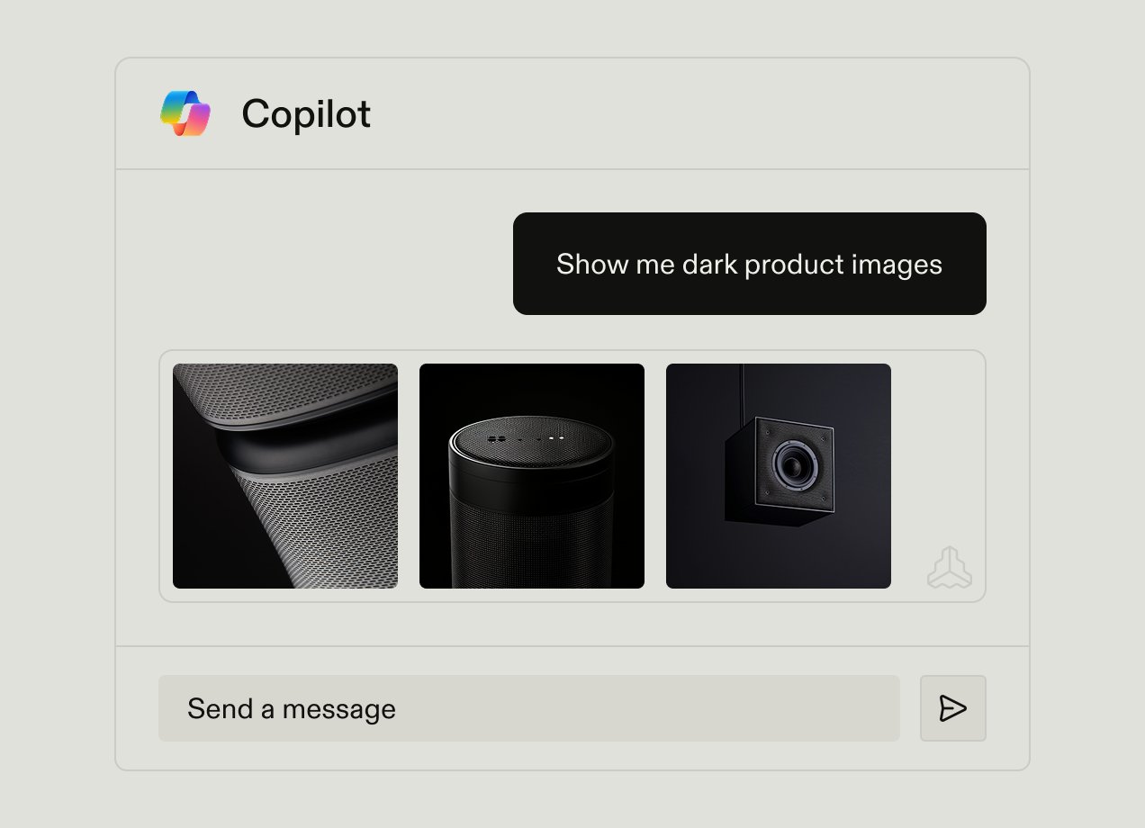
- Surface the right asset from your library based on a natural language description — "find an approved image of our product in an outdoor setting"
- Brief external partners by answering their brand questions directly, without requiring a designer to field every request
- Support global teams in their own language — removing the friction that causes regional brand drift
Frontify's Brand Assistant
Frontify's Brand Assistant is the clearest current example of this third generation in practice. It connects directly to a brand's guidelines and asset library, making the entire knowledge base conversationally accessible to anyone with the right access level.
The assistant operates within Frontify's existing permission structure, so a contractor sees what a contractor should see, and an internal team member sees the full picture. It supports over 100 languages, which matters for global brands managing guidelines across markets where the local team's first language isn't English.
Crucially, the Brand Assistant doesn't just retrieve information. It applies it. It can review a piece of marketing copy against your tone of voice standards. It can generate a first-draft social post in your brand voice. And it can answer a question like "can we use our secondary color as a background in a digital ad?" with the specificity your guidelines contain, rather than the vague answer a human might give from memory.
"Frontify's platform allows us to create user-friendly brand guidelines that help our global teams access the latest specifications." — Gregor Schilling, Bosch
The guidelines content API: brand guidelines as infrastructure
Beyond the Brand Assistant interface, the next evolution is brand guidelines as an API: a structured data layer that external tools, AI systems, and internal workflows can query programmatically.
This is significant because it decouples brand guidelines from any single platform or interface. Your design tool could pull brand color tokens directly from your guidelines API. Your marketing platform could check campaign assets for compliance automatically. A custom AI writing assistant could apply your tone of voice rules without any human in the loop.
Frontify is building toward this, making brand guidelines not just a document people visit, but a live data source that your entire marketing and product stack can reference. This is the direction the industry is moving. The brands that structure their guidelines well now will be the ones best positioned to take advantage of it.
What this means for how you write guidelines today
You don't need to be building a brand assistant tomorrow to benefit from thinking about this now. The structural habits that make guidelines machine-readable also make them clearer for humans.
- Be specific and unambiguous — "use our primary blue for all primary CTAs" is queryable; "use blue thoughtfully" is not
- Use consistent terminology throughout — if you call it a "primary colour" in one section, don't call it a "hero colour" in another
- Separate rules from examples — an AI (and a new employee) needs to know which statements are mandatory and which are illustrative
- Define every term you use — don't assume the reader (human or machine) knows what "clearspace" or "brand lockup" means without explanation
- Structure by element, not by audience — guidelines organised around logo, colour, and typography are easier to query than guidelines organised by use case
The discipline of writing for clarity (not just for design professionals who can fill in the gaps) is what connects good guidelines to AI-ready guidelines. They're the same thing.
Tools for creating and housing brand guidelines
The right tool depends on your team size, budget, technical capability, and how often your guidelines need updating. Here's an honest overview of the main categories.
Dedicated platforms
Platforms built specifically for brand guidelines (Frontify, Standards, Corebook) offer the most complete feature sets. They're the right choice when guidelines are complex, frequently updated, and used across large or distributed teams.
Design-led documentation tools
Frontify, Zeroheight, Supernova, and InVision DSM are purpose-built for teams bridging brand guidelines and design systems. They connect directly to Figma and other design tools, letting you publish live components and tokens alongside written guidelines. Useful when your guidelines need to serve both brand and product teams.
General documentation tools
Notion and Confluence work well for smaller teams or early-stage brands. They're fast to set up, familiar to most teams, and free at entry level. Their limitations become apparent at scale: asset management is basic, version control is manual, and there's no purpose-built structure for brand guidelines content.
Design tools with sharing features
Figma and Canva both offer ways to share brand assets and guidelines with teams. Figma's brand libraries and component sharing work well for design teams. Canva's Brand Kit features are a practical option for non-designer-heavy organizations where the priority is template access over documentation depth.
How often should brand guidelines be updated?
Brand guidelines aren't a one-time project. They're a living document that should evolve as your brand does.
Trigger-based updates
Some updates are triggered by specific events:
- A rebrand or brand refresh — rebuild the guidelines alongside the identity work
- A new product line or sub-brand launch — update brand architecture and expand templates
- Expansion into new markets — add regional adaptation guidance
- A major channel addition (e.g. launching a TikTok presence) — add platform-specific social standards
- A significant change in brand positioning or audience
Scheduled reviews
Outside of trigger events, a quarterly review of your guidelines against live brand output is a useful discipline. Check: are the guidelines being used? Where is drift happening? What scenarios are teams encountering that the guidelines don't cover?
An annual comprehensive review (benchmarking your guidelines against what competitors and best-in-class brands are doing) keeps your documentation from becoming stale relative to evolving expectations.
Brand guidelines in practice: what good looks like
Uber
Uber's brand guidelines are notable for their operational depth, particularly around logo usage in contexts most brands ignore, including right-to-left language localization and co-branded partner executions. They're built for a brand that operates in vastly different cultural contexts simultaneously.

Bang & Olufsen
Bang & Olufsen's brand hub prioritizes experience and navigation over exhaustive documentation. The guidelines feel like an expression of the brand itself: minimal, deliberate, precise. A useful reminder that the way your guidelines look communicates as much as what they say.

Budweiser
Budweiser manages brand consistency across a sprawling ecosystem of markets, agencies, and platforms. Their approach to guidelines as a multi-platform system (rather than a single document) is a model for any brand managing at scale.

Kansas City Chiefs
Kansas City Chiefs's brand guidelines helps the brand and creative teams deliver memorable experiences across all their touchpoints.

Frontify helps you create easy-to-use brand guidelines
Some of the world’s leading companies use Frontify’s platform to house everything related to their brand, including guidelines. With Frontify’s Brand Guidelines, you ensure that everyone has access to up-to-date information that allows them to create, organize, and manage:
- Centralize your guidelines so everyone knows where to go to access the most recent version
- Customize your guidelines with no-code content elements to cover all use cases.
- Share guidelines with your internal team and external agencies and partners, collaborate on updates, and set access restrictions where necessary.
- Store and update your guidelines without needing to work with external graphic designers or agencies.
- Integrate Frontify with your existing tools, including Adobe, Figma, HubSpot, and more.
FAQs