PORTO ROCHA is a creative design agency based in New York. Their projects focus on building creative solutions and branding systems for brands seeking to drive real cultural change.

TW: Let's start with your recent branding efforts. Tell us about the rebrand for Olympikus first!
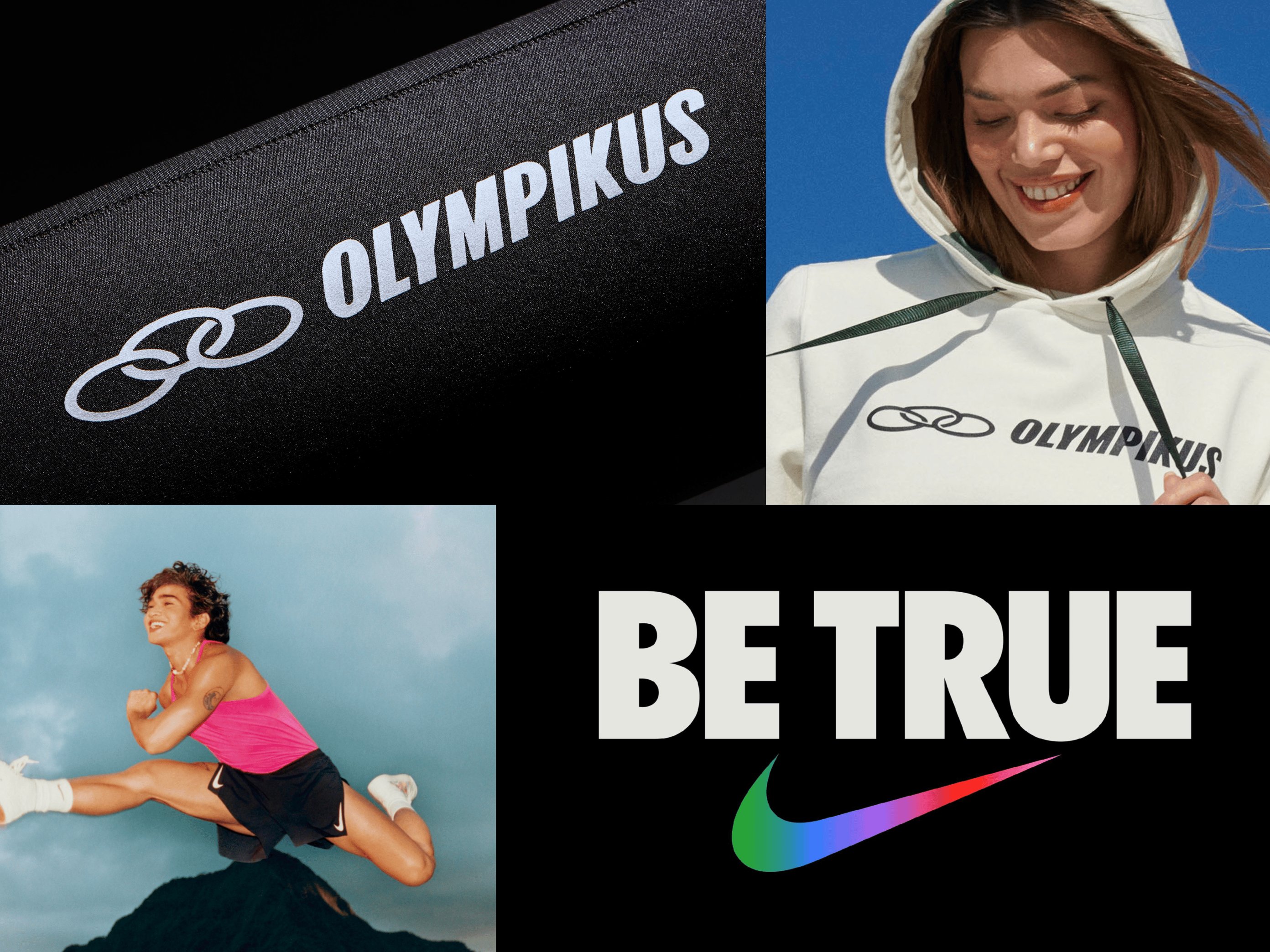
Leo Porto: When Olympikus reached out to us, they presented three main challenges and goals in the brief. First, as a legacy sneaker company that has been around since the '70s, they needed to modernize the brand and better communicate the high-caliber technology behind their products. Second, they’re so popular in Brazil that, to some extent, they've hit a saturation point (15 million pairs of shoes sold yearly, to be precise), meaning they needed to reach new audiences. Lastly, to do so, they wanted to expand into other lifestyle categories and introduce more high-end products. So, we needed to give them a more flexible identity system and, ultimately, help them cultivate stronger brand affinity.
TW: And what are some of the results you've seen from the rebrand? What key improvements of the brand after the rebrand?
LP: Through the rebrand, Olympikus was able to reduce its reliance on price as their main selling point, shifting their communication strategy and increasing brand affinity. In terms of numbers, less than two years after the rebrand, sales increased by more than 32% and profits by 60%. They successfully expanded their product offerings, reached new audiences, all while maintaining their loyal customer base.
Another interesting shift becomes clear when you look at their product portfolio, where many new designs — from t-shirts and accessories to the shoes themselves— include a much more prominent and confident use of the logo, which was previously used more discreetly. The proud use of the Olympikus brand in product is, more than anything, a clear indicator of how people are engaging with the brand.

TW: Let's move on to Nike’s rebranding campaign. You helped Nike’s "Be True" platform for the LGBTQ+ community. How did you approach this project — both as a sort of a global brand and also as such an established brand?
LP: Well, the good thing about working with Nike is that they have an extraordinarily well-established brand with a solid foundation and brand equity. That gave us permission to be more expressive and experimental, approaching the "Be True" project more like a creative platform or playground. On the other hand, we had specific brand elements we had to use, so we had to get creative in how we used them. It often feels like Nike has already done it all — it’s a tricky balance between creating something super fresh and unique. But also not so far off that it feels out of place in the Nike brand world.
TW: I suppose there was an added challenge with this as well in terms of the iconography and imagery, which is inherent within the LGBTQ+ community. So, utilizing that must have been something of a creative design challenge as well.
LP: Sure, that was one of the biggest challenges with this project. We took a step back and looked at what Nike "Be True" was truly about. The real opportunity was to transform Nike "Be True" into a more meaningful platform for the queer community versus what most brands do, which is a short-lived pride campaign that's up only during the month of June. The idea was to create an evergreen platform with enough tools for Nike to run with, engaging meaningfully with the community for many years to come.
DZ: Obviously, with Nike being such a global brand and LGBTQ+ rights being such a universal discussion, how did you approach this rebrand with that at the front of your mind?
LP: We considered the notion of global versus local from the start. Especially when it comes to such a sensitive topic as LGBTQIA+ rights, which is, for example, very different in the US than in Brazil or Japan. So, rather than having Nike create a look that gets replicated all over the world, each region would have space to engage local talent and work with their own athletes to be the faces of the campaign. That's the thing about working for Nike that I find most gratifying — the reach and scale. It breaks so many barriers in terms of culture, gender, race, age, and class. It's one of the few brands that can be both global and local at the same time.

DZ: Do you have ethics standards, if you will, that you follow in terms of the types of brands you wouldn't work with or any kind of rules that you've set for yourself in that regard?
LP: It's definitely a tricky one: I feel, to some extent, every brand causes some level of harm. It would be rather naive to say that we only work with companies that only do good. But there are many companies that we'll never work with, that cross that line of ethics, or that have values or affiliations that are different from ours. For example, we wouldn't do a rebrand for a fossil fuel company or a company whose CEO spoke against LGBTQ+ rights, among others.
On the other hand, we also see branding as an opportunity for brands to transform into better versions of themselves. If we only work with brands that are already "perfect," the impact of our work is less significant. So, we have to be very critical of who we work with and determine if they’re serious about enacting change.
DZ: When companies come to you and say, “We want to rebrand,” do you ever find yourself in a situation where you realize that, no, actually, they shouldn’t?
LP: I don't think we’ve ever told a client not to rebrand. But we often find ourselves telling them they don't need to change certain elements — like an iconic logo, for example. Ultimately, we don't ever change things just for the sake of it. When we start a rebranding project, we take a critical look at existing brand elements through two lenses: One, is it technically well-executed? And two, does it hold brand equity or help differentiate the brand in the landscape? That's how we determine what needs to be changed and to what extent. Often, keeping some familiar elements in the mix gives us permission to propose more radical changes in other aspects of the brand.
TW: Off the back of that, what do you think are the most important elements in a good rebrand nowadays — and has that changed from 10 years ago?
LP: One thing that has changed the most over the past decade or so is that nowadays, it's critical that brands are able to adapt and react to the world around them. Traditionally, branding has been a discipline of order and repetition, building brand recognition through strict guidelines. But now, with a myriad of touchpoints and much more frequent communication, repetition can quickly turn monotonous. Brands are expected to be more contextual and more meaningful. And to add to that, audiences are more skeptical of branding. If you're not meaningfully engaging with culture, which is always in flux, you're going to fall behind.
TW: Obviously, nowadays, there are a thousand touchpoints for a brand, and not all of them are deliberate. Is that something that a rebranding agency should be considering?
LP: There are a few ways that we look at that. One way is through co-creation. We encourage brands to reach out to creators, influencers, photographers — anyone who is driving culture — to make sure the brand is very much alive. Another way is introducing user-generated content into the brand, which is an important aspect of how people consume information and culture. It ties back to thinking of the brand as a living organism.
TW: That’s a really interesting notion, handing over the reins to the cultural zeitgeist. What do you think makes a rebrand important and, in some cases, necessary?
Leo Porto: A rebrand is a moment to pause, reflect, and recalibrate. As a brand grows organically, sometimes its vision can get blurry. So it's important, every once in a while, to have that moment of self-reflection, to refocus and ask important questions. Is the brand fulfilling its promise? Is it aligned with its values? What do we believe in? How do we communicate that to the world? And how do we visualize that as well?
TW: Okay, last question, then we’ll let you go. What is the one piece of critical advice you'd give to a brand embarking on a rebrand today?
(At this point, Leo’s fellow Founder and Creative Director, Felipe Rocha, jumps onto the call to say hello)
FR: When I think of the times that a rebrand didn’t go so well, it was when there wasn't an alignment in terms of how important that process would be for the entire team — whether that came from the leadership team or the design team. I think everyone has to see the value of embarking on the rebrand. You need to be willing to be fully invested and willing to change.
LP: I would say, in a roundabout answer to your question, that risk aversion is the biggest block we run into. Don't get me wrong, a rebrand is a high-stakes decision that can impact the future of a business. But when we're presenting to large teams and stakeholders only see risk instead of potential, it can certainly lead us to more expected and less innovative places. To make work that feels genuinely exciting in our hyper-saturated world, sometimes brands have to take a leap of faith.