What is a design system?
A design system is a toolkit containing various resources to help developers and designers create consistent user experiences that authentically represent the brand. Some companies build a dedicated website for their design system, while others use dedicated tools (like Frontify). A design system typically includes the following elements:
- Reusable pre-built components (including code snippets) for commonly used elements such as website buttons, links, or menus
- Grid systems to support graphic design by providing structure for creating different layouts
- Design principles explaining the company’s philosophies and principles for creating digital experiences and designs
- Guidelines describing how and when to use various elements
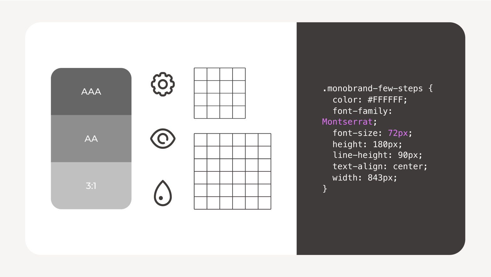
- Usability and accessibility guidelines to help developers create a positive journey for all users
Design systems help UX (user experience) and UI (user interface) teams build consistent digital experiences across different platforms, products, and services. They also improve efficiency, as developers and designers don’t spend time recreating the same elements from scratch.
6 signs your organization needs a design system
Creating a design system can feel like a lot of work, but that time will be a great investment if you’re experiencing any (or all!) of these challenges.
- Inconsistency across projects: Many teams and individuals work on your brand projects, and each has their own creative process. The result? You end up with product packaging that looks slightly different from what’s on your website, which doesn’t quite align with your paid ads and landing pages. So, you have to spend extra time making everything look and feel consistent or ship items that provide an inconsistent user experience.
- Poor collaboration between departments: Teams find it difficult to collaborate on projects without a shared set of resources. This makes it hard to work together efficiently, meaning projects go through multiple revisions as teams try to align their designs.
- Steep learning curves for new team members and partners: It’s tough for new team members to achieve consistency with their designs compared to what their colleagues deliver when there’s not enough guidance or templates to help them. The same is true for external partners and agencies. Long-standing team members rely on their experience and knowledge, which exists only in their heads.
- Repeated work and redundancy: Your developers and designers recreate frequently used elements and assets — such as buttons, form fields, headers, footers, or tables — from scratch. This results in repeated or redundant work that could be achieved much more efficiently if the teams had a library of reusable elements to pull from.
- Slow design or development processes: There are delays in your design or development projects, with time wasted waiting for feedback or going through multiple rounds of revisions to ensure consistency across processes.
- Difficulty with scaling designs: Your design team finds it hard to scale their work across multiple projects, products, or formats. Either because it’s too time-consuming to recreate core brand assets anew or it’s not clear how to adapt brand elements to different use cases.
Key components of a design system
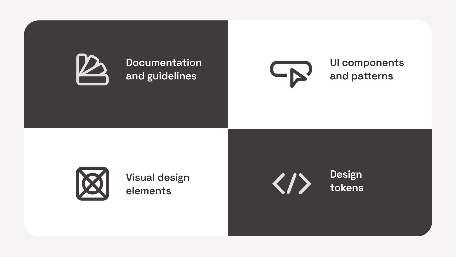
Documentation and guidelines
Documentation and guidelines separate a design system from a simple pattern library. You should provide comprehensive information about all the elements, components, and patterns in your design system and explain how and when to use them.
Your documentation can explain your design principles and help users understand the best practices when implementing design elements. You may want to include examples of different elements in their natural habitat.
UI components and patterns
A design system should contain reusable components and patterns that developers and designers can use when building new digital experiences. This includes commonly used elements for websites and apps:
- Buttons
- Forms
- Navigation bars
- Headers and footers
- Cookie banners
Reusable components help developers work more efficiently, as they don’t need to code them from scratch. By using the same core elements each time, you’ll also improve consistency across pages and products.
Visual design elements
You can add the core visual elements that designers will use when building digital experiences. This information will likely be documented in your brand guidelines, but you can help designers and developers by including it in your design system as well. Here are some visual elements you’d want to mention:
- Brand colors and color codes
- Typography
- Icons
- Guidelines around spacing
These details will help improve brand consistency across projects by ensuring products not only feel the same but also look cohesive. Including visual elements in your design system means designers and developers work from the same core design elements as other creatives and departments in your organization.
Design tokens
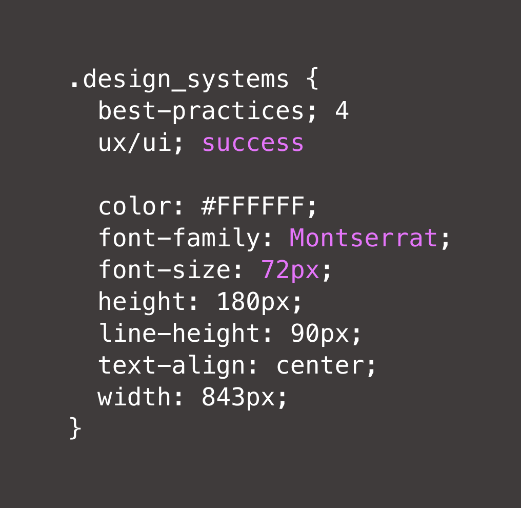
Design tokens are like nicknames for common design elements your developers and design teams use most frequently. For example, instead of manually typing the color code for the exact shade of green in your primary color palette, you can create a design token called “logo-green.” So, next time a designer or developer wants to use that shade of green, they can remember it more easily.
Design tokens make these elements simple and easy to understand. They work with all style files in your design system, which helps to improve consistency across projects, products, and tools. By giving everyone a shared language when discussing or implementing design elements, design tokens improve collaboration and make it easier to scale design and development across the organization.
Best practices for UX and UI success with design systems
If you’re creating a design system for your organization, following these recommendations will set you up for success:
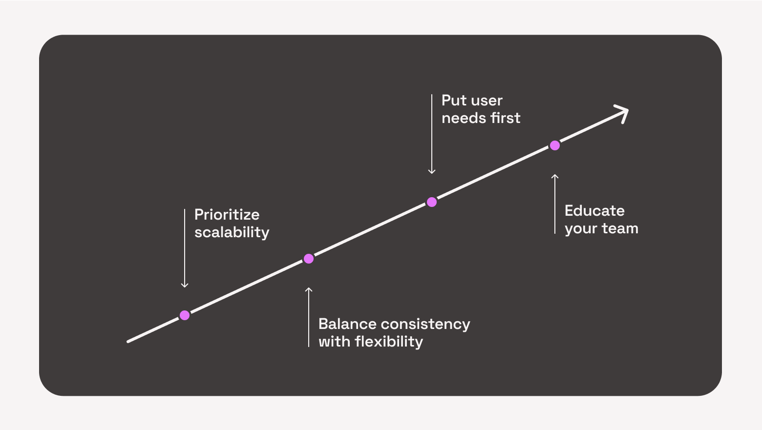
- Prioritize scalability: Building a design system is a significant investment, so you want to make sure it will grow with your product and the organization. A well-thought-out hierarchy for organizing patterns and components will allow you to add new elements easily. Choosing the right software will make it easier to scale your design system in the long run, too.
- Balance consistency with flexibility: A design system helps your teams get more consistent when creating new digital experiences by using the same language and design patterns when possible. But your design system shouldn’t become a straightjacket — make sure designers and developers can suggest changes when they find better ways of doing things or the brand evolves.
- Put user needs first: When deciding about your design system — such as its structure and tools or what to include — keep your team’s workflows and preferences in mind. They’ll use it every day, so their needs should be at the forefront, guiding your decision-making.
- Educate your team: To get the most out of your design system, your team must be confident using it. So, focus on educating new and existing team members. Help them understand what the design system is and how to use it. Formal training, show-and-tell sessions, and detailed documentation and guidance throughout the system will help users navigate comfortably.
Start your design system journey
If you’re noticing any of the signs from earlier in this article, it’s time to consider setting up a design system. Whether you’re starting a design system from scratch or taking over an existing solution, focus on the benefits it will bring your organization.
Wherever possible, take time to engage your entire team and relevant leadership. Getting buy-in from the wider business — especially the people who will use your design system daily — will make it easier to drive adoption from those key stakeholders and set your whole team up for success.