- Rebranding must evolve with consumer consciousness, not just aesthetic preferences
- Visual updates alone aren't sufficient — values clarification amplifies brand storytelling
- Heritage should support innovation, not overshadow it — and vice versa
- Purposeful messaging fosters community beyond transactional relationships
- Balance nostalgic trust-building with contemporary cultural relevance
Key takeaway: Brands that endure will be those that rebrand with intention — staying authentic to their core while adapting meaningfully to modern expectations.
As social, economic, and political uncertainty rises, companies must continue to stay on top of crafting their image in step with evolving customer values.
Whether spurred by changing demographics or entrance into a new market, rebrands indicate which businesses have stayed in pace with the times — and their patrons.
This isn't a matter of simply updating visuals and Gen Z-ifying copy. Modern rebranding needs to center on clarifying communication around brand values, and uplifting community above all.
Some brands will opt for the feel-good quality and trust to be found along the heritage route.
Others may choose to prioritize connecting younger generations by engaging heavily with newness in all forms, from digital culture and media to emergent technologies.
The sweet spot is in striking a balance.
According to a Frontify report surveying 450 CMOs across the UK, US, and DACH region, 88% supported the idea that “investing in brand-building is key to building a resilient brand during economic uncertainty.”
And the number one factor to a resilient brand? A strong concept 1.
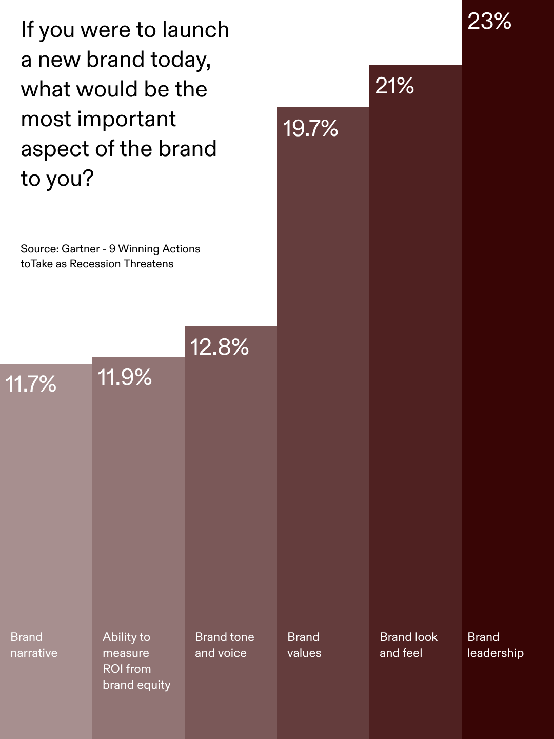
1“Almost 70% of smaller brands ranked a strong brand concept above all other factors, compared to only 40% of larger brands.”
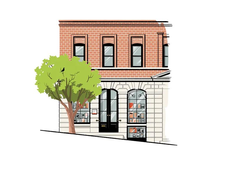
2LoveFrom devised a flexible toolkit for William Stout Architectural Bookstore, featuring a custom typeface and Satoshi Hashimoto illustrations.
Understanding how this focus fits to existing messaging and scale is paramount — from brick-and-mortar shops and online fashion retailers, to SaaS applications and global automotive makers.
A fixture of San Francisco's cultural scene since 1974, William Stout Architectural Books was acquired by the Eames Institute of Infinite Curiosity in 2022.
The retailer has unveiled a fresh visual identity, signed by Jony Ive's creative collective LoveFrom 2.
The brand environment includes a logo, scalable content system for print and digital, playful Satoshi Hashimoto illustrations, and a custom sans serif typeface dubbed LF Washington.
William Stout's new redesigned shop interior exemplifies how nostalgic cues can be reworked to contemporary resonance, emanating a sense of warmth that conveys accessibility and reliability — a luxury when digital interactions are so often met with consumer skepticism.
Even online, heritage can be a survival tactic. This spring, the British fashion e-tailer formerly known as Boohoo resurfaced as Debenhams Group; sales of its youth label could not keep up with fast-fashion competition.
A department store chain dating back to 1778 that shuttered physically in 2021, the Debenhams brand was purchased by Boohoo, which has relaunched it as a digital merchant.
For nascent companies, what's to be done when your audience develops far beyond the original scope?
Figma, a popular collaborative interface design tool launched in 2016, faced this question.
Acknowledging that its user base has shifted from designers only to entire product teams — and wanting to welcome this new community appropriately — the brand revitalized its image 3.

3Aiming to move past the “vector vernacular” that defined its previous visual language, Figma developed brand elements and a typeface that better embodied their goals.

4Figma’s Damien Correll acknowledges that many modern brands can’t “own” a color or pairing like heritage companies.
Versatile primitives, dynamic compositions, an expanded color palette, and integrated motion principles underpin Figma's facelift 4.
Embodying research into the way people use the tool, each element represents an aspect of the creative process. “Enduring visual identities should be thought of as languages, not systems,” says Damien Correll, Director of Brand Studio at Figma.
Then there's Audi China. Founded in 2009 as a subsidiary of the German giant, the company has made a decision to ditch Audi's biggest recognition marker: its four interlocked rings.
Instead, AUDI — notably in all caps — features on the grilles of China's newest models.
The decision to differentiate the Chinese brand 5 is targeted at appealing to tomorrow's car buyers, symbolizing the shift to electric vehicles, AUDI's engineering feats, and China's advanced digital innovations.
What unites all these brands is a willingness to reframe their story without losing their essence.
Ultimately, rebranding today isn't about reinvention for reinvention's sake, but telling stronger stories with greater conviction. That hinges entirely on clear brand values — knowing the why of the who.

5“Audi is breaking new ground to tap into new and more tech-savvy customer segments.” – Audi CEO Gernot Döllner on its Chinese subsidiary’s reworking as AUDI.